Usability Testing UX Booth: How We Did It by Gavin Lau

The new homepage design was all ready to go, and we were excited to launch. As the team discussed our rollout plan, we all agreed that testing the design before launch would be the right thing to do—we are, after all, focused on user-centered design. The problem was doing testing in a timely manner, while still gathering enough information to make sure our new homepage would provide a fantastic experience for our readers. 


Believe it or not, UX Booth has a pretty small staff (see for yourself on our About page). And in addition to our work with all of you, we all work full time in the UX field. So adding usability test creation, recruitment, moderation, and analysis to our busy schedules was an overwhelming prospect. Plus, we were feeling the pressure to launch our new homepage design quickly, so that we could share it with you.

Of course, there’s more than one way to approach testing. We looked through some articles for recommendations:

But ultimately, moderation was still going to be a struggle. So we turned to our trusty Complete Beginner’s Guide to Research for inspiration.


Enter UserZoom

We’ve known the team at UserZoom for quite awhile. We’ve bounced around a few article topics – sometime soon you may see a UX Booth article from one of their team members – and we featured them in our Complete Beginner’s Guide in 2016. Here’s what we had to say about them:

The good news is, whatever you need, UserZoom has it. Usability testing, both moderated and unmoderated, remote testing for mobile and desktop, benchmarking, card sorting, tree testing, surveys, and rankings: they’ve got it! The bad news, as can be expected with any product this robust, is that it can be overwhelming to learn, and it is expensive. Still, for organizations with the budget to handle it, UserZoom is a solid, effective choice.

Luckily for us, the team at UserZoom is fantastic. Alfonso and Phil got us set up, and Ann was there along the way to answer our questions and provide advice. In just over two weeks, we were able to set up our test, recruit participants, get results, and analyze them. 


The Process

Here’s a step-by-step of how it went down.

Day 1: Before even looking at UserZoom, our team at UX Booth discussed the study goals, and we identified five introductory questions, six questions about our current homepage, and six questions about our new design.

Day 3: Having finalized our questions, we reached out to UserZoom for help setting up the test. It turned out to be very easy. We chose to run an “Agile Usability Test (Think-Out-Loud)”, and the site led us through a set of simple steps to prepare the test. 

  1. Choose the type of study (Agile Usability Test, in our case)
  2. Select the device you expect testers to use to access the study (desktop or mobile)
  3. Name the project and describe the test’s goals – a smart thing to ask, as it ensures we know those goals
  4. Choose how to find participants – in our case, we were recruiting our own, but UserZoom also offers the option of finding participants for you
  5. Identify user profiles (useful if you have multiple personas or audience segments to screen for)
  6. Add tasks and questions
  7. Review and preview the test (from the participant perspective)
  8. Launch!

The whole process took less than 30 minutes.

Day 4: We held off on launching the test until after recruitment, which took the form of a few tweets and an article to let our audience know we were redesigning. Which reminds me – thank you to the many wonderful readers who responded and participated!

Day 8: We launched the test four days later and shared it with the volunteers who had responded to our article. We gave them one week to complete the test. Shout out to UserZoom – when Ann saw we had launched our test, she reached out to ask how things were going, and she pointed out a few additional features I hadn’t known about.

Day 15: One week later, we had our results. We hadn’t needed to moderate the test because UserZoom does such a great job of videoing the interaction, recording audio, and pulling the written responses to questions into an easy-to-scan Excel doc.

The best part? It only took about two hours to review the responses and reach conclusions, and the conclusions were varied and valuable. We found that some of our assumptions were dead on – yes, you love having article categorized by topic, and our new design could make it easier for you to find the most recent articles related to trends or sub-sets of UX. But some areas we were proposing changes weren’t as helpful as we’d expected – you helped us recognize flaws in our navigation, and pointed out that the new homepage could be awfully confusing if we didn’t provide enough text.

Now we’re onto phase 2: updating the designs with your feedback, and then onto launch!


Easy and Useful

Ideally, testing a new design should be easy to do, and it should provide valuable feedback. With UserZoom, we were able to do both – even on a tight timeline, with limited availability. We recommended UserZoom before based on individual experiences and stories from our readers. Now we recommend them even more, based on our experience at UX Booth.


Realizing Empathy, Part 3: Conversation by Gavin Lau

For as long as I can remember, I’d considered art to be the antithesis of design; the rationale being that art was self-indulgent whereas design was empathic. After spending four years studying both the visual and performing arts, however, I’ve come to realize that not only was empathy required in the creative process found in art, but its role was pronounced in a broader and more granular way than design. With this newfound understanding, I now hope to bring more empathy into design so as to reconsider how we think of and practice design on a day-to-day basis. I also wish to challenge willing designers to go beyond presenting people with things and services and towards supporting them in the journey of learning the choice to become artists of their own lives—exploring who they are, who others are, and how we are all interrelated.

This is part three of a three-part series, diving into some of the events that led me to the epiphany that realizing empathy is at the core of the creative processPart one explored the direct relationship between making art and empathy. Part twosuggested how, in becoming aware of what the relationship is, we can not only help develop our empathy but also better realize it in all aspects of our design practice. Part three (the part you’re currently reading) will invite you to a challenge where you, as a member of the design community, can shape the future of design through the lens of empathy.

In my previous article, I made a more explicit connection between the creative process and the process of realizing empathy, and opened up a dialogue around how that connection relates to the individual designer’s practice. In this article, I will share my wish for the design community, and demonstrate how we can use the design process to think globally and locally.


Thinking Globally; Missing Locally

I’ll start by sharing something personal.

It took me 40 years before I began to empathize with my father as frequently as I do now.

When I was a little child, he was always working. Often times, overseas. There simply weren’t that many opportunities for us to interact. Then when he quit his job to start his own business, I was off to a college in a foreign country. Now I was overseas. Our entire life was like a missed connection on Craigslist.

Recently, I asked him about his one regret in life. He said “Not spending more time with the family.” Why do I bring this up? To illustrate a phenomena I’ve come to call “Thinking Globally; Missing Locally.”

A phenomena I often see is our tendency to become so focused on something bigger and more far out (i.e. saving humanity, achieving a future outcome), that we lose focus on something smaller and more near (i.e. spending time with our families, being in the moment).

I see the same thing happening in the design industry. For example, my primary job now is that of a mettā-designer. I work outside an organization helping those inside develop themselves and their relationships with one another such that they can more effectively design together. A common pattern I see in these companies is that their Founders/CEOs tend to naturally focus on fulfilling the needs of (potential) customers outside their companies. In fact, this is often why they founded their company. For better or for worse, most of them didn’t found the company to focus on their employees. Given such focus compounded with a variety of other reasons, they often miss out on attending to the needs of the people inside their companies. Thinking globally; missing locally.

Similarly, there is currently a trend to make design bigger. Huge, in fact. “At scale” is the name of the game. Popular media is filled with articles promising magnanimous visions of a newly designed future where large systems are transformed, poverty is eliminated, and customer needs across “omni” channels are satisfied. As a designer, these are highly inspiring. At the same time, I worry that we may be forgetting to also find value in making design smaller. Micro, in fact. Micro as in attending to the seemingly mundane interactions we have with the various “others” we encounter in the design process on a day-to-day and moment-to-moment basis.


Giving Rise to Human-Human (not Computer) Interaction Design

There’s something called the 6-circle model developed by Margaret Wheatley, Tim Dalmau, and Richard Knowles. The model is as follows:

What is above the green line are what is external to people. They are often measured as goals. They are the deliverables, sometimes euphemistically called “goods.” Below the green line are what is internal to people. They are difficult to measure. There are no deliverables, because they are purely experiential. It’s sometimes derogatorily called “politics.”

With this model, the authors call out the work of traditional change initiative as focusing primarily above the green line, while neglecting to also focus on what is below the green line. As a result, most change initiatives either fail or fail to sustain. I see much symmetry between this insight and the idea of “Thinking Globally; Missing Locally.”

Throughout my 18 year-long career, I’ve partaken and observed, over and over again, design projects that put great emphasis on design thinking, human centered design, service design, or other terms for the items above the green line. At the same time, I’ve seen very few design projects that put equal emphasis below the green line. The results are all too common.

  1. Wonderful designs get canceled because there wasn’t the right relationship inside the organization to champion it all the way through.
  2. Beautiful designs launch extremely well with the help of external team of consultants, (i.e. globals) only to die a quick death, because there isn’t an internal team (i.e. locals) with the information or the identity that the external team have about and with the product.
  3. Marvelous designs get severely butchered, because there is an abundance of misinformation or misunderstanding and a lack of sufficient trust and respect among a variety of stakeholders involved.
  4. Fabulous designs do not receive adequate resources (i.e. funding, personnel, attention) because the relationships inside the organization don’t share or no longer (i.e. we tried it before and it didn’t work) share their identity with the designs.

What lies at the heart of these patterns is the challenge of empathy.

The authors of the 6 circle model espouse that to bring about successful change that sustains, we must work on what is above the green line in a way that simultaneously works on what is below the green line.

That is also my wish.

I want to call on our community of designers to join me in paying greater attention to what are below the green line. I wish to refer to the practice of attending to what is below the green line as “human-human interaction design.” A form of design that focuses on influencing the way we, not others (i.e. users or stakeholders), appreciate, understand, express, and be on a day-by-day and moment-by-moment basis. The product of which is a development of a certain quality relationship between ourselves and others. I believe such micro-level design is critical to making our impact more viable, meaningful, valuable, and sustainable to all of us.


My Design Challenge For You

If you’re currently experiencing difficulties bringing about transformation or innovation in your organization, chances are good that you’re feeling stuck, blaming someone.

  • If you’re an individual contributor you may be blaming middle or upper management
  • If you’re a middle manager, you may be blaming upper management or the individual contributors
  • If you’re an executive, you may be blaming middle management or the individual contributors
  • You may be blaming your colleagues
  • You may be blaming the customers
  • You may even be blaming yourself!

If this is you, I invite you to a challenge.
I challenge you to realize empathy with yourself and the people you’re blaming.
Now, let me be clear.

By “realizing empathy,” I don’t mean going around “feeling what others are feeling,” “taking their perspectives,” “understanding,” “listening,” or “interviewing” yourself or other people. I most certainly do not mean being merely nice or polite to them. Let’s refresh our memory on what it means to realize empathy as covered in part 1 and 2.

  • Empathizing is feeling connected or at one with an “other.”
  • Not Empathizing is not feeling connected or at one with an other.
  • Hyper Empathizing is feeling so connected or at one with an other that we are unable or unwilling to make any distinctions between our “self” and that “other.”
  • Empathy is a word invented to explain what makes it possible for us to move from A) not empathizing to either B) empathizing or B’) hyper empathizing.

Given that empathy is a means to moving from not feeling connected or at one with an “other” to feeling so, there are two basic ways we can make that trip.

  1. We can be moved instantly by having our empathy realized involuntarily.
  2. We can move ourselves over time by realizing our empathy deliberately.

Being moved instantly is like a time when you watched a singer sing or an actor act and were instantly moved to feel connected or at one with them without effort.

With the phrase “realizing empathy,” I want to invite you to shift your focus away from empathizing or not empathizing and instead focus on the space between not empathizing and empathizing. 

For example, imagine a married couple in the brink of a nasty divorce. They are not empathizing with each other. Now let’s say they finally empathized with one another after a year of couples therapy. Imagine what it must have taken for them to complete that journey of realizing empathy. Every single one of those efforts that contributed to their eventual empathizing makes up for what it means to “realize empathy.”

If it isn’t already clear, this is a very difficult challenge.

Realizing empathy with someone you’re blaming? Most people will say “Forget it!” Yet, that’s the challenge of Human-Human Interaction Design. It requires you to tap into something significantly more vulnerable and anxiety-inducing than required by other kinds of design. Not everyone is willing or even interested in this kind of difficult design.

At the same time, I trust that there are some of us who are willing and interested. I believe that’s all it takes. Like Margaret Mead, I do not doubt that a small group of thoughtful, committed citizens can change the world; indeed, it’s the only thing that ever has.


The Choice is Yours

As you can imagine, there are many ways to realize empathy. If you’re finding it daunting to figure out where to go next, here’s one way to get started.

First of all, notice it. Notice yourself blaming.

Then make a deliberate choice of your next thought or behavior. In other words, instead of letting yourself do or think by default, be the designer that you already are and choose. Choose the kind of thought you want to think. Choose the kind of behavior you want to enact. Choose the kind of person you want to be.

When you do this, I urge you to remember two things.

If you do not like the choices immediately available to you, for whatever reason, you need not choose any of them.

Just as you choose to create new paradigms of human-computer interaction previously unimaginable, you can also choose to create new paradigms of human-human interaction previously unimaginable. You have the choice to increase the choices you have. These new choices will often only be obvious in hindsight.

Let the design process begin.

Will you join me in this challenge?

The choice is yours.


UX and design thinking: 5 tips for changing your company mindset by Gavin Lau

An actionable guide to make the UX designer role clear to                    your company and team


The UX design is based off an attitude, a mindset that aims to catch those unfulfilled user needs in the context of a certain experience and turn them into design opportunities, through a process made of specific steps, mainly provided by the “design thinking tool set”.

Conversely, so many companies in the digital industry keep on working all centred on personal assumptions and tastes of the ones that are in charge for the ultimate decision or of those ones who put the money into the project. These assumptions and tastes are all conveyed into the final product!

Well, if you are reading this article, you may feel like a natural-born UX designer and you have probably spent your weekends and nights learning about UX methods, techniques, metrics and tools just to validate your natural attitude. You are probably convinced that your goal is to deliver successful products, but you feel like your working team doesn’t appreciate your work. You put all your efforts into it, but when you look at the final result you feel like an underachiever.

It may be sound like a huge mission, but you should try to bring some of your UX designer mindset to your company both for your mental and professional well-being and for the company success. It may cost you some extra work to perform processes and tasks that, at the beginning, may not be appreciated and taken into account by the other members of the team but it’s worth a try.


1. User research process: make it accessible

As a first step, you need to shift the focus of product design from managers’ assumptions and tastes to user needs.

For achieving your this goal you need to apply some tweaks to your “get out of the building” mantra as a user researcher. Users are the only ones who can convince managers that they are a real goldmine for design opportunities, but as the one who conducts this game you must keep them real.

Managers and investors are hard to convince if you get out of the building for your user research work and get back to them later just for debriefing them with the final report. Make your user research process accessible! Social networks, where you can both join in groups and channels and create your own are definitely a valuable resource to get in touch and work with users.

You can invite managers and investors to join in as well, so they can follow all your work as a user researcher while you interact with users, build a relationship with them, administering questionnaires and ask for their help on a specific case. For each questionnaire you’ll produce a report with all the collected insights, and, hopefully, your managers and investors will perceive them with all their “scientific” and objective relevance.


2. Sharing deliverables: do it in a physical place!

Maybe in you office meeting room there’s already a white board or some boards for sticky notes. Right from there, you can start building a place where you can share your UX design deliverables with your team.

Any digital platform for sharing documentation can be fine, of course, but a physical place where you can leave a copy of your deliverables just pinned on the wall can have a great impact on your (still) backward workmates.

An overall visual perception can provide them with such a powerful convincing evidence of your work relevance! You can even ask your team members to spend some time just sitting alone and quiet in the meeting room for giving a look at each new deliverable addition. They will appreciate your invitation to share with them your findings, as they will also be curious to know what your work is about. This way, you’ll also make sure that they will be much more focused, avoiding distractions while away from their computers.


3. User stories: lines of code making sense

One of those attitudes that are hard to break is that “the user will get used to it” that’s very typical for developers. They spend too much time coping with their code and machines and they loose touch with users and their real needs. Moreover, their mindset is totally different from the average user mindset, so it’s important to provide them with something that keep their heads in the real world. So, for each chunk of functionality you’d better write some user stories to share with your developers: this will prevent them to feel free to change your UI just to make it quick and easy for themselves to develop. So, all of the elements in your UI, as well as every step in the interaction flow, will have a relevance clearly stated in the related user story. And… you will have plenty of evidence to defend your work when it comes to be turned from a prototype into a fully working application.


4. Giving key points: 10 heuristics in plain view

Well, just another way to help your team to get some UX design sense is to give them a list of defined key points, that they can recognise and apply in their own work. It would be great if developers could get involved in the user testing process with prototypes and all the heuristic evaluation work and iterations, but it would be extremely time consuming. Anyway, it can be very useful for the ultimate quality of the product that they endorse those 10 heuristic principles stated by Jakob Nielsen.

When we were just kids, our teachers in the school used to hang on the wall all those posters with relevant information for supporting our learning. So, that’s about the same case! Just hang on the wall in the development team room a list with all the 10 heuristic principles with a short description of each of them, so that you can't miss to point them out, while working with developers.

Ten usability heuristics, summarised by professor Scott Klemmer for Interaction Design Specialization @ Coursera

Ten usability heuristics, summarised by professor Scott Klemmer for Interaction Design Specialization @ Coursera


5. Periodical checkpoints: “dating” your user personas

Make sure that among the deliverables, pinned on one of the meeting room board, there’s a couple of your user persona posters. It will be essential for your team have periodical “dates” with your “users representative” just n0t to forget where everything started and to check if their expectations have been disappointed at some stage of the production process. These periodical checkpoints are needed to always stay on track with a mindset focused on user-centred and UX design, make critical analysis and find an adjustment, if some technical or budget issues determine any constraints.

A user persona is a key component in every UX design project and every team member has to keep it in mind.

A user persona is a key component in every UX design project and every team member has to keep it in mind.

Well, this can be just the starting point to introduce UX design and Design Thinking in your company by improving the understanding of it with these 5 actionable tips. I really wish that in every business there was room for let such a user-centred mindset in, as well as for some bold natural-born UX designer, fool enough to make the job. In a few years we expect that user experience will make the difference between brands.


Empathy is not a tool. It’s a lifestyle by Gavin Lau

Empathy is one of the most important tenets of UX design. In the design community, we often use empathy as if it’s just a tool used to acquire insights. But we rarely think about what it means to actually have empathy.

As a designer, how can you get better at empathizing with your users?


What is empathy?

Empathy is our ability to see the world through another person’s s eyes — it’s about giving, receiving, and feeling unity with others. In terms of design, to empathize means to discover people’s needs (both expressed and latent) so that designers can address them through their solutions.


Why empathy is important for UXers

Too many times, great products fail because businesses expect users to interact with the product in one way but they instead interact with it in a completely different way.

To create meaningful products, you need to know your users and care about their lives. That’s why empathy is the foundation of a human-centered design process. The ultimate aim of HCD is to improve the user’s experience by tailoring the product to their explicit and implicit needs.

A human-centered design approach pays attention to the user’s feelings toward a product. It cannot begin without a deeper understanding of the people you are designing for.

A human-centered design approach pays attention to the user’s feelings toward a product. It cannot begin without a deeper understanding of the people you are designing for.


The Challenges of Being Empathic

Empathy can be assessed, but it can also be developed. Designers who want to bring empathy in their design often face the following problems:


Confirmation bias

We’re all susceptible to confirmation bias. The problem with confirmation bias is that you selectively filter the information you choose to pay attention to. Designers who suffer from confirmation bias not only actively look for evidence that confirms their existing beliefs, but they also discredit any information that contradicts their viewpoint. Here are a few ways to mitigate your own confirmation bias:

  • Abandon your ego. Confirmation bias is rooted in the ego. To truly empathize with your users, you need to put aside your ego, your opinions, and your preconceived notions and actually listen to them. Then, you need to accept what you hear.
  • Don’t hesitate to ask for feedback. Surround yourself with a diverse group of people (not just designers or developers), and don’t be afraid to listen to dissenting views.
  • Ask better questions. The question itself plays an important role in negating confirmation bias. One of the most worthless questions to ask when searching for the feedback is “How did I do?” It’s worthless because you’ll never get constructive criticism. A much better question is, “What could I have done differently to make it better?” By changing the question ever so slightly, you’ll be surprised by the answers you’ll hear.


Tips On How To Create Empathy-Driven Designs

These are a few popular techniques that will help you to create more empathic designs. Some of them are obvious, others less so.


Learn to observe the people you design for

Many times, what your users say is only a fraction of the story. You can fill in the gaps by adding the empirical data and intuitive information that comes from user observations. Observe real people in real-life situations — when the user uses your product in the their natural environment (work, home, on-the-go, etc) — to find out what makes them tick. Try and understand what confuses them, what they like, hate, and what needs are not addressed by current products and services.

Observing what people do and how they interact with their environment gives you clues about what they think and feel. Image credit: Github

Observing what people do and how they interact with their environment gives you clues about what they think and feel. Image credit: Github

Weave empathetic communication into your interviews

Engaging with people directly reveals a tremendous amount about the way they think.

Talking directly to the people you’re designing for may be the best way to understand needs, hopes, desires, and goals. Image credit: wocintechchat

Talking directly to the people you’re designing for may be the best way to understand needs, hopes, desires, and goals. Image credit: wocintechchat


A few pointers on getting the most out of person-to-person interactions:

  • Build a rapport with interviewee. During the interview try to shift the focus to your user. Start with a question like, “How are you doing today?” and actually listen what they say.
  • Keep the conversation natural. Each interview should feel like a conversation. Prepare some questions you’d like to ask, but expect the conversation deviate from them.
  • Seek for stories and emotions. Try to evoke specific stories to learn about what your interviewee does, and more importantly, thinks and feels. Think of your questions not just as topics to cover, but as ways to get people to share. Ask questions like, “Can you tell me about the first time you tried our app?” “What do you remember about that moment?” or “What was your best/worst/most memorable experience with our app?” Ask “Why?” to uncover deeper meaning.
  • Learn to understand body language. UX designers need to read and interpret the signals that users give off via their body language.
Watching videos is a powerful way to build real empathy. Image credit: Flickr

Watching videos is a powerful way to build real empathy. Image credit: Flickr


Constantly validate your ideas

Having empathy also means that you constantly tweak your approach to get the best solution for the people that you’re designing for: Taking your idea to your users and asking for feedback while keeping an open mind is key.


Create empathy maps

By interviewing people, you can capture physical manifestations of their experiences. When an interview is completed, teams should summarize the highlights of their conversation on a simple one-page template called an empathy map. Empathy maps are a powerful tool for helping designers better understand users. It helps zoom out from focusing on behaviors (how users use the product) to focus instead on users’ emotions and experiences (what they feel when they use it). A common UX empathy map is divided into a few quadrants, outlining notes on a few different aspects of the user’s experience. The quadrants can vary based on needs and preferences, but almost always contain:

  1. Quotes and defining words (3–5 bullet points of significant things the interviewee said.)
  2. Actions and behaviors (The user’s behaviors, whether in general or in a specific case. For example: “Returns to the home screen every time she don’t know where to go.”)
  3. Thoughts (Quotes of what the user is thinking. For example: “I hope this process doesn’t take too long.”)
  4. Feelings and emotions (The user’s emotional state. For example: “User is confused by the navigation in the app and blames herself.”)

Empathy maps allow designers to infer the intangible meaning of users’ experiences in order to uncover insights.

Empathy map reveals the underlying “why” behind users’ actions, choices and decisions so designers can proactively design for their real needs. Image credit: UXMag

Empathy map reveals the underlying “why” behind users’ actions, choices and decisions so designers can proactively design for their real needs. Image credit: UXMag


Maintain the humanity of the people you’re designing for

All too often, we forget that there are real human beings behind the numbers. Create visual personas of your audience and leave them around the office for your team to see. It might be something as simple as a user quote about the product, which summarize user’s feelings or thoughts.

Attaching a real name and face to your users shows they are real people which help others to relate.

Attaching a real name and face to your users shows they are real people which help others to relate.


Use storyboarding to understand how people will use a product

Storyboarding is a tool which helps you visually predict and explore a user’s experience with a product. It involves thinking about your product as if it were a movie in term of how people use it. It helps you understand how people flow through the interaction over time, giving you a clear sense of how to create a strong narrative.

Smile and sadness on human faces can add emotions to your story and it comes alive in the hearts and minds of your audience. Image credit: Chelsea Hostetter, Austin Center for Design

Smile and sadness on human faces can add emotions to your story and it comes alive in the hearts and minds of your audience. Image credit: Chelsea Hostetter, Austin Center for Design


Bodystorming

One of the most effective ways you can gain empathy is immersion: direct experience of the context, environment, and activities of the users. Bodystorming is the act of physically experiencing a situation in order to truly immerse oneself in the users’ environment. Bodystorming puts the team in the users’ shoes — (The team explores ideas through role-playing and physical interaction with prototypes) — which will increase the their feelings of empathy and help them generate the most fitting solutions.

For example, if you are designing the interactive interface for cars you might role-play a scenario in which you use the system while driving.

The idea is to imagine what it would be like if the product existed, and act as though it exists, ideally in the place it would be used. Bodystorming for multimodal interface for car. Image credit: pouliadou

The idea is to imagine what it would be like if the product existed, and act as though it exists, ideally in the place it would be used. Bodystorming for multimodal interface for car. Image credit: pouliadou


Empathy is the heart and soul of user experience design. Being able to connect with your users, understand their goals, problems, emotions, and motivations will make you a better designer and a better person. As we realize empathy with others, we actually become better at realizing empathy with ourselves.


BRAND TO INTERFACE: A SLICE OF A PRODUCT DESIGN PROCESS by Gavin Lau

Here’s a slice of a product design process—synthesizing a client’s brand and turning it into product concepts that then lead to a full visual design system.


Step 1: Brand intake

Different agencies have their own spin on this step, so this isn’t the end-all-be-all process, but what I’ve been a part of is a hybrid of the Cooper Brand Experience Workshop. Here’s a crude outline of the workshop:

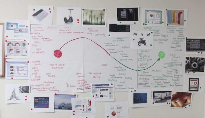
  1. Grab around 100 photos of different products and other things while keeping your client’s industry in mind (cars, watches, packaging, abstract shapes, data visualizations, movies, drinks, logos, celebrities, etc.)
  2. Tile the photos on the wall
  3. Allow stakeholders to react to these photos while thinking about how their brand should be experienced—they can mark positive and negative reactions with red and green stickers (this takes some coaching around subjectivity)
  4. Draw a spectrum, from positive to negative reactions, and hang a few key photos along the spectrum. Ones with all green dots are positive, ones with all red are negative, and mixed emotions go along the middle.
  5. Facilitate a discussion, and keep track of positive and negative words in green and red markers (this takes some coaching as well)

At the end of the day, you’re left with a lot of great words to synthesize from an off- to on-brand spectrum that should look something like this:

Photo credit: Cooper.

Photo credit: Cooper.

This workshop is great for gaining alignment with your stakeholders, and you can make it as fun as you want (adding some music to the voting session lightens the mood as well).

More often than not, the client will have a style guide already with some tone and voice, color, typography, imagery, and design assets predefined. But colors and typography aren’t “on brand”—they are consistency measures. It’s about how you present them that promotes or violates that brand. 

Related: How to break through the limits of brand style guides

An existing style guide shouldn’t stop anyone from doing a brand intake session. Brand intakes can also vary per product, so we can’t say we know what the product will feel/look like just because our client has a style guide.

“Colors and typography aren’t ‘on brand’—they’re consistency measures.”


Step 2: Brand synthesis

What do I do with all these words?

Organize them, for a start. You’re looking for 4–5 key attributes that best describe the brand in the form of adjectives. You’re also looking for positive words that support those key attributes. And don’t throw away those negative words, they are just as important in defining something. Like measuring anti-matter by measuring the matter around it…

Organize and reorganize—sticky notes help…

Organize and reorganize—sticky notes help…


Grab those key attributes

Think about the many different factors like competitive landscape, other sub-brands, master brand, brand story, target demographic, research insights, etc. The product is always more defined when these attributes create some tension with each other. When they push and pull at each other is where an interesting brand experience can lie. 

Get familiar with these words. They should drive everything about the product—even the architecture should be subject to influence from these words. UX counterparts often don’t see the value in these types of workshops, so it’s the designer’s job to push this initiative early. Hopefully, if you have a nice design process paired with your UX counterpart, that influence should be easy. If you still have some waterfall in your process, that might be an uphill battle.

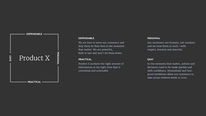
Here’s an example output:


Spectrums

Along with the attributes, I like to provide some spectrums where the product lies. This helps me quite a bit when creating a visual system and gives you a bit tighter of a line to walk. Here’s where the negative words will come in handy:

The attributes and spectrums are my first deliverable after the workshop and they provide the client with a nice buttoned-up synthesis of the product brand experience. Plus, they lay out your future visual directions with words. Make sure to get consensus on the document—the client may want to change a few words.

Besides the client’s needs, the synthesis is a great resource for the current designer on the project, as well as future designers to update the product while staying “on brand.”


Step 3: Concepts

Why do we need concepts? I thought we were aligned?

Defining the brand is like creating a box to work within. Now you know your boundaries, but you don’t know if you want to be in the center of the box, the upper left, or the bottom right. You may want to accentuate certain words and prioritize them over others. If your words are at tension with each other, you have to prioritize them over others—meaning you can’t be dead-center in the box. Creating concepts will show the client how many different roads you can go down, while still being “on brand.”

Related: Product design with the world’s best restaurants in mind

Here are 2 example concepts that push and pull on different brand attributes and use different spectrums to be defined:


Concept 1: Companion

Companion is personal, contextual, focused, fool-proof, human, and supportive.

Companion engages the user in a discussion and makes sure they know they’re making the right moves. We’re their friend who never lets them down. We can sacrifice space to make sure the user feels comfortable and focused. Animation, gestures, and emotional color choices come to the forefront.


Concept 2: Power Tool

Power Tool is dependable, practical, controllable, quick, smart, and tough.

Power Tool’s use of color is poignant, plus there’s verbiage on actions. We aren’t having a conversation with the user—we’re enabling them to take fast, optimal actions. They want to see more and do more, and we make sure every space is utilized to its full potential. Action items, controls, and processes come to the forefront.


Polarize

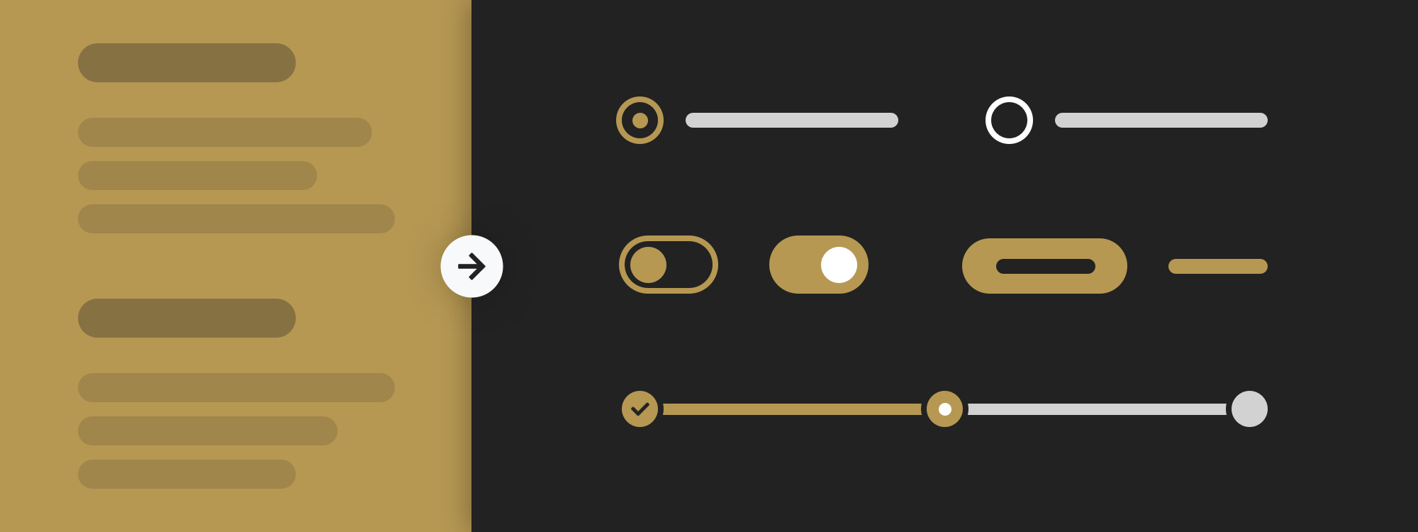
This is one of my favorite parts. Although these are just examples without a real brand behind them, they have some continuity and some differences. They show the same feedback screen and use the same colors and typography.

Companion is much more immersive, with a full-color background and large type and white space. The copy is more friendly and conversational. Also, this layout only surfaces one question at a time (architecture). This accentuates the personal and easy side of the brand box while sacrificing a bit of practicality.

Power Tool, on the other hand, surfaces all feedback questions on the same screen and allows the user to quickly scan the information needed to finish the flow. The layout is compact—obviously not too much, but enough to optimize efficiency. The color is used like exit lights on an airplane: action items get top priority while other elements take a back seat. Copy is straightforward, making sure no one is confused and information is quickly digestible. This accentuates the dependable and practical side of the brand box, while sacrificing a bit of personality.

Related: A unified product design workflow with Craft Sync—now for Photoshop

Neither concept is wrong, technically, and the “sacrifices” I’m prioritizing are minute. Turning words into visuals isn’t such a clear 1:1, though this process helps you get as close as possible to doing so. Instead of solving a math problem, we’re writing a persuasive essay and proving our points along the way.

At the end of the day, people have different writing styles and decide to prove arguments in different ways. What I’m trying to prove to the client here is that these attributes push and pull at each other, and when we accentuate one side, the other gets pushed back. I’m also asking them which one resinates more, because I could go either way (#notanartistatwork).


Step 4: Get the client to pick one

It’s been my experience that if you do the workshop and polarize these concepts just enough, the client will undoubtably pick one. No more of this “I don’t like either,” or, more commonly “Can you mix these 2 together?” These comments are the results of not getting aligned on the brand upfront, and not using the client’s words against them, for lack of a better term.


Step 5: Crush it!

After they’ve picked one, the rest of the design process ensues, with hopefully smoother sails and brighter days. Use those great words and chosen concept to influence color choices, type styles, photography choices, animations, interactions, gestures, illustrations, icons—and, yes, framework and content.

I believe designers should influence architecture and content decisions without stepping on toes. We aren’t UX or content experts, but throwing our hat into the discussion as the brand advocate is ideal for the product to have a successful brand experience.


Template

Here’s a brand experience template I made for a date planning app that can help you through this endeavor. Notice in this synthesis I’ve made a word cloud, spectrum, and explanation for each brand attribute. I’ve done more detailed versions and slimmer versions of a synthesis, and I think this template hits the sweet spot. 


Source: https://www.invisionapp.com/blog/brand-to-interface-product-design/?utm_campaign=Weekly%20Digest&utm_source=hs_email&utm_medium=email&utm_content=52752293&_hsenc=p2ANqtz-8zhjDUy9n-6wgQCADXZ6VkgiUtRI6hmNciEawkAYqWhNEgiLCUyxqkdpogNqr7Uw_FJWGqjHXWIn__ROEcWwTEkML8_g&_hsmi=52753156

Design principle: Collective intelligence by Gavin Lau

We all know that 2 heads are better than one, when facing a challenge. However, many heads are better than two and frequently more accurate, too.

This article aims to inspire people involved in the creation of products (Designers) to think about how important is to collaborate with diverse group of people when facing challenges.

Let’s look at how the collective intelligence can influence our design and in what ways we can make usage of this sociological phenomenon.


Collective intelligence in short

Collective intelligence (CI) is shared or group intelligence that emerges from the collaboration, collective efforts, and competition of many individuals and appears in consensus decision making.

It is interesting that our individual intelligence can be boosted significantly just by the simple act of collaboration with other individuals. It is not even needed to be a direct collaboration, where the people know each other.

Many pixels can show a better and more detailed picture than one pixel can.

Collective intelligence works in a similar way.

The more diverse is the group of people, the higher the collective intelligence grows. It is no surprise that international teams can achieve much more than only one nationality teams.

Having a mix of different opinions and beliefs focused on solving a challenge gives rise to the collective intelligence. It allows approaching the problem solution in multiple different ways until the best one emerges.

However, it is important to note that the presence of an expert, that could potentially influence the opinions of the rest of the group, automatically degrades the collective intelligence.

Several conditions are usually needed to ensure that collective intelligence will happen. Diversity, independence, and decentralization. In addition, disagreement and contest among the contributors are also beneficial for increasing the collective intelligence.

The amount of communication should be moderate, because too much of it can reduce the CI, due to the predominance of influencing each others opinions.


How to use collective intelligence in Design

We can split the collective intelligence for our design work to several contexts. Team work, Research and Products.


Team work

As designers it is essential in my opinion to harness the collective intelligence as much as possible. Facilitating workshops with different stakeholders can bring great benefits to the final product.

So is collective intelligence all we need to make great design?

Sadly it’s not that simple! In workshops and group work, it is important to have also a leader, a decision maker, who is authorized to make the final call.

Without a Decision maker, all that collective intelligence can end up into endless cycle of communication and collaboration without any tangible result.

Allow the collective intelligence to grow until satisfactory ideas and solutions arise, and then make a decision.


Research

Collective intelligence is essential part of any quantitative research. Using tools that collect data from multiple people is a great way to make use of the CI. Survey tools like Typeform, Qualaroo, HotJar and similar can be used for asking people the right questions, in order to use the collective intelligence in your design work.

One interesting example of using collective intelligence to help real scientific research is the puzzle game FoldIt. Playing the game speeds up the AIDS research done by scientists.

Ordinary people can contribute for faster progress with the research just by playing and combining their intelligence with other people around the world.

Players of the game managed to decipher one of the structures that has been challenging PhD scientists for 15 years. Collectively, they found solution in 10 days!

Other ways to use collective intelligence is to formulate well structured questions in your product surveys.

Let’s say you want to estimate how frequently your users will be using a particular feature. Asking such questions and getting the responses from the diverse audience can give you a very accurate estimate even before developing the feature itself.


Products

Voting websites, rating websites and other similar platforms are a good example of how the collective intelligence works in products.

If you are building a platform that will be facilitating a lot of content and data you can make use of collective intelligence. It can help you moderate the information and even regulate what will be more important for other consumers.

Make sure to provide easy and concrete way for the users to express their opinion and unique intelligence. You can use that feedback to shape the experience of the product. Think of Reddit voting system for example.


Final thoughts

In the book You Are Not a GadgetJaron Lanier argues that collective intelligence (a.k.a. crowd wisdom) is best suited for problems that involve optimization, but ill-suited for problems that require creativity or innovation.

As a Designer, I would argue that collective intelligence is also super useful when facing creative and innovation challenges. Being able to collaborate with many different people helps lift up the group intelligence and produces amazing results. Especially when there is a pre-establieshed decision maker.

Remember we are living in a connected world. Collective intelligence will be more and more important part of making great design and good decisions. Use it to your advantage.


User Research with Prototypes: Asking the Right Questions by Gavin Lau

Showing users a half-baked prototype is partially usability testing and partially user research. You get feedback on actual designs and you get to learn about their mental model through deeper questioning.

In conducting these interviews, I have a few simple tricks to get people to talk more about who they are, what they need, and what they’re thinking. Before I get to the tricks, though, I want to describe a simple framework I use for constructing these scripts.


A basic conversation pattern

Like a design pattern, this framework is a starting point. It gives me a basic hook, which I then embellish to suit the need.

1. Establish frame of mind: Participants need to look at the prototype from the right perspective. I’ll ask them a question simply to set up the next one, to make sure they’re approaching from the right mindset. By asking these questions — even ones I know the answer to — I’ve primed the participant for the next series of tasks.

Example: In designing an application to support portfolio reviews, I might ask a reviewer participant, “When you’re looking at someone’s portfolio, what kinds of things are you looking for?” Encouraging them to reflect on previous experiences, I’ve primed them to apply that perspective to the prototype.

2. Ask about expectations: With the participant primed, I ask them to describe what they expect to see in the product itself. This applies to a variety of situations. At the smallest level, it might be that they’ve pointed to a link or button they want to click. More broadly, I can ask about their expectations for the whole application. It’s the priming in the first step that lets me do this.

Example: In the app for portfolio reviews, the first screen is a list of people they need to review. I ask, “What do you think you’ll see when you click on a person’s name?”

3. Reveal and ask about alignment: One cardinal rule of user research is to avoid yes-no questions, like “Does this meet your expectations?”. My favorite construction for this is “How is this different from what you expected?” I could even remind them what they said earlier to reinforce that perspective. By asking how it’s different, I’ve encouraged them to contrast what they see with what they imagined.

Example: Once the portfolio reviewer clicked on a person’s name, they did not see a list of pieces in the portfolio. Instead, they saw a list of standard categories that portfolio items were assigned to. In this circumstance, the reviewers were all familiar with the categories. Though it was different from their expectation, none was surprised at the arrangement.


Redirecting on the fly

Creating these tests demands crafting a script that surfaces both design issues and user insights. The real magic happens during the interview itself. As participants talk, I’m actively listening, using the things they say as a cue to dig deeper. In these kinds of tests a few types of responses turn up time and again. Here’s how I turn those responses into more insights.

“I don’t understand why…”

Participants will express confusion about something by questioning the reason behind it. It’s pretty easy to turn this around to:

  • Why do you think it looks like this?
  • Why do you think it’s organized like this?
  • Why do you think this comes first?

Be careful not to explain the reason for something, then asking “Does that make sense?” or “Do you agree?” Those questions shed no light on the participant’s mental model of your system.

“I don’t know how this got here.”

Participants will question the source of the information they’re looking at. Part of our mental models for information spaces is that the contents have a known source, even if the exact identity is unclear. I turn this around to:

  • How do you think this got here?
  • Where do you think it came from?

Be careful not to tell them the source or explain the inner workings of your system.

“I think this is here because…”

If participants offer an explanation, that gives you a great opening for probing further. My favorite response to that is:

  • What makes you say that?

Be careful not to tell them they’ve gotten something wrong or that their impression is incorrect.

“I like that I can…”

If participants highlight something that works or they like, that’s also an invitation to probe further. When something clicks for them, there’s a reason, and it’s your job to uncover that reason. So, I ask them:

  • What’s a scenario where this might be important?
  • How would you use this in your day-to-day job?
  • How do you handle this today?

Be careful not to gloss over this as a compliment. It’s nice that they liked the design, but you need to find out what about it resonated with them.

“Does this product do or have…?”

Sometimes participants look to you to clarify the functionality or content of the product. If you’ve been involved with the design, it’s almost as if they’ve asked you about your child. You almost can’t wait to tell them all about it. To resist this urge, I turn the question around:

  • What do you think?
  • How would that fit in with what you see?

Be careful not to just answer their question right away. Even asking “Do you think it should?” is counter-productive, as it turns an insight into a yes-no question.


Keeping me honest

In the five techniques above, I caution you against directly alleviated participants’ confusion or misapprehension. You don’t answer their questions because there’s a slippery slope. Start answering their questions and you might start defending the product design. Defend the product design and you’ve primed them to be confrontational, rather than a cooperative.

At the same time, avoiding their questions entirely can make you seem less trustworthy. Once I probe a bit, I respond to their question. And then, as if I’d just shown them something on the screen, I’ll ask, “How is that different from what you’d expect?” They may reiterate an earlier answer. New information, however, can trigger additional thoughts.

Sometimes I want to prompt participants to elaborate. I’ll recap an earlier answer and ask them additional questions. When I do that, though, I’m careful to give them a chance to correct me. I want to make sure I’ve formed a correct impression of their mental model. I’ll say, “Here’s what I thought you said, but keep me honest and correct me if I’m wrong.” I give them permission to correct me, but also clarify themselves.

This is a different kind of testing than straight usability testing. We’re not entirely focused on completing tasks, or how long it takes to do so. Instead, we’re using the prototype to help uncover new insights about the target audience, not to mention get feedback on our design work. Working with half-baked prototypes can be daunting. The techniques here help you:

  1. Prepare a good script
  2. Focus on uncovering your users’ mental model
  3. Stay humble about your own impressions

All Thumbs, Why Reach Navigation Should Replace the Navbar in iOS Design by Gavin Lau


The Navbar is Tapped Out

The UINavigationBar, navbar for short, has been around since the original iPhone. Historically, navbars have been convenient and clear, easy to understand and easy to build.

Then phones ballooned, enough that the iPhone 7 Plus supplanted sales of the iPad mini. Now, if you own a modern iPhone, navbars can feel unwieldy — literally out of touch.

Burgeoning screens mean the distance between the navbar and our thumbs has grown. The screen on a 7 Plus is so tall it would take a thumb-length increase of 150 percent to reach those pesky buttons with one hand. Just another knuckle or two. Nothing weird.

Hurff’s Touch Zones illustrate right-handed thumb reachability.

Hurff’s Touch Zones illustrate right-handed thumb reachability.

As devices change, our visual language changes with them. It’s time to move away from the navbar in favor of navigation within thumb-reach. For the purposes of this article, we’ll call that Reach Navigation.


Why the Navbar is Out of Touch

The Navbar is a mainstay of the “system standard” application, used in Phone, Messages, Mail, Calendar, and countless others. There are lots of reasons it gained favor:

  • iOS Standard Apple built the navbar to be customizable, scalable, accessible, and easy to implement. Because it’s an iOS standard, it’s recognizable across apps.
  • Navigation The left and right sides of the navbar afford space for buttons. The left area often navigates users up in the hierarchy, and the right area is up for grabs. The back button informs users that they’re not at the root view.
  • Title Provides a consistent location for text defining the function of the view. Since the navbar always stays on screen, it helps further establish the information hierarchy.
  • Companion to Tab Bar If you have a row of tappable icons at the bottom of the screen (namely, a Tab Bar), putting other icons at the top of the screen helps separate the parent/child relationship.
  • Logo Your client can put a logo here! Genius. Lol jk, I find this tacky, but I digress.
Some sample navbars for your enjoyment.

Some sample navbars for your enjoyment.

Oh my gosh, so many great reasons to use a navbar in your project. Except, damn! It’s hard to get your thumb up there now.

That being the case, let’s talk some Navbar cons:

  • It’s harder to go back. You can swipe from the edge, as long as the view you’re on doesn’t have anything that scrolls horizontally, but if it does then you’re in stretch-town.
  • Naming all the views is a pain. Not all screens need a persistent title, and some require labels too long to fit. Leaving a blank navigation area wastes screen space and looks barren.
  • Navigating requires two hands. If you can hold a device in one hand, you should be able to operate the device with one hand. It feels better, and it’s more convenient in a world full of shopping carts to push, and babies to carry.
  • Simple apps become more complex than necessary. Navbars tend to lead to information architecture that runs deep. It’s easy to develop for horizontal progressive disclosure, which means it can be a battle to expand inline or use a sheet.

All right. Now we know how navbars can be crap. So what are we doing?


Reach Navigation and Apple

As an iOS designer, this is the part where I support my thesis by pointing out how Apple is already incorporating Reach Navigation. Ready? We’ll start with two of the obvious ways Apple is accommodating larger mobile screens.

In lieu of a back button, navigate back by swiping from the left edge.

In lieu of a back button, navigate back by swiping from the left edge.

First, you don’t have to hit the back button anymore, you can navigate back by swiping from the left edge. You can also control the movement of the screen as it swipes backwards, letting you peek at a previous screen before you commit. It doesn’t work in every app, but when it does you get to watch the back label transition into the title, which is just beautiful.

Lightly double-tapping the home button shifts content down.

Lightly double-tapping the home button shifts content down.

Second, iOS includes a feature called Reachability, where your screen’s contents shift down to help you reach buttons near the top when you lightly double tap the home button. Workable for now, but it feels like a Bandaid solution.

Now here’s where the turn toward Reach Nav gets more apparent. Apple has already started weaning their apps off the navbar. Maps and Music both had structural redesigns for iOS 10 that diminished or removed the need for navbars.

Apple Music changes from iOS 9 (left) to iOS 10 (right). Removing the Navigation Bar allowed the primary view label to increase in size. Pretty.

Apple Music changes from iOS 9 (left) to iOS 10 (right). Removing the Navigation Bar allowed the primary view label to increase in size. Pretty.

Now both apps use a sheet you can swipe down to dismiss.

Apple Maps changes from iOS 9 (left) to iOS 10 (right). The UI is almost entirely inverted. Map Settings and Lock to Current Location are harder to reach, while Search and Results are prioritized.

Apple Maps changes from iOS 9 (left) to iOS 10 (right). The UI is almost entirely inverted. Map Settings and Lock to Current Location are harder to reach, while Search and Results are prioritized.

A few back buttons in Apple Music survived the chop block for iOS 10, but they appear marked for removal in a future OS. It’s silly to earmark so much horizontal space for a button that only occupies 20 percent of the real estate. Apple Music has also reverted to a mere Back label instead of describing the return destination, a cornerstone of the back button’s functionality through the iOS 7 release.

The Back button in iOS 10 is taking up a lot of real estate here. Seems temporary, no? Yes.

The Back button in iOS 10 is taking up a lot of real estate here. Seems temporary, no? Yes.

So it seems like this is the direction Apple’s taking, which gives you a chance to shift your designs accordingly.


Incorporating Reach Navigation

Here are some specifics on how to incorporate Reach Nav in your apps. If you’re working on:

A new app using a Tab Bar:

  • Use sheets that pop up from the bottom and can be swiped away.
  • Instead of putting important buttons like Filter or Change View up high , see if you can float them above the Tab Bar.
  • Have some conversations about which features are mission critical, before you choose tabs for your most precious screen real estate.
  • Don’t put a destination button — like Search, Cart, New Message — in the navbar. Either make a tab or embed it in the content area.

A new app with no Tab Bar:

  • Try an exposed drawer like Maps, or sheets like Mail.
  • Do I need to say this? Prioritize placing buttons at the bottom of the screen.

A revamp of a legacy design:

  • Move the most-used items to the bottom.
  • Make sure swiping from the edge of the screen to go back works for all views.
  • See what you can nest to free up space in the most usable screen areas.
  • Remove important actions from the top right navbar spot, and put them anywhere else.
A quick rendition of how Safari could move the address bar to the bottom, remove the toolbar, and still maintain functionality.

A quick rendition of how Safari could move the address bar to the bottom, remove the toolbar, and still maintain functionality.

Finally, there are a few exceptions on putting mission-critical buttons within easy reach. If an action has serious consequences, moving the button out of reach is a way to help your user avoid a mistake. So if a case of fat thumbs might cost someone thousands of dollars, or delete an important document, move those options up a bit.


Examples of Reach Nav in the Wild

New Apple apps aren’t the only products that are starting to respect Reach Nav. Lyft and Pokémon Go put everything within one-handed reach.

Pokémon Go and Lyft employ Reach Navigation.

Pokémon Go and Lyft employ Reach Navigation.

Some other apps like Overcast have started using sheets that let you swipe down.

Overcast uses sheets that let users swipe down.

Overcast uses sheets that let users swipe down.

The iOS Twitter app removes the need to swipe from the edge of the screen to go back, now you can swipe from anywhere.

Expect to see more apps move functionality to the bottom on the most reachable part of the screen. It’s pretty easy to adapt, though apps with excessive features will have the most trouble.


Stay In Touch

The navbar has been essential part of iOS since Apple released the first developer kit, and it has served us well. But it’s time to let go.

Let’s agree to stop sticking important buttons to the top of the screen. Better navigation is within reach.


How financial advisors can reinvent themselves with UX design by Gavin Lau

The future of financial services is in creating simple, intelligent and customized user experience and at the heart of this digital revolution is the user. With robo-advisors like Betterment and Wealthfront and other automated savings apps like Digit and Acorns proving the need for human centered app experiences, it is critical for financial institutions to join these technological disrupters and shift the focus from products to users.

The need for simplifying the user experience does not mean financial dashboards must be stripped down to its bare bones and not have the features that help users access all the information they need to plan their finances better, it is merely understanding user needs and providing contextual information based on the user’s needs and actions without overwhelming them with a lot of features that might distract the user and dilute the need to use the application.

Simple can be harder than complex: You have to work hard to get your thinking clean to make it simple.
— Steve Jobs

It is our responsibility, as designers, to help transform what has long been a traumatic and onerous financial experience into a simplified and contextual user experience. Below are a few suggested layouts, micro-interactions and areas of improvement that wealth management services can adopt to improve their user experience.


1. Understand what users need

The financial needs of a millennial trying to pay off a college loan is very different from a person in her 40’s with a traditional job, saving up for retirement. Though the data(account details, portfolio performance and savings information) that has to be presented are similar for both use-cases, the experiences are starkly different.

Today, most wealth management tools, do not demarcate these user requirements and paint financial data with a broad brush in their tools. Talking to users and understanding their specific goals and paths will help advisors provide targeted financial advice that will benefit the user and make advisors more trustworthy. It is important to understand the different user goals and paths and tailor experiences to their specific needs.

An effective way to identify goals, action points and prioritize the information gathered in the user research stage is by creating personas. Personas help with focusing on user goals, current behavior and pain points, as they are based on real people and tell a story that is relatable and provides the basis for good user stories. Personas minimize assumptions and reflect patterns identified in research, thereby improving user experiences and strengthening the quality of data presented to users. Especially in wealth management, where there is a lot of information and diverse requirements, personas can help in creating unified experiences by prioritizing what users want to see and when.

Create a Persona, UserForge

Create a Persona, UserForge

UserForge is a free and easy way to start creating personas and collaborate with decision makers and stakeholders in the organization. Ronan Rooney has also identified a few broad personas for FinTech that could act as a starting point for first time user researchers.


2. Invest in on-boarding

User attrition in the age of robo-advisors is a huge concern for most advisors and one efficient way to connect with users and improve their experience is onboarding. As stated in Guide to Multichannel Onboarding in Banking by Digital Banking Report, “Onboarding requires a strategy that shows the customer you know them; that you will look out for their individual needs and you will ultimately reward them.”

Having a seamless, enjoyable onboarding and account management process improves account security and sets high standards for compliance, risk and internal controls. Moving away from the onerous task of making clients fill out forms to transfer and setup accounts, try a storytelling approach that is tailored to the user and reassure clients to create a strong first impression.

New User Experience, Dropbox Paper

New User Experience, Dropbox Paper

Popular services like Dropbox and Mailchimp do an excellent job in onboarding new users and extending it past the account setup stage with tutorials and tips. UX archive and Pttrns have documented the signup/ onboarding process for many popular applications to get inspired and identify best practices.


3. Use data visualization & infographics

Data visualization can really help in delivering large/ insightful messages in an easily digestible format. Visualization tools like infographics help tell the user the story of their finances by visually representing boring, tabular data in an interactive, attention-grabbing visual. Here’s an example of how Acorns displays the growth in investment and the user’s net worth in a simple visual.

Net Worth, Acorns

Net Worth, Acorns

Tools like Chartio, Data Hero and Plotly can help your team quickly ingest data and provide useful visual representations. For an advanced integration that includes visual analytics and behavioural visualizations, you could also try Tableau.


4. Know What Works

Designing is a virtuous cycle and it is imperative that financial advisors understand how users interact with the service and identify patterns in UX flows that could use some improvement. Wealth management firms often have people with strong design opinions and the only way to prove what works will be using design metrics. Define strong design metrics that will help identify the success of the design, these metrics should also answer questions on user engagement and user behaviour in relation to product goals. The easiest way to achieve this is by including a testing and validation cycle to your design process.

Audience Explorer from Optimizely

Audience Explorer from Optimizely

Tools like Google Analytics & Mixpanel provide some basic user engagement data, but there are multiple apps and services, in addition to these, that can help in tracking and analysing design metrics. Optimizely helps you set up different web and mobile experiences to A/B test and provide detailed analytics on their performances, to help you make informed decisions on the user experience. FullStory is another great tool, that gives action based feedback while creating a narrative for every user that uses your service.


In Summary

Users will always use intuitive experiences that they can easily interact with and as designers, it is our responsibility to make this transition into a user-centric wealth management world easy for both, financial advisors and users alike.

Facebook’s Sheryl Sandberg: Lessons on Leading a High-Growth Business by Gavin Lau

Facebook COO Sheryl Sandberg talks leadership lessons with Reid Hoffman on the Masters of Scale podcast. Photo by Jacqui Ipp.

Facebook COO Sheryl Sandberg talks leadership lessons with Reid Hoffman on the Masters of Scale podcast. Photo by Jacqui Ipp.

The COO shares insights on taking risks, scaling at Google, and working through differences with Mark Zuckerberg.


Leading a high-growth company and scaling it into a tech empire involves working through countless challenges: You need to constantly innovate, adapt with the economy, navigate relationships with executives, evolve your team, and more. Sheryl Sandberg knows this experience intimately, from her time as Google’s VP of global online sales and operations — during which she scaled the company’s online sales team from four to 4,000, driving two-thirds of the company’s revenue — through her past nine years as Facebook’s chief operating officer.

To get to where she — and Facebook — is today, Sandberg has learned hard leadership lessons about growing a team and a company.

Tune in to Masters of Scale for an exclusive interview with Sheryl Sandberg.

Tune in to Masters of Scale for an exclusive interview with Sheryl Sandberg.

In the fifth episode of Masters of Scale, the podcast hosted by famed entrepreneur Reid Hoffman, co-founder of LinkedIn and partner at the VC firm Greylock, Sandberg shares some of her most vital learnings from the tech world’s arduous trenches. The episode, “Lead, Lead Again,” also features exclusive insight from Bill Gates, Facebook founder Mark Zuckerberg, and more. Subscribe to Masters of Scale for access to this and future episodes, and listen to a preview below.

Read on for Sandberg’s three key lessons for managing a growing business, and get an insider’s look at her time at two of today’s most powerful companies.


1. Take risks to adapt your workforce to changing needs.

Businesses evolve at a rapid clip, especially in the tech industry — and a 10-person startup’s needs are drastically different from those at a company of 10, 100, or 1,000 times that size. Early in her business career, Sandberg learned that managing a startup means that promises you make are going to be broken, and plans will be changed. As Hoffman notes in the podcast, you can’t stop the onslaught of challenges, but you can identify the moment when they force you to pivot — and act accordingly.

“My team [at Google] was four people and they were very worried [how] we were going to grow,” Sandberg says. “So my first day I said, ‘Don’t worry. We’re all going to interview everyone.’ Two weeks later the team was 12 people and it was completely unreasonable to have a person interview with 12 people. So this promise I had made to make them feel good about scaling, I took away in a week.”

As a business grows, leaders face hard choices. Sometimes, they have to let go of staffers who were key to a startup’s early days but aren’t experienced enough to manage growing teams. Or, they must hire for roles that don’t exist yet, as Sandberg had to do when building her team at Google.

One solution that solves many ills is the strategic reskilling of employees to adapt to new priorities, which Facebook did in 2012. At that time, the company’s products were designed for desktop use, but people were transitioning to primarily mobile use faster than it could keep up with. Sandberg recalls:

“Mark [Zuckerberg] stood up at the company all-hands and said, ‘We’re going to be a mobile first company,’ and he did it incredibly well. But you know what happened the next day? Nothing. People still came in with their desktop screenshots because that’s what they knew how to build. So a couple of meetings in, Mark just said, ‘You know what? No more meetings unless you’re mobile screenshots first.’ Just by making that shift, he made the shift in the company. We really had to force it. The company really got on board but it meant retraining a lot of engineers.”

The entire organization’s shift to mobile involved a massive risk, from both a business and workforce perspective: pausing all new product features for an astonishing two years, and throwing engineers off the deep end into unknown territory. However, this willingness to adapt and confront limitations again where the industry was headed allowed for the change the company needed to get ahead.


2. Disagreements are a given — how you handle them is a choice.

When you’re joining a new company, it’s all but guaranteed that you won’t always see eye to eye with your future boss. But establishing a strategy for working through those inevitable disagreements will make your work more constructive, which benefits the whole business.

When Facebook founder Mark Zuckerberg was scouting Sandberg to potentially join the company, the two spent months speaking for several hours a week to determine whether she would be a good fit. “To say I had multiple conversations with Mark is kind of the understatement,” Sandberg says. “He was a late-night guy. He didn’t come into the office particularly early so he would come over for dinner at 8. I would literally have to kick him out at 11 or 12.”

During this time, Sandberg’s husband, the late Dave Goldberg, offered advice that still resonates with her today.

“Mark and I didn’t agree on a lot of substantive things at that point,” Sandberg recalls. “Dave told me, ‘Don’t work any of those out. You never will.’ He said, ‘What you want from Mark is process agreement on how you will work things out. Because even if you work all the questions you have out now, they’re going to change.’”

Sandberg and Zuckerberg agreed to schedule twice-weekly meetings to give each other honest feedback and work through their disagreements, which they’ve now been doing for nine years. A company’s goals, priorities, and challenges are constantly changing, but one thing you can keep consistent is your approach to finding a solution.


3. Promote a culture of constant feedback at all levels of the business.

As Hoffman notes in the Masters of Scale episode, the best managers don’t spot changes on their own — their team surfaces problems up to them. The challenge, Sandberg has learned, is getting them to speak up.

When Sandberg was building her team at Google, she realized she had been holding up the hiring process — and her reports already knew that, but didn’t tell her. “I thought to myself, ‘I’ve become a bottleneck and you didn’t tell me, and that’s on me,’” she says. “I realized I had to make it safe to speak up when I’m messing up.”

She faced a similar issue at Facebook, when her request of “No PowerPoint in my meetings” was misunderstood as “No PowerPoint in any meetings, ever.” To straighten it out, “I got on the stage [at Facebook’s global sales conferences] and said, ‘One, I’m sorry, I didn’t mean that. Two, it is on me that if you all thought that was a stupid idea, you need to speak up and tell me. Of course you have PowerPoint with clients. Clients love PowerPoint. I don’t,’” she says. “It was just a really good lesson that I needed to be super careful that things didn’t get taken too far, but also that I needed to make sure people could speak up.”

Sandberg champions openness, and being resilient through embracing and learning from failure. “You have to build in a culture where, when I think you need to do something better or you think I need to do something better, we tell each other and tell each other directly and work it out,” she says. “You have to embrace organizational failure. You have to sit down and debrief when things go wrong. Why did they go wrong? What can we learn and what can we do better? It’s organizations that hide things under the rug that don’t create the resilience because they don’t learn.”


Better Form Design: One Thing Per Page by Gavin Lau

In 2008, I worked on Boots.com. They wanted a single-page checkout with the trendiest of techniques from that era, including accordions, AJAX and client-side validation.

Each step (delivery address, delivery options and credit-card details) had an accordion panel. Each panel was submitted via AJAX. Upon successful submission, the panel collapsed and the next one opened, with a sliding transition.

It looked a little like this:

Boots’ single-page checkout, using an accordion panel for each step. (View large version)

Boots’ single-page checkout, using an accordion panel for each step. (View large version)

Users struggled to complete their orders. Errors were hard to fix because users had to scroll up and down. And the accordion panels were painful and distracting. Inevitably, the client asked us to make changes.

We redesigned it so that each panel became its own page, removing the need for accordions and AJAX. However, we kept the client-side validation to avoid an unnecessary trip to the server.

It looked a little like this:

Boots’ checkout: Each step became its own screen. (View large version)

Boots’ checkout: Each step became its own screen. (View large version)

This version converted much better. Though I can’t remember the exact numbers, I do know that the client was happy.

Six years later (2014), when I was at Just Eat, the same thing happened. We redesigned the single-page checkout flow so that each section became its own page. This time, I made a note of the numbers.

The result was an extra 2 million orders a year. Just to be clear, that’s orders, not revenue. The number is based on a percentage increase to conversion at checkout after releasing the new version for at least a week. The percentage was then converted to orders and multiplied by 52.

Here are some of the mobile-first designs we used:

Just Eat’s checkout split up into pages. We also had a design that further simplified the payment page: The user would first choose “Pay with cash” or “Pay with card,” which would then go to a page with the relevant form on it. Unfortunately, we nev…

Just Eat’s checkout split up into pages. We also had a design that further simplified the payment page: The user would first choose “Pay with cash” or “Pay with card,” which would then go to a page with the relevant form on it. Unfortunately, we never tested it. (View large version)

A couple of years later (2016), Robin Whittleton of GDS told me that putting each thing on a page of its own was a design pattern in its own right, known as “One Thing Per Page.” Apart from the resulting numbers, there is a strong rationale behind the pattern, which we’ll get to shortly.

Before we do that, though, let’s take a look at exactly what this pattern is.


What Does “One Thing Per Page” Mean Exactly?

One Thing Per Page is not necessarily about having one element or component on a page (although it could be). In all likeliness, you’ll still have, for example, a header and footer.

Similarly, it’s not about having a single form field on each page either (although, again, it could be).

This pattern is about splitting up a complex process into multiple smaller pieces, and placing those smaller pieces on screens of their own.

For example, instead of placing the address form on the same page as the delivery options and payment forms, we would put it on a dedicated page.

An address form has multiple fields, but it’s a single, discrete question that is being asked of the user. It makes sense to tackle this question on one screen.

Let’s consider why the pattern is so good.


Why Is It So Good?

While this pattern often bears wonderful and delicious fruit (or orders and conversions, if you hate my analogies), it would be nice to understand the rationale behind it.


1. IT REDUCES COGNITIVE LOAD

As Ryan Holiday describes in The Obstacle Is The Way:

Remember the first time you saw a complicated algebra equation? It was a jumble of symbols and unknowns. But when you stopped to break it down and isolate the parts, all that was left was the answer.

An equation broken down step by step is easier to solve. (View large version)

An equation broken down step by step is easier to solve. (View large version)


It’s the same for users trying to complete a form, or anything else for that matter. If there is less stuff on screen and only one choice to make, then friction is reduced to a minimum. Therefore, users stay on task.
 

2. HANDLING ERRORS IS EASY

When users fill out a small form, errors are caught and presented early. If there’s one thing to fix, then it becomes easy to fix, which reduces the chance of users giving up.

Even with several errors, Kidly’s address form is easy to fix. (View large version)

Even with several errors, Kidly’s address form is easy to fix. (View large version)


3. PAGES LOAD FASTER

If pages are small by design, they will load faster. Faster pages reduce the risk of users leaving, and they build trust in the service.


4. TRACKING BEHAVIOR IS EASIER

The more there is on a page, the harder it is to determine why a user has left the page. Don’t get me wrong: The ability to analyze a page shouldn’t drive design, but it is a nice byproduct.


5. TRACKING PROGRESS AND RETURNING TO PREVIOUS STEPS IS EASIER

If a user submits information frequently, we can save it in a more granular fashion. If a user drops off, we can send them an email, prompting them to complete their order, for example.


6. SCROLLING IS REDUCED OR ELIMINATED

Don’t get me wrong: Scrolling isn’t a big deal — users expect web pages to work that way. But if pages are small, users won’t have to scroll. And the call to action is more likely to appear above the fold, which reinforces the requirements, making it easier to proceed.


7. BRANCHING IS EASIER

Sometimes we’ll send users down a different path based on a previous answer. A simple example would be two dropdown menus; what the user chooses in the first will affect the values shown in the second.

One Thing Per Page makes this simple: The user makes a choice and submits, and the server works out what the user sees next — easy and inclusive by default.

We could use JavaScript. But it’s more complicated to build it and ensure that the UI is accessible. When JavaScript fails, the user might suffer a broken experience. And loading the page with all of the permutations and options could add significant page weight.

Alternatively, we could use AJAX, but this doesn’t free us from having to render new (parts of) screens. More crucially, it doesn’t negate the server-side roundtrip.

That’s not all. We’d need to send more code to send an AJAX request, to handle errors and to show a loading indicator. Once again, this makes the page slower to load.

Custom loading indicators are problematic because they aren’t accurate, unlike the browser’s native implementation. And they aren’t familiar to the user — that is, they are specific to the website showing them. However, familiarity is a UX convention that we should break only if we really have to.

Also, having two or more fields that are dynamically updated on one page depends on the user interacting with the fields in order. We could enable and disable or show and hide fields, but this is more complicated.

Lastly, a user could make a change that requires a subsequent panel to disappear or be replaced by a different panel, which is confusing.


8. IT’S EASIER FOR SCREEN-READER USERS

If there is less on a page, then screen readers don’t have to wade through a lot of superfluous secondary information. Users can navigate to the first heading and start interacting with the form more quickly.


9. AMENDING DETAILS IS EASIER

Imagine someone is about to confirm their order. Crucially, they spot a mistake with their payment details. Going back to a dedicated page is far easier than going to a section within a page.

Clicking “Edit” takes the user to the payment page, with a dedicated title and related form fields. (View large version)

Clicking “Edit” takes the user to the payment page, with a dedicated title and related form fields. (View large version)


Being taken halfway down the page is disorienting. Remember that the user clicked a link to perform a particular action — having other things on the page would be distracting.

It’s also potentially more work. For example, if you want to show and hide panels within the same page, you’d need extra logic to handle it.

With One Thing Per Page, these problems fade away.


10. USERS GET CONTROL OF THEIR DATA ALLOWANCE

Users cannot half download a page. It’s all or nothing. Smaller pages save user’s data. If they want more information, they can click a link, getting the ability to choose. Users don’t mind clicking, as long as each step brings them closer to their goal.


11. IT SOLVES PERFORMANCE PROBLEMS

If everything is one gigantic thing — the extreme of which is a single-page application — then figuring out performance problems is hard. Is it a runtime issue? A memory leak? An AJAX call?

It’s easy to think that AJAX improves the experience, but adding more code rarely leads to a faster experience.

Having complexity on the client obscures the root cause of problems on the server. But if a page has one thing, then there’s little chance of performance issues. And if there is an issue, then finding it will be easier.


12. IT ADDS A SENSE OF PROGRESSION

Because the user is constantly moving to the next step, there is a sense of progression, which gives the user a positive feeling as they fill out the form.


13. IT REDUCES THE RISK OF LOSING INFORMATION

A long form takes longer to complete. If it takes too long, then a page timeout may cause the information to be lost, leading to tremendous frustration.

Alternatively, the computer might freeze, which is the case for Daniel, the lead character in I, Daniel Blake. With declining health and having never used a computer before, he suffers from a frozen computer and lost data. In the end, he gives up.


14. SECOND-TIME EXPERIENCES ARE FASTER

If, for example, we store the user’s address and payment details, we can skip these pages and take them straight to the “check and confirm” page. This reduces friction and increases conversion.


15. IT COMPLEMENTS MOBILE-FIRST DESIGN

Mobile-first design encourages us to design what is truly essential for small screens. One Thing Per Page follows the same approach.


16. THE DESIGN PROCESS IS EASIER

When we’re designing a complex flow, breaking it down into atomic screens and components makes it easier to understand the problem.

It’s easy to swap screens to change the order. And analyzing problem areas is easier when, like the user, we’re looking at one thing at a time.

This reduces the design effort — which is a nice byproduct of a pattern that benefits users so greatly.


Is This Pattern Suitable In All Situations?

Not always. Caroline Jarrett, who first wrote about One Thing Per Page in 2015, makes this quite clear. She explains that user research “will quickly show you that some questions will be best grouped into a longer page.”

However, conversely, she also goes onto explain that “questions that naturally ‘go together’ from the point of view of designers… don’t need to be on the same page to work for users.”

She provides an enlightening example when, for GOV.UK Verify, they tested putting “Create a username” on one page and “Create a password” on the next.

Like most designers, Caroline thought that putting these two form fields on separate pages would be overkill. In reality, users weren’t bothered by this at all.

The key point here is to at least start with One Thing Per Page and then, through research, find out whether grouping fields together would improve the user experience.

That is not to say you’ll always end up combining screens together — in my experience, the best results come from splitting things apart, period. I’d love to hear about your own experience, though.


Summary

This inconspicuous and humble UX pattern is flexible, performant and inclusive by design. It truly embraces the web, making things easy for high- and low-confidence users.

Having a lot (or everything) on one page might give the illusion of simplicity, but like algebraic equations, they are difficult to deal with unless they are broken down.

If we consider a task as a transaction that the user wants to complete, breaking it down into multiple steps makes sense. It’s as if we’re using the very building blocks of the web as a form of progressive disclosure. And the metaphor behind pages provides a subconscious sense of moving forward.

I’ve not come across another design pattern that has as many benefits as this one. This is one of those times when simple is just that: simple.


Design ‘No Results Found’ Pages that Get Results by Gavin Lau

Despite being a staple of web design, poor search usability is something I encounter all the time. Recognising the impact of failed searches (and having a plan for them) could help prevent lost revenue.

A customer walks into a brick and mortar store, asking after a product the staff don’t recognise. The staff shrug, offering nothing but an apology (and perhaps not even that). The customer leaves dissatisfied with the whole exchange, and heads to the nearest competitor instead.

As the owners of this hypothetical business, we’d be pretty cheesed off with our staff. They weren’t helpful, and didn’t even attempt to salvage the interaction. The behavior of many websites and apps is no different. 

Visitors being stumped by unhelpful ‘no results found’ screens is one of the most common issues I encounter when user testing. I find it astounding how little emphasis some teams put on this critical scenario.

If we’re designing a site with search, we must give consideration to ‘no results found’ scenarios as well. When the unexpected happens, we’ve got to give the user more than just an apology. 


Making the case for good search

On larger sites, visitors can have literally thousands of choices for content. With e-commerce in particular, a user’s ability to find specific products can directly affect profits in a big way. 

A failed search on Office’s website simply dead-ends the user journey.

A failed search on Office’s website simply dead-ends the user journey.

A study by KissMetrics found that when asked, 40% of people said they’d prefer to use free text search when finding a specific product online.

A brief check of site analytics allows designers to see how many people are searching, and how many of those encounter ‘no results’. This can help identify how much revenue is being lost to poor search.

Good designers think carefully about how they handle user errors with care. There are entire books written on the topic form optimisation—though they usually reference to registration, checkout or sign-up screens. Search should be treated with the same gravitas as those other kinds of forms. During the design process, effort should be spent preparing for ‘edge case’ scenarios and errors.

When designing better search experiences, there are a few guidelines to follow…

  • Step one: Prevention—Try to stop the failed search from happening in the first place.
  • Step two: Recovery—When it does happen, help people get back on track.
  • Step three: Alternatives—Turn an error into an opportunity.


Step One: Prevention

The best way to deal with an error is to stop it from happening in the first place. 

The Japanese principle of Poka-Yoke design (Literally ‘error proof’) is a favorite of mine. It means designing interfaces that safeguard against errors. When it comes to search, there are a bunch of techniques we can use to reduce the possibility of ‘no results’.

TAsos does a great job of showing suggestions as the user types. They even go so far as to show the number of results that search will return.

TAsos does a great job of showing suggestions as the user types. They even go so far as to show the number of results that search will return.


Offer search suggestions

As the user types, attempt to auto-complete their search by displaying popular, relevant terms. Selecting one of these would take the user directly to a results page.

This not only saves time, but it also prevents possible misspellings. Above all, it guides our visitors towards appropriate searches that we know will give them results. 


Promote specific content or products in the suggestions

In addition to suggested search terms, we could also preview some specific results.

If our visitor is looking for something specific, we want to give it to them as quickly as possible. Surfacing that immediately can save the need for an extra page load.

Staple’s search starts showing specific products right as the user starts typing.

Staple’s search starts showing specific products right as the user starts typing.


Give helpful search instruction

Aim to display some helpful instructions or examples around the search field. Instructions should highlight the characteristics of our content, and guide the user toward more effective searches. 

For example, searching a journal might query article keywords, author or date. By making this clear to the user upfront as a hint or tooltip, we can prevent problematic searches.

Monster.com’s search provides handy examples. This helps make sure the visitor enters appropriate terms.

Monster.com’s search provides handy examples. This helps make sure the visitor enters appropriate terms.


Accommodate for language differences and synonyms

Depending on a person’s cultural or geographic background, a single object could have dozens of different names. To take an extreme example—the word ‘drunk’ has over 2,985 synonyms! 

We need to think about how these variations might affect search terms. Designers should plan for any known aliases of important content themes and categories. Open card sorting studies can help identify the different ways that visitors classify information.

These classifications can then go on to inform content metadata. Metadata is the structural information that describes your content. This may never be exposed to the user directly, but it’s invaluable for powering navigation and search. We can store dozens (or even hundreds) of alternative titles for content in its metadata. This can then be queried in site searches, ensuring that same content can be returned for a variety of terms.

Asos makes sure that a search for ‘sneakers’ returns the same results as a search for ‘trainers’.

Asos makes sure that a search for ‘sneakers’ returns the same results as a search for ‘trainers’.


Step two. Recovery

In spite of our best efforts to craft a Poka-Yoke search, there’s always the possibility that we come up empty. In a genuine ‘no results found’ scenario, we need to get the user back on track if we possibly can.


Identify spelling mistakes

If possible, site owners should add automatic spell check to search results pages. This can be a big ask for development teams, but many content managementsystems offer extensions that make this more accessible that you might think.

If it’s clear that the user did misspell a word we should immediately take them through to results for the correct spelling. This saves a little bit of time, and labor the point that the user made a mistake. It just quickly gets them to where they need to be.

Ebay immediately shows me the results for the word I was probably trying to spell.

Ebay immediately shows me the results for the word I was probably trying to spell.


Provide some helpful suggestions

Even if there’s no fancy spell-check functionality, giving the user friendly instructions is still a great start. Because we’ve got no results to display, there’s plenty of space to show some really clear instructions of what the user might want do next. 

Tips might advise them to :

  • Check their spelling.
  • Search for simpler, shorter terms.
  • Search for something less specific.
  • Suggest where they might be able to browse for that content.

It’s important to use clear, friendly language. Above all else, our copy should make sure the blame for this scenario is placed on us; not the user. It’s not our user’s fault that we couldn’t give them what they wanted. Writing helpful error copy isn’t a new idea, but it’s certainly important and often forgotten!

John Lewis give me clear, helpful advice when my search shows no results.

John Lewis give me clear, helpful advice when my search shows no results.


Step three. Alternatives

We’ve done our best to error-proof search. We’ve tried to get the user back on track. 

But what happens when the issue isn’t with the search, but with our content? Do we give up? Nope. This is when we turn the issue into an opportunity. 

Another important application of ‘no results found’ pages is to salvage some kind of desirable action from the user. 


Suggest something similar

If we don’t have exactly what the user wanted, they may still be interested in something else. Suggesting some other popular products, articles or even search terms could prevent them leaving after a failed search. 

At the very least we might catch the user’s attention. This could lead them to discover something they wouldn’t have looked for otherwise.

When Target’s search returns no results they use this space to show featured categories and most popular items.

When Target’s search returns no results they use this space to show featured categories and most popular items.


Give the user someone to talk to

There may not be a way forward for this interaction online, but it doesn’t need to be the end. A business may still be able to help the user offline.

If we want to be truly helpful, we could provide an email address, a telephone number or even an instant messenger facility. Speaking to the user directly will help us understand what they wanted, and potentially find a way to help them. If the business can’t help, then at least the discussion will highlight the gaps in the content.

Even though contact information is probably already on the site somewhere else (normally buried away in the footer), visitors may not seek it out. The ‘no results found’ page is an ideal place to surface this in a prominent way, if appropriate. 

Wayfair provide a really clear call to action to ‘Contact Us’ if a search provides no results.

Wayfair provide a really clear call to action to ‘Contact Us’ if a search provides no results.


Alert the user when content becomes available

It’s possible that what the user searched for may not exist right now—but it might at a later date.

It won’t work for all organizations, but alerting users when what they’re searching becomes available could be a great way to get them back.

Many real estate websites use this technique to great effect. Properties in new areas are constantly becoming available. In a week’s time what was once a ‘no results found’ page may actually be chock-full of content.

Primelocation allow me to save a search, or sign up for instant alerts when items meeting my criteria become available.

Primelocation allow me to save a search, or sign up for instant alerts when items meeting my criteria become available.

Another great example can be seen on Gumtree. Their classifieds are changing all of the time, so even if there are no results right now, something that meets the user’s needs might get added very soon. Allowing users to set search alerts keeps them in the loop, and can help secure a sale later on.

Gumtree strongly promote the user’s ability to search alerts on ‘no results found’ pages.

Gumtree strongly promote the user’s ability to search alerts on ‘no results found’ pages.


Allow the user to contribute the missing content

Sometimes the best person to provide the answer for the search might be the user themselves. In the case of a ‘no results found’ page, we could give the user the opportunity to submit or suggest the content that they can’t find.

This works best in scenarios where user generated content plays a strong role in a website or app. I’m currently working on a new app called listmaker. The app allows users to create and share top-10 style lists. The ‘no results’ pages play an important role in of the content strategy. We make the user feel good about the failed search, encouraging them to be the first person to create this list.

Listmaker celebrates a ‘no results’ search, encouraging the user to make this content themselves.

Listmaker celebrates a ‘no results’ search, encouraging the user to make this content themselves.

When used appropriately, promoting user generated content submission on a ‘no results’ page can transform a usability issue into an engagement opportunity. 

Collins’ online dictionary also spins failed searches in a positive light, offering the user the ability to suggest this word for consideration in the next dictionary update.

Collins’ online dictionary also spins failed searches in a positive light, offering the user the ability to suggest this word for consideration in the next dictionary update.


Use analytics to identify the gaps in your content

Even if we can’t help the user directly, ‘no results found’ pages can still provide great opportunities to expand your content.

Most businesses regularly monitor their analytics data. A review of searched terms, and which have been returning no results should always be included in these audits. Though it requires a tiny bit of extra set-up, Google Analytics provides a whole report on your on-site search behaviour.

Getting a full breakdown of what people are searching for allows us to identify what we might be missing. Seeing just how many people are searching for this content can help pull together a better business case for adding it.

Paying attention to searched terms in analytics can help identify gaps in the content.

Paying attention to searched terms in analytics can help identify gaps in the content.


Next steps

The best customer experiences demonstrate helpfulness at every opportunity, even if they can’t give the user exactly what they wanted.

As designers, we need to be doing whatever we can to prevent dead-ends in the user journey. ‘No results’ pages are make-or-break moments in the experience, and putting a little effort into them could add a whole lot of value.

Make sure you’re designing for those edge cases, and keep being helpful!


Why is AR/VR still, well, kind of awful? by Gavin Lau

Over the past months, I’ve been excited to share my rather primitive augmented and virtual reality creations with any who will spare a few minutes. Most of the time, anyone I can wrangle to my tech setup shows the same amount of enthusiasm. This is especially promising, as I realize my asking people to try out a VR headset sounds about as creepy as an up-and-coming, first-time, white, preppy actor attempting to portray a seedy thug proposing an alley drug deal in a cheesy 1980s cop drama. I’ve yet to decide whether I want to alter my approach, as it’s amusing for me and appears to work in the way intended.

So why, if I admit what I’m showing is rather technically crude but my test subjects still enjoy the experience, would I claim AR/VR is awful? Well, because it is. And it will continue to be, regardless of technological strides and innovations, until these “reality” companies provide us with this one major thing: consistency.

Now, I’ll be the first to admit this technology infant needs a bit of time to grow. Yes, we have to make time for more things to evolve and come together, but that’s hardly the point of this blog. The point is: until we get consistency in augmented and virtual realities, both will continue to lack quality—it’s simply not a necessity for the creators right now.


What do I mean by Consistency?

I should take a moment, here.

When you’re looking to rent, buy or lease a new car, what do you look for? Are you excited for a moon roof? Perhaps heated or leather seats are your thing. Maybe you want to be more Earth-friendly, so good gas mileage or electric vehicles strike your fancy.

How about a new smart phone—what do you want there? Are you excited to see the new iPhone model, or did you hear the Pixel has a better camera?

What’s important in your new computer? Do you need a good graphics card for gaming, or are you more partial to a light-weight, portable model allowing you to work while traveling?

For all of the things you purchase, yes-ALL, you make your decisions on one over the other based upon details or “perks.”

Think about this for just a moment. What have you purchased in the last week?

  • A new pair of shoes? Heels for a night out or sneakers for running?
  • A loaf of bread? White? Multi-grain? Why’d you choose one over the other?
  • Scissors because you broke your last pair trying to get into the bubble packaging of a different new pair of scissors? Did you then base your next purchase on packaging instead of color of the handgrips?

Again, it’s all in the details. But, because of consistency, we don’t focus on what would be considered ridiculous. You already know some things about what you’re buying — all you need is the details to make the choice.

You already know…

  • …the car is a vehicle meant to transport people or things. It has an engine. It drives.


  • …the smart phone makes phone calls, texts, uses apps such as Facebook.
  • …the computer computes. It uses internet when available. It allows you to create and save things.
  • …the shoes will protect your feet from the brutalities of rough ground.
  • …the bread is edible.
  • …and, scissors cut things.


No. That’s not how you use a shoe.

No. That’s not how you use a shoe.

Yes, the quality of these may differ, but the basics all remain the same. You wouldn’t buy a pair of scissors and expect the same functions as a smart phone.

The consistency in product function gives us the ability to make decisions on purchases/selections based upon details which appeal to us and our specific situations.


Wait, what am I doing with this thing?

Wait, what am I doing with this thing?


AR and VR currently lack consistency.

My guess is that I’ll get a bit of push back on this claim, but hear me out. There is a huge lack of consistency within the AR and VR realms.

I was recently part of a purchase for a Vuze camera. This is meant to capture 360 photos and videos for use in, among others, VR situations. I was excited to open the package when it arrived. I turned the first page on the user manual to find a small insert alerting me to the fact that the camera did not currently take still photos, and it would not until an upgrade was made available at some non-specific time in the future.

From my years as a consumer, and my decades having used the word “camera,” my assumption was that the device would take both stills and videos. (Well, that and the guy I spoke to at the SXSW trade show said it did.) Alas, in the VR/AR world, these common-place words take on whatever meaning is convenient for the marketeers.

In the way of AR headsets, even more inconsistencies exist. “This one” shows additional information on an image when I hover my smart-phone camera over it, but “that one” will show me what an elephant would look like in my living room. Neither has overlapping functions, but both are considered augmented reality.

Virtual Reality programs have the same problems. One allows you to wield controllers as you battle the song you hated the most in eighth-grade marching band, while the other requires you to use four separate programs (spliced together in a way that is not likely to be duplicated) in order to view a video from only twenty-four of the available 360 cameras.

I won’t continue to harp on this, as I think you get the gist. This leads to the next point.


We’re witnessing the wrong type of competition.

Companies are so focused on doing something different than their competitors, they’re skipping over perfecting—or even including—what’s already been established.

This is the main reason inconsistencies in this space currently exist.

Facebook’s interests focus on now allowing people to view 360 videos on YouTube. Meanwhile, Google’s interests are jabbing back by doing the same with the Facebook videos.

This childish (often called proprietary) practice isn’t new. We’ve seen it before — remember when Androids and iPhones were at each other’s throats? Do I even need to mention Apple Maps?

Without taking a full-on leap down that depressing, albeit comically distorted, rabbit hole, let’s take a moment to reflect on how Apple’s version of a map app actually benefited the whole. Pre-Apple Maps, Google Maps had little to no competition. With the launch of Apple Maps (and the forced use on iPhones), Google needed to step up their game. In turn, Apple did, as well. This type of competition, where products function similarly but boast small perks, is how better products are created.

We need the same for AR and VR. When we have all of the companies using the same functions as a base, they will compete to be better at that base — thus providing us consumers with a better product.

Then, companies can differentiate themselves by way of the details and benefits. In the same way I know my smartphone (regardless of model) will allow me to download apps to customize the features of my phone, I need to be able to enhance my basic AR/VR setup while electing to purchase a specific version based upon frivolous attributes.


Right now, no one knows what to expect.

So everyone’s own ideas take over.

I’ve witnessed this frequently as I creepily lure my VR “victims” into an experience. Few have had the pleasure prior, so they’re blank slates. Now, however, they have a pre-conceived notion of what to expect. It’s based off of what I showed to them which, in turn, is based off of what one particular brand allowed at it’s very basic of functions.

Other “victims” have tried something in the virtual reality realms before. They are harder to coerce into sitting on my swiveling stool. They are already locked into their pre-conceived ideas of what will be shown — almost always based upon a prior experience shown by an over-eager teen gamer — and are none too eager to give it another go.

Perhaps, when we are able to have some functional stability, these viewers will make their choices with more information. One may elect to avoid a roller coaster video or augmented version of a charging triceratops on Grand Ave. while electing to see how I purpose to paint my office walls. They’ll need a better base knowledge — with certainty of consistency — before that lovely world will progress.

 
Photo courtesy VRS

Photo courtesy VRS


We’re already on the path to greatness.

As much as it may sound as though I am harping on the AR and VR companies, boldly stating above that they’re basically “doing it wrong,” I do not believe we can take another path.

AR and VR will evolve as all other technology has before them. Our computers today are nothing like what were released in the 80s, and our smartphones have come a long way in just a decade.

The difference of today is that the consumer has become a larger test base. We purchase the goods, provide feedback — by way of online surveys or reviews — and companies modify the products. This method shows us more flaws in products at the start, but we get to see the products earlier than we would in other scenarios.

Eventually, there will be an unwritten standard — one that defines what we expect when we purchase AR or VR. In the same way we expect basic functions from cars or shoes, we’ll expect the same from our new reality devices. When we get to that point, when we’re making our purchasing decisions based off of details instead of whether a camera actually takes pictures, we’ll know we’ve been thrust into the greatness of AR and VR.


Default to simplicity to design better user experiences by Gavin Lau

Any fool can make something complicated. It takes a genius to make it simple. -Woody Guthrie


If you pick any random iPhone user from the street and ask him why he’s a fan- Boy! You are going to get an earful. Apart from a logical reason- beautifully engineered and designed- the other reason which gets the crowd swooning over it, is its simplicity. Ironic it may sound, because the device is capable of a various other things apart from making phone calls- maps, to-do notes, text messages, photography, and of course the (un)intelligent assistant Siri.

The word ‘simple’ here, is in relative reference. Wondering what is relative reference?

Why do we say ‘Google it‘ more often than we say ‘Yahoo it’?

Why do we say ‘Whatsapp your number’ more often than we say ‘Hikeme’?

Why do we say “Ok Google” more often than “Hey Siri”?

Digressing, Hey Siri, if you are listening — I so want to break up with you. What! No Damn it, not ways to break you! I said — “I want to break up with you!”

The answer is- we, as users, loved the experience the first time we used it.

So, what’s simple? One could find many quotes to know about simplicity but it’s hard to draw much meaning out of them —

Simplicity is the ultimate sophistication. -Leonardo da Vinci
Everything should be as simple as possible but no simpler. -Albert Einstein
Simplicity is not the goal. It is the by-product of a good idea and modest expectations. -Paul Rand

As a designer, the quotes wouldn’t help you understand how to design simple products. Like I mentioned above, simplicity is relative and depends on user’s mental models and experiences. Here are some more examples to drive home the point-

  • People who are blessed to have both the legs consider walking pretty simple but ask a child who is just learning to walk.
  • Techies consider working with command shell pretty simple but ask someone who has never seen a Mac before.
  • Frequent travelers consider flying pretty simple but ask someone who has flown with United Airlines before.

A simple design always focuses on the essence of the problem and leverage mental models to design an experience for the users who are going to use the product. It uses easy to understand constructs to help users learn and get task done faster.

Here’s how you can default to simplicity and hopefully design something which might be complex inside but simple outside

Leverage user’s mental models

A design perceived as simple always leverages user’s mental models. It helps them learn the product faster and become efficient in it quickly.

Susan Carey came up with the perfect definition of mental models —

A mental model represents a person’s thought process for how something works (i.e., a person’s understanding of the surrounding world). Mental models are based on incomplete facts, past experiences, and even intuitive perceptions. They help shape actions and behavior, influence what people pay attention to in complicated situations, and define how people approach and solve problems.

Not sure if you realized but here is what you can take away from the above definition-

  • Mental models rely on perceptions and beliefs, not necessarily facts.
  • Mental models allow the user to perceive or shape the actions and their results
  • Mental models might be a gross simplification of a complex or complicated concept
  • Mental models are shaped by past experiences or cultural influences

Thus, it’s imperative to understand your user’s personas, their perceptions, influences and goals to come up with a design concept that matches with their mental models.

And, then there is a high chance that it would be perceived as simple.

Take for example the image below — would a 20 year old male living in Los Angeles and living every hour of his life immersed in digital solutions intuitively select a circular red button on a web page?

Probably not, I guess. Unless, he grew up in a power plant facility littered with red rounded buttons on its consoles.

The user wouldn’t prefer the circular button because his mental model of a button on a website is that of a solid or hollow rectangle with text at its center. The image on the right hand side.


Use the concept of design affordance to make it simple

Affordance is where an object’s visual or physical characteristics plausibly hint about its functionality and use. The product design should naturally guide people to take the right steps in order to complete their goals.

Just as the (Donald Norman)door by its appearance of having a flat bar gives the idea of pushing it, a pull handle on the door gives an idea of pulling it.

I would recommend reading the highly influential Donald Norman’s book, Design of Everyday Things to learn about affordance.


Group things which belong together

Old school! But really important. Your focus should lie on how you can divide and then logically group the most common features together. So that the user has to spend less time on discovering them.

The appropriate grouping helps increase the user’s efficiency in discovering, learning, remembering and performing tasks within the product.


Remove the unessential

What does one do when one’s laptop starts to become slow? Remove unnecessary files.

What does one do when an app frequently starts crashing? Clean the cache. Reboot the computer. Kneel and pray!

A very common thing which happens when one starts building something from the scratch is getting influenced from what others are doing. One tends to build something similar to what’s trending and try to borrow its features. After all, if every similar second product has that feature then it ought to be good. Right?

Wrong. WRONG. W.R.O.N.G

The more number of elements one puts without thinking through the core of the problem, more complex the user experience becomes. One should focus on the “absolute must” elements and make sure that there isn’t any visual clutter to get a specific task done.

The simplest way to achieve simplicity is through thoughtful reduction.When in doubt, just remove.

— The Laws of Simplicty, John Maeda


Hide things if you have to

There is no problem in hiding information if it makes your website look less cluttered. Rather it helps reduce the cognitive load on the user. If you are running an e-commerce website, your first aim is to grab user’s attention.

In the picture below, the product code and details of each watch is hidden. When users scroll through the collection, they aren’t bombarded with too much visual information and can focus on what they like at the first sight.

Is there any use of displaying product code to your customer at the first glance? Hide it. Does hiding away product description helps user focus on the actual product? Yes? Hide that as well.

Is there anything else that could be hidden and shown subsequently? Hide and then use techniques like progressive disclosure to help users maintain focus on current task at hand.

Allow users to focus on the specifications like design, color, price of the watch.

You can add the extra information- description, user rating, size guide, item code separately. Do not let the user feel distracted with unnecessary information.

Perfection is achieved, not when there is nothing more to add, but when there is nothing left to take away. — Antoine de Saint-Exupery

You could easily replace perfection in the above quote with simplicity and you would have a pretty darn good definition designs that just work.


Original Source: https://uxplanet.org/default-to-simplicity-to-design-better-user-experiences-854895396450
 

Should Designers Code??? by Gavin Lau

There’s a recurring debate in our industry over whether or not designers should write code. I answered the question more broadly in a previous post, but there is so much to say on the topic that I am putting more detailed thoughts in this and other posts.

As I’ve said so many times, the answer to the question is “No, designers should not code,” except of course for the times when they should code. This conundrum resolves only when you examine the topic more closely than most commentators do.

The root of the confusion is our naturally human desire to encapsulate and simplify our world. Humans don’t like complicated things, and we fabricate little stories in our minds that reduce the wickedly complex world into one of tribalism, white and black hats, sound bytes, slogans, and overly simplified stories. This tendency to simplify isn’t necessarily a fault. It’s an evolved survival mechanism. Of course, we evolved that mechanism in a pre-digital, pre-industrial world, when we were trying to make sense of the scary darkness. In the modern world, it has been shown to cause problems.

One of the notions that we simplify is the nature of tech work. There are people whose primary job output is code, and we simplify their identity to “coders.” There are others whose primary job output is descriptions of things to code, and we simplify their identity to “designers.” These are not real jobs or job descriptions. They are mental shortcuts, over-simplified approximations, and a great source of confusion and contention.

If you stood outside and peered into the window of most tech companies and saw designers and coders, you’d be hard pressed to tell the difference between them. They both spend lots of time talking with their peers, white-boarding complex diagrams, and typing into their computers.

When a designer creates interactions, they are engaged in a process of designing. They are designing views. They are designing representations of mental models. They are designing paths and journeys through intention and logic. They are designing behavior. They are designing deterministic sequences of events, actions, and reactions.

When a programmer writes code, they are also engaged in a process of design. They are designing code. They are designing data structures. They are designing procedures. They are designing algorithms. They are designing solutions to problems posed by the various interfaces they must access.

In the programmer’s world, the big solutions are often constructed on the white board, on paper, or in their mind’s eye. Reducing them to actual computer code is just mop-up work.

In the designer’s world, solutions are often constructed by iterating through programmed prototypes, through code. They are building interactions in software to see how the program’s behavior feels and to test how users will respond to it.

Do you see where I’m going here? The dividing line between coding and design is wide and gray and ever-shifting. That is, the division is confusing when we use the excessive simplification of “coding” as a litmus. Coding is a tool, and good craftspeople use whatever tool is best for the job. Neither coding, nor creativity, nor design, nor interviewing others, nor any other tool is particularly relevant when we are trying to discern the difference between job roles.

What is relevant, what does differentiate the job roles, is responsibility. The developer is responsible for distinctly different things than the designer is. The coder is responsible for the safety, security, efficiency, and success of the program. The designer is responsible for the experience, the happiness, the satisfaction, and success of the person who uses the program. Both of their responsibilities are significant and important, but they are not at all the same. The developer is responsible for the technology while the designer is responsible for the user. Both have to be made happy for the business to succeed.

The late Peter Breeze circa 1979, the first programmer I ever hired.

The late Peter Breeze circa 1979, the first programmer I ever hired.

When we say someone “is a developer” or “is a designer,” it’s like saying someone “is a doctor.” There are doctors who study disease, study baboons, study bones, who grind up rat livers seeking oncological data, interview accident victims seeking safety insights, perform autopsies on cadavers seeking causes of death, who administer drugs to knock people out, cut them open to repair heart damage, insert robot arms to stitch up tendons. The breadth of skill and activity of doctors is enormous. Some doctors never even touch a human in their professional capacity. What defines a doctor isn’t their tools or their skills, but their responsibility. They even have an oath they recite — and take very seriously — that enumerates their commitment.

Sometimes the best way for a designer to communicate their vision is to code something up so that their colleagues can interact with the proposed behavior, rather than just see still images. The goal of such code is not the same as the goal of the code that coders write. The code isn’t for deployment, but for design. It’s purpose is different. It has a different responsibility. It’s code, but not the same as code as from a programmer.

I have written thousands of lines of code for this purpose. Back in the late 1980s, Ruby, the visual programming language I wrote that became Visual Basic served two purposes: It was a platform for invention, and it was a tool for communicating my invention to others. It was categorically not code that could, should, or would survive shipment to users.

The annoying recurrence of the titular question is evidence not that some group of practitioners needs to learn the other’s tools, but evidence that the groups of practitioners don’t have the same goals, and the organizational structure within which they work is okay with that broken state of affairs.

The goal of managers isn’t to make decisions anymore, but it is to assure that everyone on the team is working towards the same goal, and that everyone is fully informed of the costs, benefits, and tradeoffs of any particular strategic choice. When the organizational structure supports rather than undermines the collaborative efforts of skilled information workers, those same workers are supportive of their siblings in arms. The coders want the designers to design, because they trust the designers. The designers want the coders to code for the same reason. The last thing either wants is to step across into the other’s world.

When people ask if discipline “A” shouldn’t be doing the job of discipline “B,” it’s clear evidence that the organization is flawed and — by extension — that management has failed.

A Sprint Story Chapter One: Mapping Monday & the Meaning of Empathy by Gavin Lau

A Sprint Story

Design Sprints are a highly structured week-long approach to solving problems. There’s a strict schedule. There’s an outlined series of exercises to follow. There’s even a timer to ensure things are on task. The structure of a Design Sprint is what makes it so successful and productive, but within that format there are moments of uncertainty and ambiguity.

And it’s during those times when the unexpected happens. That lack of clarity can lead to further confusion, but when managed with care those moments can manifest themselves as the most inspiring and insightful in all of the five days spent together.

There are plenty of resources out there on how to run a Design Sprint. There are books and blog posts. There are tools for facilitating them.

This blog series is none of those things. This is A Sprint Story.

An extremely honest and in-depth look into what it’s like to run a Design Sprint first-hand. You’ll get a peek into the process, but more importantly you’ll understand what it feels like to facilitate one. How to manage the strong minds of eight different people. How to get decisions made.

And how to break the rules.

. . .

Prologue

We just completed a Design Sprint that included all the great ingredients of a movie plot. The hero, the villain, the journey into the unknown, the twists, the turns, and the surprise ending. So we decided to get a little cheeky with it and tell this story in classic serial style.

But this is real life. And while the scenario was contained within a week, the implications of this Design Sprint were not trivial.

It’s always fun to take the edge off of designing by saying “it’s not like we’re saving lives.” Enter Roche, one of the largest pharmaceutical companies in the world. Each day, their massive team of researchers, scientists, doctors, and technologists are mission-driven to use biotechnology and engineering to solve diseases that threaten the human condition. At Roche, they are literally saving lives. At Digital Telepathy, this Design Sprint meant something extra special to us.

Our task was two-fold.

Our first goal was to go through the Design Sprint process from beginning to end, providing hands-on training to their Global Market Insights team so they could return to their organization of nearly 80,000 people with design-thinking methodologies that could transform the way their teams solve problems.

In the words of Jim Collins, this goal was big, hairy, and audacious.

Our second goal was one that mattered deeply: how might Roche use digital technology to improve nutritional education for newly diagnosed type 2 diabetic patients. Diabetes, our villain of the story, is one of the fastest growing diseases in the United States, and one of the leading causes of death. But in many cases, proper diet and lifestyle changes can render type 2 diabetes a non-issue. If we could impact the lives of those suffering with this illness through design, we could truly save lives. #nopressure

Everyone has a unique story to tell, including you. Before we begin, it’s important to communicate why we wrote this story:

  1. We’re proud of the work we accomplished with our friends at Roche and want to tell the world. 
  2. We’re big believers in sharing what we learn. We believe in Design Sprints and the impact that they bring to organizations like yours.  
  3. We want to inspire you. As you read this, let this story spark one of your own. Design methodologies like these are tactical ways to solve real-world problems. So think about what you might tackle with an approach like this. 

Chapter One:
Mapping Monday & the Meaning of Empathy

The Plan

On Monday, we kick off the week in our Sprint Studio by reviewing the structure and guidelines for running a Design Sprint. We confirm the roles being played by each participant in the room and align on a long-term goal. Once we’ve found our challenge, we create a quick journey map, which helps the team identify the specific problem to be solved. In the afternoon, we interview experts in the company to learn more about the problem and gain insights on how to solve it by reframing problems as opportunities.


The Plot

Our story begins on a Monday, and we had already broken the rules. A Design Sprint proper starts at 10AM and ends at 5PM, with lunch at 1:00PM. At DT, our catered team lunches are scheduled for 12:30PM and we didn’t want to disrupt the entire company for a small group of Sprinters, so we moved the daily schedule back a half hour, starting at 9:30AM. This allowed the Roche team to spend time with the entire office and soak in the culture. Another benefit to this time shift: we ended each day at 4:30PM with enough daylight to enjoy the San Diego surf and sun.


9:30am

Two members of the Design Sprint team from Roche had delayed flights (they were coming from Indianapolis and Germany), but we had to push forward to make the week work. So we began promptly, starting with roundtable introductions. One of the recommended icebreakers is as follows: State your name and two words about what you do. We broke some more rules, tweaking this to include two additional words. So our intros were as follows: State your name. Two words about what you do professionally. And two words about who you are as a human being. My favorite: “Alan. Designer. Strategist. Die-hard Dad.” (he took some liberties with that hyphen :).


9:43am

While devices are not used during a Design Sprint, we made one exception. The facilitator could refer back to our newly released and free Design Sprint Playbook. This would serve as our guide through the week, and as a place to hold all artifacts created.


9:45am

It was time to set goals. We shaped the next hour and fifteen minutes with a productive and highly structured exercise called the 666 Roadmap. I know, it sounds dark. We’ve considered changing it to 777 for good luck. But for the time being, 666 it remained. If you work in the startup world, this is a fairly common approach to aligning product vision. For Roche, a company founded in Switzerland in 1896, this was a new concept.

Rather than projecting what a roadmap might look like for Roche at large, we roadmapped how this design sprint and the methodologies within it might impact the company from an innovation perspective.

It became clear that introducing Design Sprints and getting stakeholder buy-in was a 6 week priority. Parallel to that, if the prototype we create during the sprint is validated, at 6 weeks the concept could be put into a full design cycle. At 6 months, an MVP of the concept could be near completion, and by then the organization would be adopting lean methodologies and letting go of antiquated systems. At 6 years, Roche would be people-focused, not product focused. Impacting patient’s lives and partnering with health organizations to solve human problems for high and low tech economies. #nopressure


11:00am

Mapping time. Identifying the key players involved in the diagnosis and treatment of a diabetic patient, we were ready to learn more about the process to understand where we could make the most impact.


1:30pm

Shot with our favorite whiteboard capturing tool, Microsoft Lens.

Asking the Experts. This was the first “aha!” moment of the week. In addition to speaking with stakeholders, we also reached out to patients living with type 2 diabetes. And it moved the entire room. The insights we gained were great, but the empathy gained was even greater. We observed that some patients have accepted their disease and are working hard to fight it. But others knew they were in trouble yet didn’t even know where to start getting well. One of the greatest learnings was about nutrition. A man spoke about his upbringing in a family where many are diabetic. He spoke of how he “never really learned how to eat well”. So when he goes to the doctor and is told to change his diet, he’s overwhelmed, lost, and doesn’t even know where to start.

Of everyone we spoke to, it became crystal clear that we needed to target nutritional education. If we could impact that area of people’s lives, we could not only help those with the disease, we could potentially prevent others from getting it.


4:30pm

Day one done, and it went really well. Energy was high, optimism was in the air, and we had found our north star for the Design Sprint. At the end of the day, we reminded everyone that we’d start Tuesday by sharing inspiration in a session called Lightning Demos. This gave people something to sleep on. So off to an early dinner and bed we went, saving our energy for the next day of ideation.


Original Source: http://www.dtelepathy.com/blog/news-events/a-sprint-story-chapter-one-mapping-monday-the-meaning-of-empathy


A Sprint Story Chapter Two: Solution Sketching & The Case Of The Missing Context by Gavin Lau

CHAPTER ONE IN CASE YOU MISSED IT


The Plan

Now that we’ve laid the groundwork, it’s time to dive in and start brainstorming ways to solve the problems identified during Day One. Today’s activities involve sketching out lots of ideas to identify the best course of action. Before the fun begins, each team member shares examples of inspiration to help get the everyone in right mindset. When everyone is ready, each team member will sketch out low-fidelity solutions that solve the core problem. After sketching, we regroup with the team to begin the process of recruiting people for Friday’s prototype testing.


The Plot

9:30am

We began the day by breaking some more rules! People weren’t prepared to share inspiration and neither was I. So before jumping right into Lightning Demos, we gave the team some time to think. The first half hour of the morning was designated to silently and individually collecting examples. We created a Google Doc and had each team member paste in screens and/or URLs of the work they wanted to share.


10:00am

Lightning Demos! A huge variety of digital products were on display. We looked at products focused on habit building, fitness, wellness, nutrition, meditation, community building, productivity, project management, and more. While my partner John drove through the screens, Roche designer Anurag and I captured the essence of each example through sketching.


10:34am

It was around this time that things started to go off track. Perhaps the exercise wasn’t communicated well enough. Or perhaps people were biased on tools they liked. But we noticed that some of the inspiration being shown wasn’t connected to solving the problem we decided upon. It was then that Marco, the main stakeholder from Roche, introduced a method he called Keystorming.

Keystorming is a system of discussing analogous inspiration and its relevance to the problem being solved. This technique helped the team reframe the work being shown by answering the following questions:

  • What are the top three keys in this example that unlock the desired human behavior we are looking to unlock in our scenario?
  • How can we apply these keys to our solution?

The result of the exercise was fascinating. All of the work now had relevance, as it helped everyone see the potential use of each example. Through this approach, the possibilities were abundant and we were ready to ideate.


1:30pm

Sketching in Four Steps. The typical four step process outlined in the GV Sprint Book is as follows:

  1. Notes. Twenty minutes. Synthesize. Silently walk around the room and gather notes.
  2. Ideas. Twenty minutes. Brain dump. Privately jot down some rough ideas. Circle the most promising ones.
  3. Crazy 8s. Eight minutes. Fold a sheet of paper to create eight frames. Sketch a variation of one of your best ideas in each frame. Spend one minute per sketch.
  4. Solution sketch. Thirty to ninety minutes. Create a three panel storyboard by sketching in three sticky notes on a sheet of paper. Make it self-explanatory. Keep it anonymous. Ugly is okay. Words matter. Give it a catchy title.

The new team members came across some issues with this process. I don’t think it was the process itself, but maybe the way we explained it. Or perhaps it was difficult for some because this type of rapid ideation is not what they are used to. You see, a Design Sprint is nothing more than a bunch of UX best practices wrapped into one week, but if you aren’t versed in UX or design this stuff can be tricky. So we showed them examples of how we would tackle it. They asked for more. We showed them more. Moving forward, we learned that the best way to communicate these exercises up front is with examples. So if you are leading a Design Sprint with n00bs, bring a lot of visual references!

With a little coaching and some electronic music to get us in the zone, at day’s end our solution sketches were complete. A nice and tidy assortment of ideas to review and vote on the following day.


4:30pm

This is typically when we would start the recruiting process for testing. But a big sloppy happy curveball came our way. The Roche team asked that we consider doing unmoderated remote testing. This was something they were not very familiar with and wanted to get better at. We were all set for in-person interviews, but we were open to pivoting. After all, one of the goals of the week was to train them. So we discussed the pros and cons of going remote and determined that while we might loose some conversational qualitative feedback, we could still write a test plan that pulled thoughts out of the users’ minds. This plan seemed sound, but it became suuuuuuper tricky during prototyping day.


Original Source: http://www.dtelepathy.com/blog/news-events/a-sprint-story-chapter-two-solution-sketching-the-case-of-the-missing-context


A Sprint Story Chapter Three: Decision Day & The Disciples of Deliberation by Gavin Lau

CHAPTER TWO IN CASE YOU MISSED IT


The Plan

Now that our team has generated a bunch of ideas, it’s time for the group to hone in on the solutions that carry the most promise and decide how to test and validate their potential. Today we bust out the dot stickers and have the Sprint team walk around the room, museum gallery style, and vote on their favorite ideas. This will highlight the best solutions so the group can discuss them further. We then determine if the best ideas can be blended into one mega prototype, or into a few competing prototypes (keeping design time in consideration, of course). Next, a storyboard will be created to inform the prototype and fill any gaps in the agreed upon flow.


The Plot

9:30am

Wow, Tuesday really paid off! The quality of ideas being reviewed on Wednesday morning was delightful. While the fidelity of each drawing was wildly different, the communication of the ideas was stellar. We had stressed the importance of clearly writing the concept with words and descriptions, and everyone listened. It’s worth noting at this time that the Roche team was an absolute pleasure to collaborate with. They came with open minds and were willing to try anything. With that growth mindset, we moved into the next exercise: voting. This is where sh*t got real…


10:00am

This was the easy part. Using red dots to identify the ideas that look promising. As many dots as you want, resulting in a heat map of interesting approaches.

John walked through each idea, ensuring that we all understood the concepts. We then allowed the creator of each concept to clarify any missed portions of the core idea. Things were going well and the clusters of dots were beginning to reveal how a super-awesome-Frankenstein concept might come together.


10:43am

It was time our Decider, Marco, to take the floor and place his three supervotes down. These three small neon orange dots would determine the direction for the rest of the week. #nopressure


11:00am

The Decider’s votes, along with the pieces of work that had the highest dot count, were moved to another wall. Juan, a DT rockstar designer and Sprinter, walked the team through the process, noting that none of the ideas were conflicting so we could actually take everything with high votes on the wall and merge them into one super concept. We were ready to storyboard, but first it was time for lunch!


1:30pm

Lined with blue tape, we broke out the whiteboard, pulled out some chairs, and began planning our storyboard. Then… we got stuck. Was it the lunch? Was it the afternoon nap we didn’t get to take? Or was something missing? Enter the contrarian. There is one in every group – the person who thinks differently and isn’t afraid to challenge the norm. In my experience, it’s usually a developer (sorry devs!). And in this case, the dev was in the details. As Roche engineer Nils pointed back to our initial map, he began to question the overall direction, wondering if we were off the mark. Were we solving the problem?

This is where it got tense and incredibly interesting. We began to spin, going back and forth debating what steps to take. Did we have the right concept? The group voted so, but something still felt off. It was at that time that Marco, the Decider, pointed back to the map and referred to an area of focus that he voted against (which happened to be the same area of the map that had the majority of votes from the group on Monday). We discussed the pace of the sprint and noted that if we shift focus, we’ll potentially set ourselves back to Monday again. But Nils argued that if this is an agile process open to inspiration and ideation, we should be able to flex the plan.

We agreed and discussed ways to adapt. We looked at the two focus areas, the one the Decider chose and the one the group had voted for. We discussed the implications of merging the two focus areas.

Then, we returned to the sketches and we found it. The concept with the least amount of votes. The one left behind. The one that didn’t quite hit the mark for the initial focus area. It was perfect for this new direction. It included everything we wanted to get out of this sprint!

Just at that time, our amazing office manager Jen arrived with cookies and espresso. Energy levels (and blood sugar) were on the rise.

With cookies in hand and a concept to run with, the storyboarding went fast. We had lost an hour of time due to the deliberation, but through to the new team alignment we were able to pull it all together.


4:30pm

A hard but successful day was done, so we celebrated with beer, hot dogs, and a Padres game!

We were past the hump of the week and could look forward to the next day, shifting our focus to prototyping and scriptwriting for the user tests. Confidence was high until another curveball came our way. We realized that what we were about to build was better tested with a different audience. Rather than testing with diabetic patients, feedback on this new prototype was better suited coming from family and support members of those patients.


Original Story: http://www.dtelepathy.com/blog/news-events/a-sprint-story-chapter-three-decision-day-the-disciples-of-deliberation?utm_source=Newsletter&utm_campaign=Blog%20Updates&utm_source=hs_email&utm_medium=email&utm_content=52352149&_hsenc=p2ANqtz--CJ4tzNuRjDk4m7xjbJiK8kN6XWgZ3f2HFpux0j0sB94lD1W9_eHCfxqTl7ruMQvIgu19TtW7Qml_hYheqU-G5hYhvLA&_hsmi=52352149


My Startup Failed, I Lost Everything. Here’s What I Learned by Gavin Lau

This is how my startup failed, how i lost all my savings (around $50,000) I invested into it, my car and pretty much everything of value I owned, my co-founder/friend, and my health — all in about 10 months and what I learned from it.

Some context:

  • I was a non-techie founder
  • This happened about 2–3 years ago when I was 22
  • My 50k in savings came from a combination of online marketing stuff I was doing but mainly from a contract I had to do all the marketing stuff for the launch of a different SaaS company.
  • The name of my startup or what it was about is also not really relevant here, since my f ups can be applied to whatever startup you are in or thinking about doing

Alright here are my biggest mistakes and what I learned from them:


1) Don’t limit yourself to starting only what you think could be a billion dollar company

So with the 50k I had, I wanted to build not just any type of tech company… but the next Facebook, Instagram, Airbnb, etc. — point is something “big” with millions of users. If you’re cringing right now, I know.. same.

This was my first mistake.

I mentally dove into that “silicon valley” dream/lifestyle and any great idea I had for a software that could actually help people but would only make say 5MM in annual revenue wasn’t good enough. I only wanted to work on something that I thought could be “epic” (i.e. millions of users, top 10 tech company)

So many things wrong with this, but hope you get the point of how this isn’t the right mindset.

Lesson I learned — you don’t need to chase the next “big thing” to have a successful tech company, and it could grow to that size without you initially thinking it would have.


2) Choosing your co-founder

So I chose my college roommate to be a co-founder. Great guy, but he had no idea about marketing, no dev/design skills, wasn’t investing any money, and was just willing to help.

As a lonely entrepreneur I thought it would be a great idea to work side by side with someone every day and could use the help. I gave him a %, but after like 6 months of work with out any pay and I’m the one investing all the money he just easily backed out and went on his way and I obviously can’t give up just like that.

We obviously didn’t get along after that and I lost a friend/co-founder who had no business being a co-founder in the first place. In the end, it was a lose/lose, my fault for making him co-founder, and lost a friend.

Lesson — if you are going to get a co-founder, actually choose one for the right reasons. Avoid friends/family if possible.


3) Actually getting started

Once I had my idea, I spent about 2 weeks deciding on a name/domain I should choose, then another 2 weeks getting a logo made and opening up an LLC. Did all of this before I was even clear exactly on what I wanted to build or if anyone even wanted it.

Your startup will pivot in most cases before you make your MVP so the name and logo might not even be relevant. Time/money was used up, it shouldn’t have been the priority when I was first starting out and set me back a bit.

So before you choose a business name, domain, make a logo, or legally open up a business (all the stuff most people get wrapped up with before starting) — get started by just locking in your initial team, getting clear on what you want to build, validating it, initial wireframes and your off to the races.

A lot of work in that last sentence and everyone has their own way of getting started but the point is you could do all of that and more before even choosing a name. Don’t let the “formal” stuff hold you back.


4) Get clear on what your actually making.

For the longest time I wouldn’t be able to describe what I was making in 1–2 sentences.

This is kind of my own made up rule, maybe it exists already idk, but rule of thumb: if you can’t describe your startup in 1–2 sentences to someone not in your market and have them understand what it is, you’re not clear on what you’re building and is a sign of bigger problems to come.


5) Get clear on WHO you’re making this for and how they can be reached.

This was one of my bigger f ups. Fast forward 8 months to when I had something ready to get my first users.. I knew it was for business owners(B2B) but didn’t realize that they are that much harder to reach (for me anyways) than consumers, and I also had the type of platform that I had to grow city by city (f’ing nightmare).

After a couple days of going door to door to businesses I could start to see how this was going to be a problem.. I didn’t account for the time/costs it will take to reach my ideal customers. It was a big smack in the mouth.

So figure out WHO you are making this for and how you’re going to reach them before you start. Just take that into account so you have the right expectations and you can plan/budget for it.


6) Talk to your ideal customers / “Validation”

One of the most valuable things I ever did was go to a local business owner (my ideal customer) and sit down to have jerk chicken with him in his restaurant.

He told me what he would like my software to have, and what he wouldn’t like it to have. He told me the best features I could possibly put into my software.. essentially told me what I should build because he obviously would know what’s best since it’s for HIM not me.

Bad News: This was 8–9 months in after I built something pretty advanced already, and basically used up all my savings. What I did with him is something I should have done as many times as I can with multiple business owners before any code was even written.

Good News: That jerk chicken was on point and he gave it to me for free.


7) Don’t be a feature whore

I held back launching my MVP (minimum viable product, prototype, etc.) because I just kept adding “1 more feature”all the time. Since to me, if it just had this 1 more great feature it would make all the difference in the world.

It ran up my costs and time before launching it, and defeated the whole concept of an MVP in the first place.

Just add all your ideas for features (most of which you should be getting from your ideal customers) to a bucket list and actually launch an actual “minimum viable product” that you probably won’t be totally proud of. Will save you time/money.


8) Go lean. like Tarzan lean.

For the love of (whatever you love a lot) PLEASE freken do this.

Over 90% of my savings was paid to developers/designers for the build of it. And worse, I was paying by hour.

Paying for dev/design work by hour for a new startup is an insane concept to me now. There are always gonna be bugs, something that doesn’t work, something that needs to be added, etc.

If you are paying for a team or plan to, I would avoid paying by hour and just put them on a salary and set expectations for tasks that should be completed that week/month with them.

And ideally, especially if you’re a non-tech founder like me, PARTNER. Partner with a dev or whoever you need to make it work for equity, that’s the only way I’ve ever successfully been able to be lean and build a SaaS or any software with minimum upfront investment.


9) Don’t waste money on legal stuff.

ok that sounds like terrible advice (and I’m not a lawyer so do your own thing) but what I mean is I spent about $3,000 on a terms of service and privacy policy before my MVP was even built… yah, I know…

My startup had to deal with payment processing (at least initially before I pivoted) so I thought I needed it.

Point is, in most cases you can probably get a way with free (or cheap) basic legal docs. online to get started.


10) Funding

don’t count on funding/investment to get initial users/survive.

I went through hell and back to try to get funding. Creating pitch decks, getting meetings with investors, the whole works. At one point, the majority of my time was spent just looking for funding for my startup instead of actually working on it.

I needed funding to get users/traction. Users/traction (among other things) was needed to get funding but you can see how this could be an issue.

Lesson here is, unless you have the funds or team to get to traction then don’t start it. (there are exceptions to everything but this just a rule I follow now for the best chance of success)


11) Advertising as your only revenue model is sketchy.

So I thought I would just make my whole platform free for everyone and just eventually have ads on it when I would get “millions of users” and then, boom, we’re all rich..

Investors were like LOL, have a nice day (especially if you have poor traction). And yah it’s just something I avoid now.. if you’re going to make something that helps people, charge for it.

Note: I’m gonna get crap about this probably.. I’m not saying this can’t work, obviously it has worked for a lot of companies and continues to.

And I don’t know how I would prove this but I would bet that a higher % of startups that rely on their business model to be revenue from advertising fail more than those that actually charge for some version of their software. if that makes sense at all…

So point being, planning to sell ad space as your only revenue model for your startup is something I would try to avoid.


12) Caution with “brain drugs”

This is probably my most embarrassing mistake to share, and I think it fits here since your mind and health needs to be right to make your startup work..

I fell into the trap of thinking “brain drugs” would help me get ahead.. From various nootropic stacks, to modafinil, to stuff like adderall or vyvance. I tried different types and ended up becoming reliant on it.

Sure I was able to grind out 15 hour days no problem.. then it turned to 24 hours straight, then 40, then before I knew it I went a couple days without sleeping, had a panic attack and ended up in the hospital. Dialed it down a bit but still was going at it too hard.

So pros.. yah I felt like a God and I would crank out epic amounts of work.

Cons — besides the anxiety I would get and panic attack mentioned above, the work that I did wasn’t better, it was just a lot. And most of the time it was useless work, or work or tasks that weren’t a priority. It affected my judgement and priorities of what I should be working on.

(Note, most nootropic stacks are probably OK, but the modafinil, and harder stuff like adderall is what I’m mainly referring too).

On that note, at the time there wasn’t a damn thing I could read that would make me stop taking any of that so I don’t expect you to stop immediately if you’re taking it (even though I hope you would) but if you are thinking about starting to take anything like this, I would stay away from it and just be you. You’re more than enough to build something great.


Design principle: Organizing information by Gavin Lau

How 5 Hats can make data understandable for the user


It is essential for our designs to show well organized information, so the user can understand easily what is shown. It is a key to providing good UX.

Among many ways of showing data, one has stood the test of time and proves to be efficient even today. It is called “Five Hat Racks”.

The concept of the „Five Hat Racks” was originally developed by Richard Saul Wurman in his book Information Anxiety. Later he wrote the book “Information Architect”, where he redefines the “Five Hat Racks” concept to form the LATCH principle.

“Information may be infinite, however…The organization of information is finite as it can only be organized by LATCH: Location, Alphabet, Time, Category, or Hierarchy.” — Wurman, 1996

The idea is that there are five ways to organize all information. In the end it’s about answering the user’s question in a clear way. Avoid organizing information just for the sake of making pretty graphs that don’t contain answers!

“I’ve tried a thousand times to find other ways to organize, but I always end up using one of these five.” — Wurman, 1996

Let’s take a look at the 5 ways of organizing information.


Location

Organizing information by its location. It can be physical or conceptual (spacial) location. We humans have evolved to organize location this way in our daily lives. From using maps for navigating and war strategies to placing our ingredients in the kitchen.

Location organizing is important when the information has multiple different sources and locales.

For example, when designing a particular service we should consider the location of different goods and how they will be distributed. Designing Supermarket’s shelves is a good example of organizing information in physical location.
Pokemon go is good example of app that organizes information by location

Pokemon go is good example of app that organizes information by location

In the digital world organizing by location plays important role, too. Triggering specific UI interactions and notification based on locations for example. Think of GPS and any apps that help with orientation and finding direction. Reminders and other features that prompt you to act based on physical location.

Also, with the rise of VR/AR technologies, organizing information based on location is becoming very important aspect of Information Architecture.

When to use it?

Use it when the relative position of the information you want to present is important. When giving directions or to prioritize what is the most relevant thing to be in reach.

In combination with the “Time” organizing of information we can show the needed answers to the users in the most convenient way.


Alphabet

As the name suggests, ordering information alphabetically is great way to provide random access to data. It is one of the best ways to organize information when the amount of data is big.

For example, the word dictionary or the big phone book be it digital or physical.

We all have used them and know that as long as the user is familiar with the alphabet this method of organizing the data is efficient.

When to use it?

When the information is referential in nature (Dictionaries, encyclopedias, book indexes etc.). When efficient nonlinear access to specific items is required. It is also a good fall back when the information can’t be sorted with another method.


Time

This type of organizing information is probably the most used one by humans. We like thinking about and putting events in linear fashion. Time is great way of categorizing events that have happened over fixed time duration.

Examples: Calendar and meeting schedules, email inbox, project plans, the enjoyable Facebook timeline, order lists in e-commerce platforms, messaging apps and many more.

Organizing by time allows for changes to be easily observed and comparisons to be made. It’s the best way to document history since we humans perceive time in a linear way.

When to use it?

When presenting and/or comparing events over fixed time duration. When you want to communicate a time-based sequence (step-by-step procedures). Organize the information by time when you need to give instruction or when you need to document events in chronological order.


Category

When the information needs to be sorted by similarity or relatedness, using category is the best way to organize it. We could argue that our brains work in similar way, we like grouping similar things together.

This method of organizing information is used across the physical and digital world. From shopping goods and industries to categories on Pinterest and hashtags on Twitter.

Grouping things together into categories makes it easier for the users to find the general type of information as long as they know what they are looking for. It is a great method when combined with the Alphabet one.

When to use it?

This method works well to organizing items of similar importance. If we have indication that people will naturally seek out information by category. We can use information organized by categories to suggest complimenting features/products to increase discoverability.

We should keep in mind that people don’t always group things the same way! Especially true when the properties of the information are overlapping several categories. For example, if we take my Bluetooth speaker, which is water resistant and can be used in the shower. What category should it go in? Bathroom accessories or Audio?

Make sure to user test the terms that define the categories and if they make sense for your users.

Another potential problem with organizing information into categories is the size. The bigger the information the more likely it is that there will be sub-categories or sub-sub-sub-categories. Having this will make finding the information a pain in the butt.

Make sure not to create too many sub-categories if the only way of finding the information is by clicking on each individual category and sub-category.

Hierarchy or Continuum

When the information can be organized by comparing things across a common measure. If the information needs to be organized by magnitude.

For example: Small to large, Lowest to highest, Happy to unhappy etc. Star ratings on services and products, score tables, efficiency, sizes and more.

When to use it?

Use the Hierarchy(Continuum) way of organizing information when there is a shared measurement that you can use to compare things. You can emphasize the information by visually manipulating the sizes or colors of how the information is shown.


Wearing the 5 hats

Using more than one hat at a time is the best way to organize the information you want to use to answer the user’s questions. Mixing categories with alphabetically ordered items. Using Time and Location to organize memorable events. You can use all 5 hats, if needed, to give flexibility of how the information is served.

Allowing multiple ways to view the data is something many users expect to have in today's digital world. To do that we need to wear the 5 hats and use them the best way we can.


Final thoughts

Remember, the most important thing is to organize the information in a way that the user will easily access and understand. Use the data to answer the questions the user has.

By allowing the user to see the information in a way that is relevant to their goals you will create more usable products.