
Any fool can make something complicated. It takes a genius to make it simple. -Woody Guthrie
If you pick any random iPhone user from the street and ask him why he’s a fan- Boy! You are going to get an earful. Apart from a logical reason- beautifully engineered and designed- the other reason which gets the crowd swooning over it, is its simplicity. Ironic it may sound, because the device is capable of a various other things apart from making phone calls- maps, to-do notes, text messages, photography, and of course the (un)intelligent assistant Siri.
The word ‘simple’ here, is in relative reference. Wondering what is relative reference?
Why do we say ‘Google it‘ more often than we say ‘Yahoo it’?
Why do we say ‘Whatsapp your number’ more often than we say ‘Hikeme’?
Why do we say “Ok Google” more often than “Hey Siri”?
Digressing, Hey Siri, if you are listening — I so want to break up with you. What! No Damn it, not ways to break you! I said — “I want to break up with you!”
The answer is- we, as users, loved the experience the first time we used it.
So, what’s simple? One could find many quotes to know about simplicity but it’s hard to draw much meaning out of them —
Simplicity is the ultimate sophistication. -Leonardo da Vinci
Everything should be as simple as possible but no simpler. -Albert Einstein
Simplicity is not the goal. It is the by-product of a good idea and modest expectations. -Paul Rand
As a designer, the quotes wouldn’t help you understand how to design simple products. Like I mentioned above, simplicity is relative and depends on user’s mental models and experiences. Here are some more examples to drive home the point-
- People who are blessed to have both the legs consider walking pretty simple but ask a child who is just learning to walk.
- Techies consider working with command shell pretty simple but ask someone who has never seen a Mac before.
- Frequent travelers consider flying pretty simple but ask someone who has flown with United Airlines before.
A simple design always focuses on the essence of the problem and leverage mental models to design an experience for the users who are going to use the product. It uses easy to understand constructs to help users learn and get task done faster.
Here’s how you can default to simplicity and hopefully design something which might be complex inside but simple outside
Leverage user’s mental models
A design perceived as simple always leverages user’s mental models. It helps them learn the product faster and become efficient in it quickly.
Susan Carey came up with the perfect definition of mental models —
A mental model represents a person’s thought process for how something works (i.e., a person’s understanding of the surrounding world). Mental models are based on incomplete facts, past experiences, and even intuitive perceptions. They help shape actions and behavior, influence what people pay attention to in complicated situations, and define how people approach and solve problems.
Not sure if you realized but here is what you can take away from the above definition-
- Mental models rely on perceptions and beliefs, not necessarily facts.
- Mental models allow the user to perceive or shape the actions and their results
- Mental models might be a gross simplification of a complex or complicated concept
- Mental models are shaped by past experiences or cultural influences
Thus, it’s imperative to understand your user’s personas, their perceptions, influences and goals to come up with a design concept that matches with their mental models.
And, then there is a high chance that it would be perceived as simple.
Take for example the image below — would a 20 year old male living in Los Angeles and living every hour of his life immersed in digital solutions intuitively select a circular red button on a web page?
Probably not, I guess. Unless, he grew up in a power plant facility littered with red rounded buttons on its consoles.

The user wouldn’t prefer the circular button because his mental model of a button on a website is that of a solid or hollow rectangle with text at its center. The image on the right hand side.
Use the concept of design affordance to make it simple
Affordance is where an object’s visual or physical characteristics plausibly hint about its functionality and use. The product design should naturally guide people to take the right steps in order to complete their goals.

Just as the (Donald Norman)door by its appearance of having a flat bar gives the idea of pushing it, a pull handle on the door gives an idea of pulling it.
I would recommend reading the highly influential Donald Norman’s book, Design of Everyday Things to learn about affordance.
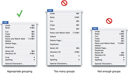
Group things which belong together
Old school! But really important. Your focus should lie on how you can divide and then logically group the most common features together. So that the user has to spend less time on discovering them.
The appropriate grouping helps increase the user’s efficiency in discovering, learning, remembering and performing tasks within the product.
Remove the unessential
What does one do when one’s laptop starts to become slow? Remove unnecessary files.
What does one do when an app frequently starts crashing? Clean the cache. Reboot the computer. Kneel and pray!
A very common thing which happens when one starts building something from the scratch is getting influenced from what others are doing. One tends to build something similar to what’s trending and try to borrow its features. After all, if every similar second product has that feature then it ought to be good. Right?
Wrong. WRONG. W.R.O.N.G
The more number of elements one puts without thinking through the core of the problem, more complex the user experience becomes. One should focus on the “absolute must” elements and make sure that there isn’t any visual clutter to get a specific task done.
The simplest way to achieve simplicity is through thoughtful reduction.When in doubt, just remove.
— The Laws of Simplicty, John Maeda
Hide things if you have to
There is no problem in hiding information if it makes your website look less cluttered. Rather it helps reduce the cognitive load on the user. If you are running an e-commerce website, your first aim is to grab user’s attention.
In the picture below, the product code and details of each watch is hidden. When users scroll through the collection, they aren’t bombarded with too much visual information and can focus on what they like at the first sight.
Is there any use of displaying product code to your customer at the first glance? Hide it. Does hiding away product description helps user focus on the actual product? Yes? Hide that as well.
Is there anything else that could be hidden and shown subsequently? Hide and then use techniques like progressive disclosure to help users maintain focus on current task at hand.
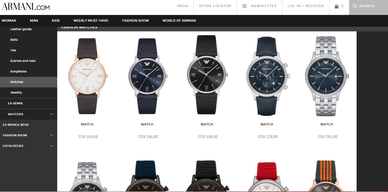
Allow users to focus on the specifications like design, color, price of the watch.
You can add the extra information- description, user rating, size guide, item code separately. Do not let the user feel distracted with unnecessary information.

Perfection is achieved, not when there is nothing more to add, but when there is nothing left to take away. — Antoine de Saint-Exupery
You could easily replace perfection in the above quote with simplicity and you would have a pretty darn good definition designs that just work.
Original Source: https://uxplanet.org/default-to-simplicity-to-design-better-user-experiences-854895396450