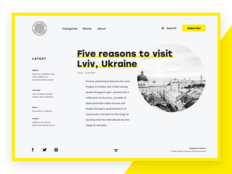
People read all the time. It’s not only books or magazines but various info on the Internet, adverts in the streets, in public transport or outside shops. However, only minority of readers may know how much time and effort often stand behind a single line. When we easily read a copy feeling comfortable and relaxed, many thanks go to a designer. Text arrangement and the aesthetic look of fonts are among designers’ top priorities. To create effective UI and clear UX designers learn basics of typography science. Today’s article covers basic points in typography which every professional designer should comprehend and apply in work.
What’s typography?
Typography is something bigger than just a design technique. A Canadian typographer, Robert Bringhurst, in his book The Elements of Typographic Style defines typography as the craft of endowing human language with a durable visual form. In addition, typography transforms language into a decorative visual element.
Typography has a much longer history than the design or the Internet itself. First, it appeared approximately in the 11–12 centuries when people invented movable type system. A real typography revolution started after the Gutenberg Bible, the first major book printed via movable metal type, which marked the beginning of the age of the printed book in the West. The style of type used in Gutenberg Bible is now known as Textualis (Textura) and Schwabacher.
Nowadays, it is more than just copy printing and organization. Commonly, typography is defined as the art and science of font style, appearance, and structure which aims at delivering the aesthetic and easily readable copy to readers. Not that long ago, it was a specialized study for editorial office workers but now the science is applied in different spheres and plays a significant role in design.
The role of typography in design
Can you think of at least one example of web or mobile design without copy elements? It’s difficult, right? Still, just a presence of copy in the interface is not enough for effective UI and positive UX. Copy and its appearance should be well-thought otherwise it may spoil the design. There are designers who ignore typography studies because they think it’s too difficult to understand so it isn’t worth spending much time. However, typography is an essential part of the effective design. Let’s see why.
People got used to receiving the majority of information in text form and designers need to make this process easy and productive. The basic knowledge of typography can help to comprehend the peculiarities of font visual presentation and its influence on users perception.
The effective copy is a key to the powerful design. Its effectiveness depends on not only its content but also presentation. Font size, width, color, and text structure — all of that matter. Designers can transfer certain mood or message by choosing appropriate fonts and the ways of their presentation. This way typography helps design to communicate with people. Visual performance and readability of copy in digital products have the great impact on user experience. If fonts are badly legible, people can face problems with navigation or even worse can’t use it at all. Today poor user experience in digital products is unforgiven since users can easily find the better alternative.
In addition, bad typography significantly affects the first impression because even when users don’t read copy, they scan it. In case fonts look inappropriate people may not want to learn about your offer or use your product.
Essential typography elements
To create profound typography, you need to learn its anatomy and the processes typography building requires. Let’s see.
Font and Typeface
Nowadays, many designers use terms “font” and “typeface” as the synonyms but that’s not quite right. Let’s straighten it out. A typeface is a style of type design which includes a complete scope of characters in all sizes and weight. On the other hand, a font is a graphical representation of text character usually introduced in one particular typeface, size, and weight. In other words, a typeface is something like a family and fonts are parts of it. These two are the main objects which designers and typographers change and transform to create readable and aesthetic typography. More about typeface styles will be presented here soon for our readers.
ean line and baseline
Typically, type characters are placed in a straight line creating a neat visual presentation. Main tools assisting designers in the process are mean line and baseline. The first marks the top and the other bottom of a character body. Such lines allow creating fonts even. Of course, the lines are invisible in interfaces after designers finish their work.
Character measurement (size, weight, and height)
To separate different types of information and highlight the vital points, designers apply fonts in different weight and size. The type weight is a measurement of how thick type character is. The sizes are usually measured in inches, millimeters, or pixels. The height of the character is also called “x-height” because the body of every character in one size is based on the letter “x”. This approach makes them look even. It’s easy to segregate copy elements such as heading, sub-heading and body copy by varying these parameters.
Ascender and Descender
The ascender is a part of a letter that goes above the mean line like in a letter “b” or “d”. The descender is opposite to ascender. It’s a segment that extends below the baseline like in “q” or “g”.
White space
White space, also known as negative space, is the area between elements in a design composition. Readers aren’t usually aware of the great role of the space, but designers pay a lot of attention to it. In case the white space is not balanced, copy will be hard to read. That’s why negative space matters as much as any other typography element.
Alignment
Creating effective typography is not that easy and it includes many processes. For example, alignment is an action of placing and justifying text. During the stage, designers aim at transforming randomly placed pieces of text into one unified composition.
Tracking
The process of tracking involves adjustment of space for a group of type characters which form a word and text block. A designer set appropriate spacing for all letters, making copy feel airy and pleasant to the eye. The effective tracking makes letters in a word easily readable.
Kerning
Kerning is a bit similar to tracking still they aren’t the same. Tracking means is spacing between all the characters of font while kerning is the process of adjusting the space between two type characters. It is usually applied for individual cases when a designer decides to change the spacing between two specific letters to make it feel more natural.
Leading
Leading is the spacing between the baselines of copy. The appropriate leading helps readers easily go from one text line to another and makes big pieces of text legible. In design, the standard leading is 120% the point size of the font still it can vary according to the typeface peculiarities.
Typographic hierarchy
As any other design element, typography should be structured. Typographic hierarchy is a system that organizes copy content in the best way for users’ perception first of all via modifications and the combination of typefaces and fonts. It is aimed at creating the contrast between the most meaningful and prominent copy elements which should be noticed first and ordinary text information. The contrast is created by regulating typography elements including typefaces, fonts, sizes, and colors as well as their alignment.
Typographic hierarchy is presented with common types of copy content used in UI design. They are headlines, subheaders, body copy, call-to-action elements, captions, and others. These copy elements create distinct layers in design: primary, secondary, and tertiary.
The primary level of copy content includes the biggest type like in headlines. It strives at drawing user’s attention to the product. The secondary level consists of copy elements which can be easily scanned. Those are subheaders and captions which allow users quickly navigate through the content. And the tertiary level of typography includes body text and the other information. It is often presented with the small type still it should be readable enough.The typography layers assist users to learn copy content gradually step by step without effort and get oriented in the digital product.
Typography cannot be learned in one day. It requires constant studying and persistence. Follow our updates to get more about typography in design.


