
“This was A productive and fun day. Everyone that attended, said they really enjoyed the process, the option of being a part of the thinking process and the general atmosphere. There is a consensus we need more sessions like these and with additional team members.”
This is the feedback I was given from the 90Min. team, a football platform product with over 30 million users per month and $40M in funding after the Google Design Sprint workshop I ran for them a couple of weeks ago.
I think this feedback symbolises the real essence of this methodology developed at Google Ventures and in the next lines i’ll explain why.
As a member of Google Developers Expert program, I’ve been invited last May to take part in the first “Google Academy for Design Sprint Masters”, a full day workshop that took place at the company’s HQ in Mountain View, California with 30 more UX and UI experts. This was the first time that the company ran this workshop for professionals that aren’t part of the company.
We were all really excited to get to know the agile oriented methodology and understand its interesting techniques.
So, what’s a Design Sprint?
The Design Sprint is a methodology of agile user experience and product design process that puts the business, technology and especially the user in the center. Basically it’s a process of structured brainstorming for answering critical business questions through design, prototyping, and testing new ideas with users throughout one to five days workshop.
The process combines 6 stages:
- Understand
- Define
- Diverge
- Decide
- Prototype
- Validate
This mini toolkit for creating a user experience is very practical when you’ve already done your research and reached the point where your team needs to be focused on a specific mission, or to be more precise — a specific challenge that needs a solution.
Each stage of the method includes practices of a large UX process such as user interviews, user testing and user research. These stages help us to sum up the educated studies so we can get the participants on the same stage and create a healthy process.
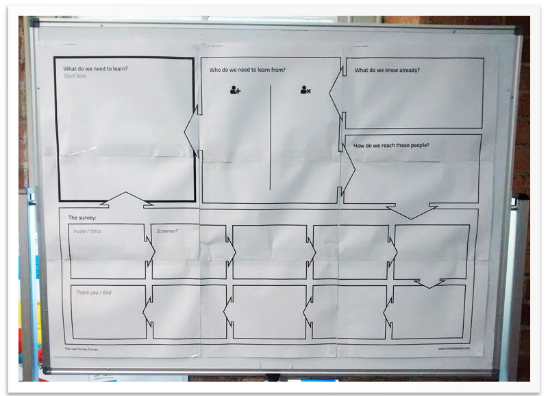
Prior the Sprint
The workshop preparation is very crucial for the Sprint’s success.
Recruiting a group of 8 participants from different aspects of the company: business, marketing, technology, product and design is important in order to get the best perspective of the challenge. I requested the team leader to provide the email of each participant and sent to all of them an introduction email. The email was a great built up for the workshop and it got really excited about the workshop.
Preparing a brief document prior the workshop helped us to create a great introduction of the challenge. The brief should include a short paragraph that specifies the current challenge, which deliverables we would like to get by the end of the process, vision of how a success outcome will look like and the initial milestones of the production process.
And lastly, the logistics preparation including finding the right place, collect the equipment and create the actual schedule so the sprint will work smoothly.
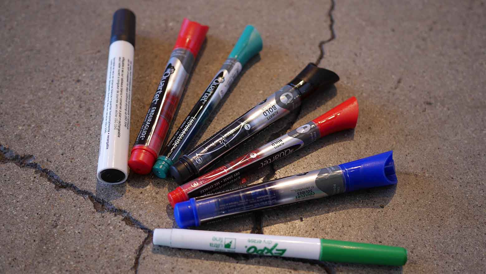
Here’s what you will need to run a design sprint:
- Sharpies
- Sticky notes
- Voting dots stickers
- A4 paper
- Erasable marker
- Pencils
- Notebooks
- Whiteboard
- Colored papers
The Stages
1. Understand
Right at the beginning of the day, we made sure to clarify the challenge statement, which was “Re-design the product’s navigation”, we understood the business and marketing opportunities of the challenge during a 5 minutes pitch from the company’s VP product, another 5 minutes pitch from the development team leader to understand the technological capabilities, and finally a 5 minutes review of the users feedback and competitors from the product manager.
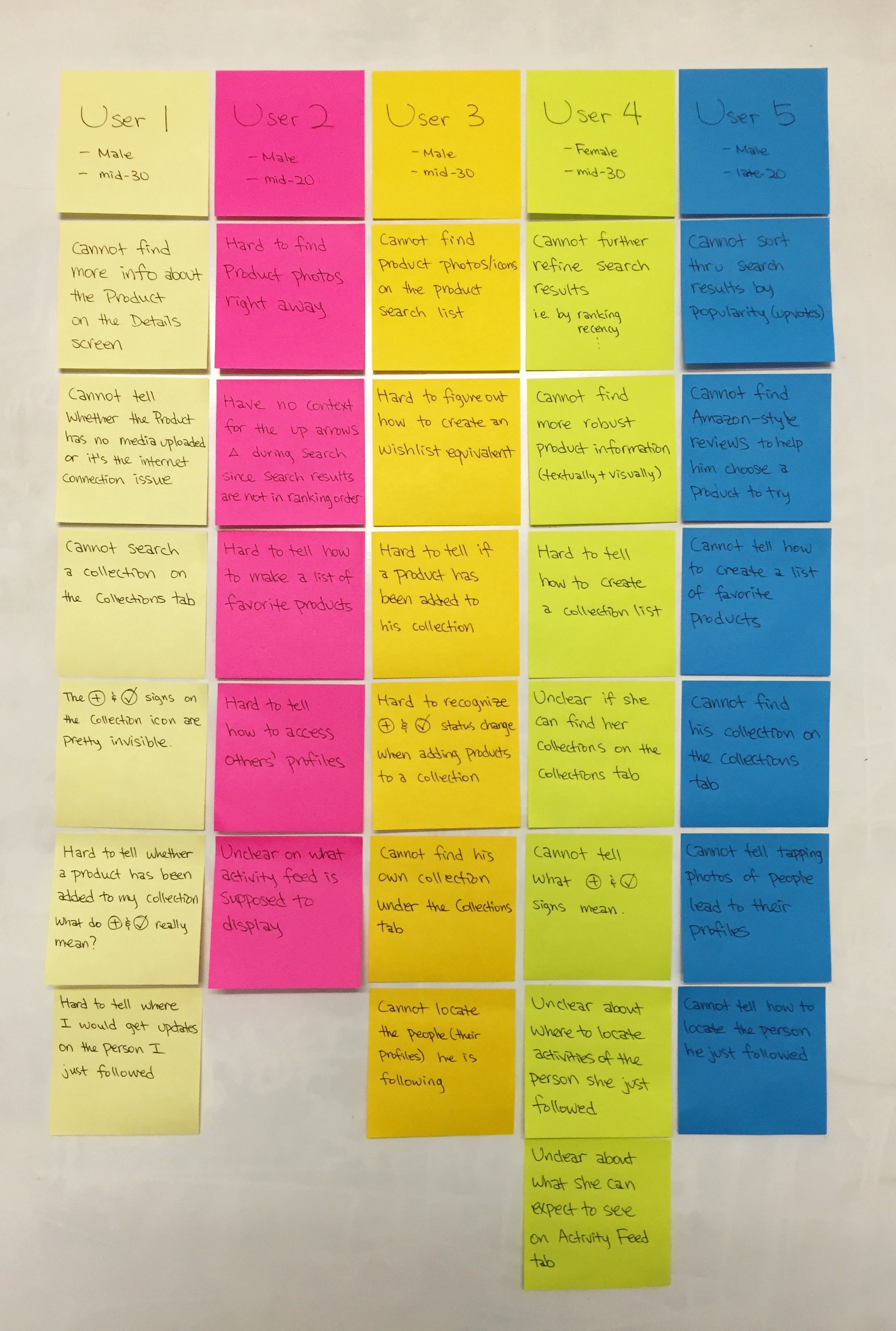
During this quick 5 minutes talk of each aspect, the team wrote down their notes using the “How Might We” technique. This approach ensures that the team asks the right questions and helps us find innovative answers. For example, “How might we help our users to find content they’re interested in?” and “How might we make the navigation fun and intuitive for our users?” — This kind of questions motivate us to push the boundaries forward in terms of the user experience we want to achieve and finding new ways of technological solutions.

The ‘How Might We’ stickies
2. Define
After we understood the challenge and its components, we proceeded on defining the initial strategy of the solution we’re looking for.
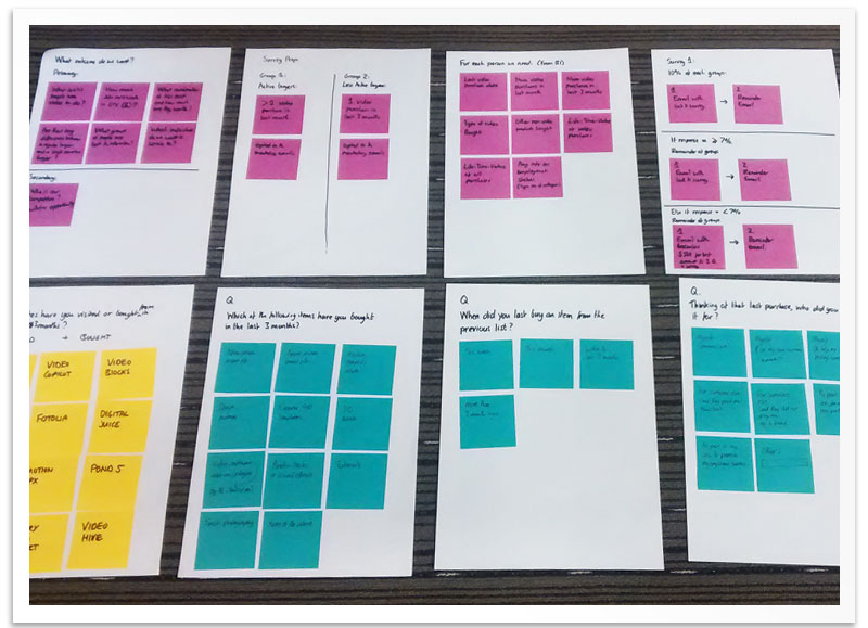
We started by creating various personas that describe the product’s users, created the first journey map from when they first discovered the product until they became “power users”. Then we created a user statement which is a simple sentence that describes the user’s characteristics, his needs, motivations and what he values the most. Next, we created the design principles list: adjectives that we want our users to describe our product with. And lastly, we executed the “First Tweet” — a very inspiring exercise of creating the company’s first tweet after the publicity of the solution within the Twitter limitation of 140 characters. The best guidance is to tell the group to imagine that it’s time to launch the feature and ask them “What is the first announcing tweet you will send out?”
I also gave the team a reference of a real tweet Google published when they launched “OnHub” router — giving a real example as an inspiration helped the group open their minds.

3. Diverge
Many times, we’re picking the first solution that comes to mind, this might be the best solution, but not always. The Diverge stage is where the fun begins!
Now that we understand the challenge and defined the strategy, we can start throwing ideas. To do so, there’s a great technique called “Crazy 8 in 5”: each individual sketches quick 8 potential UI solutions in 5 minutes. The purpose of this activity is to generate many ways of solving the challenge no matter if they’re realistic or not.

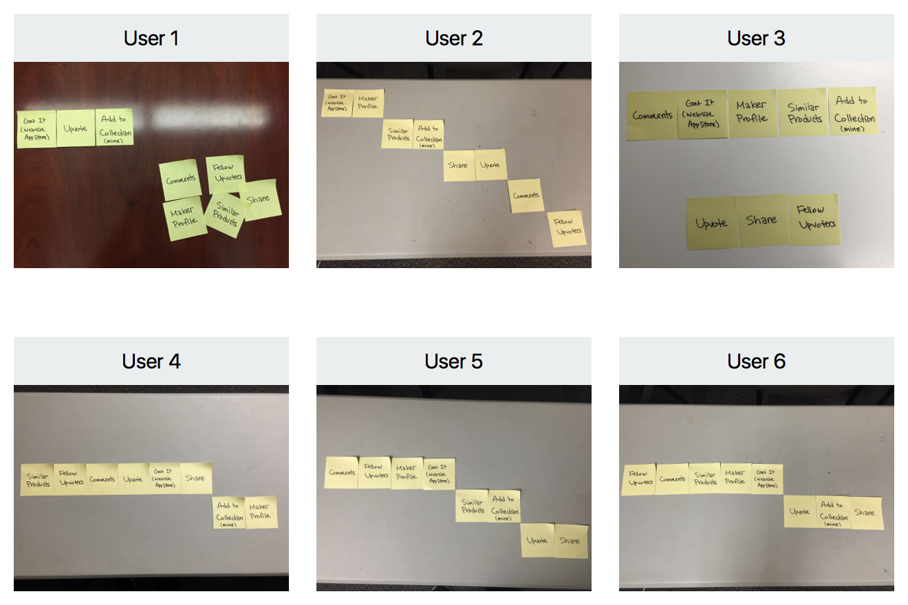
Deciding on which option to prototype (90Min team)
4. Decide
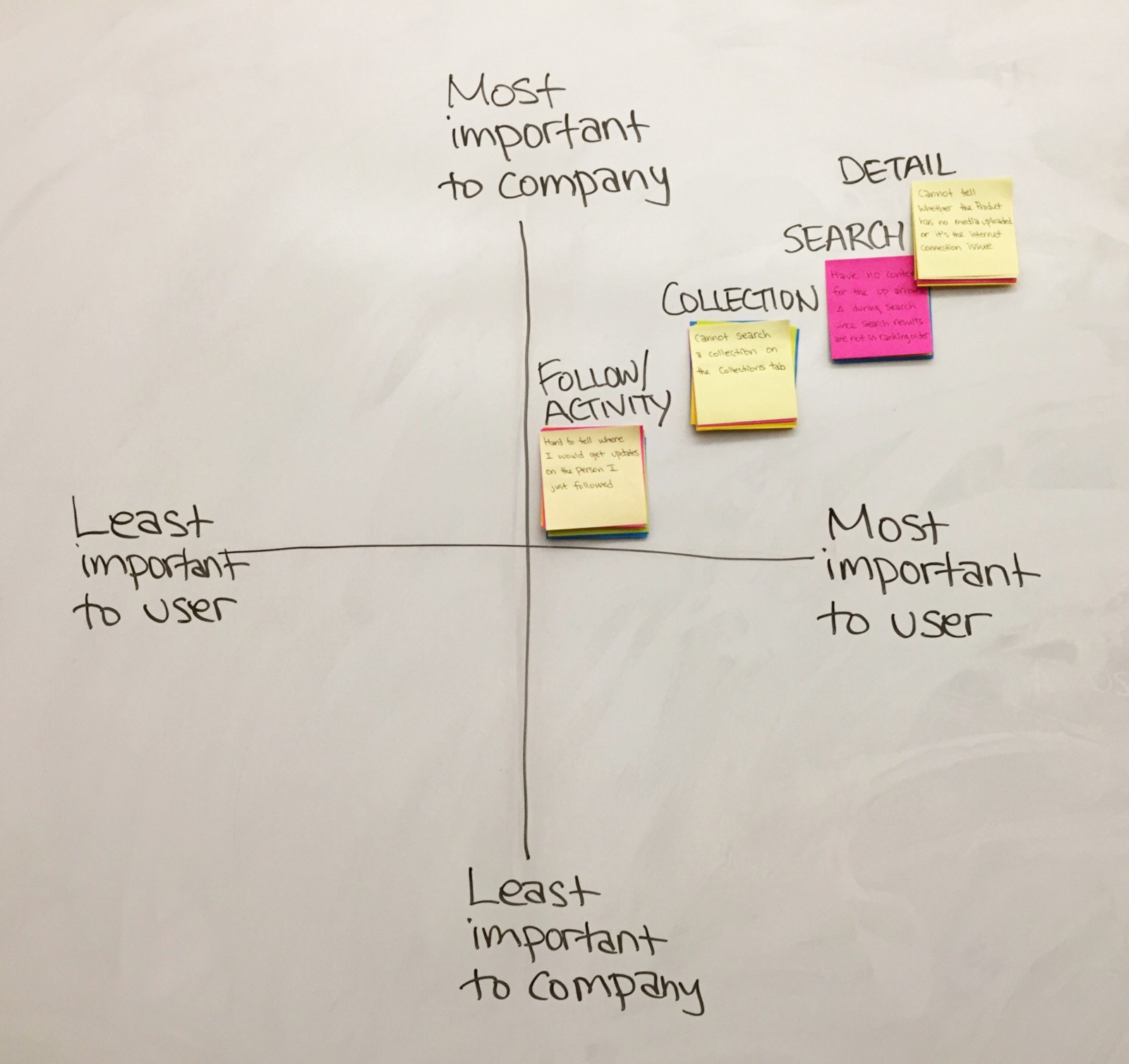
After the sketching, each team member shared the ideas on the whiteboard, the group discussed about them and afterwards we started voting using dot stickers, on our favourite solutions. After the voting we started to get a clear picture of the most popular solutions.
But how can we choose one idea to prototype? Using the “Risk vs. Reward” scale, we took each popular solution and positioned it in scale of the various risks vs. the value — It revealed what’s easy to do and important for users so we could decide which one to prototype.

5. Prototype
The prototype allows us to test our ideas, save valuable time, money and other resources. Using the prototype, we can try to predict the success and failure potential of the solution we came up with in a short time. The prototype should be as much as accurate and polished so it can be clear and easy to test with actual users and receive their ultimate feedback. The team separated into small groups and started prototyping on paper and used Popmobile app to generate transitions and links between the screens. The prototype started to get a look of a real interactive product. Afterwards the company’s designer finalized the sketches into a clean wireframes using Photoshop and created the final version of the prototype using InVision.

6. Validate
The most important question is “How can we know if we did a good job?”
In order to answer this question, we used the InVision prototype the team created and introduced the context to different users in order to test it with them, and asked them some guiding questions. But that is not all.
The validation stages requires the technology team to review the solution and figure out its complexity, how much time it takes to develop it and if we’re able to support this kind of solution in our framework. In our case it was approved and pretty much possible in the timeframe we wanted.
Last but not least — the stakeholders validation. Their review is essential for the sprint to succeed. Usually, they’re the ones that are funding and managing the company, therefore they can point out other crucial perspectives and make the final validation.
Finished the design sprint — now what?
At that stage, after a full day of work, we finished the sprint and parted ways. It’s up to us — the design sprint leaders — to monitor the progress of the development. Like an aid to the product managers, and be there if the team has doubts or questions about the solution.
Conclusion
From my experience while working with various startups and product companies in the past few years, I can say that, as a designer, you’re often required to provide quick solutions for challenges that aren’t always clear enough and when finding a solution. Mostly you don’t have the privilege of validating it, usually due to a lack of budget and time.
The Design Sprint method allows us to solve these challenges using quick validations without wasting too many resources on other solutions that the company didn’t even learn. By creating quick prototypes, we can get actual feedback and see if there’s a real potential for the solution we’ve created.
Some companies and corporates may consider the democracy approach of the Design Sprint as a threat, but they shouldn’t. The joint effort cuts out the organisation bureaucracy for a change, and gives each participant the feeling that his opinion counts and contributes to a better chemistry and greater synergy in the company.
Mostly, this process gives us useful techniques to increase creativity and generate new ideas while putting the users needs upfront, and contributes to position the user experience as a problem solver.
Want to learn more about the Google Design Sprint?


