apple

Mobile payments are finally everywhere you want to be... by Gavin Lau

Screen-Shot-2014-02-20-at-1.03.24-AM.png

NFC was supposed to be the future.

My next phone was going to include the technology, which would let me pay at any cash register by waving my phone instead of swiping my credit card. NFC would also let me touch phones with a friend to share a picture, tap my phone to a speaker to play music, and even unlock my phone with a ring or clip. NFC would someday even replace bar codes,according to Osama Bedier, the one-time head of Google Wallet and unofficial torchbearer of the NFC movement. Google’s contactless payments system was bound to take over the world. Until Google gave up on it.

Carriers blocked the company from deploying Wallet on phones, and retailers outside Mountain View didn’t feel much urgency to upgrade their cash registers with NFC capability. Eventually, Google transformed Wallet into a straightforward PayPal competitor. The best hopes for NFC payment adoption in the US lie with several programs created by carriers (Isis) and credit card companies (MasterCard MasterPass), which only work with a few banks and at select retailers. An NFC payments solution — in the US, at least — is effectively stuck in a stalemate. But a new startup called Loop thinks it has the answer: a wireless payments technology that does what NFC promised to do, all without forcing carriers or retailers to change anything.

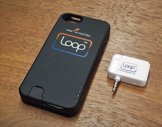
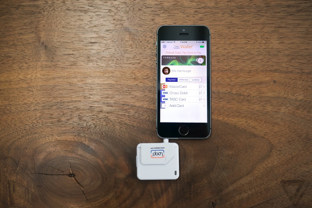
Loop comes in two flavors, for now: a $39 key fob and a $99 Mophie-esque ChargeCase. Both devices hold virtual versions of your credit and debit cards, and work at over 90 percent of the country’s credit card machines without retailers having to change anything, according to Loop. The Fob and ChargeCase work only with the iPhone, for now, but they will be compatible with Android in April. In 2015, Loop expects its technology to be built into a variety of phones from its OEM partners.

It’s the NFC dream all over again, except this time it might actually come true.

Magnetic attraction

Loop co-founder George Wallner founded Hypercom in the late ‘70s. You probably haven’t heard of it, but Hypercom built the technology behind many of the credit card readers still used in grocery stores, coffee shops, and other retailers today. After making his millions and eventually selling to Verifone, the biggest player in the space, Wallner retired to his yacht. "I was not paying much attention to the payments industry," he says, at least until about a year and a half ago. A friend mentioned that NFC was being pushed as a new medium to transmit credit card information.
Loopscreenshots2_300

"I was surprised that NFC, which is a good technology, was being used in such a simple way," Wallner says. "The best way to do it is to work with the equipment [retailers] have today — not just something in between." Wallner, an engineer by trade, prototyped a new technology that would transmit magnetic-stripe credit card data, but do it wirelessly. It would effectively have the same impact and feature set as NFC payments, but would work at over 90 percent of credit card machines in the US. Wallner was about to come out of retirement.

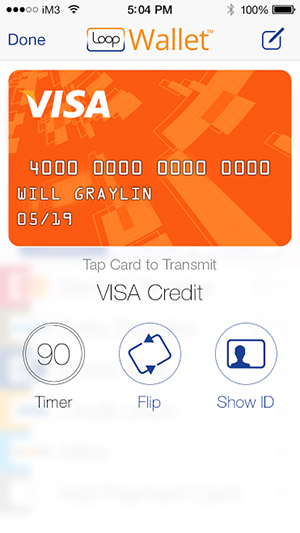
He founded Loop with Will Graylin, an entrepreneur whosold a mobile payments company of his own to Verifone, and Damien Balsan, the former head of NFC business development at Nokia. Loop’s first products are the Loop Fob and the Loop ChargeCase. The Fob is essentially a Square-esque credit card reader, and the ChargeCase is a battery pack / case combination with small credit card reader dongle. The Fob connects to your phone via headphone jack, while the ChargeCase connects via Bluetooth. Both devices interface with the PIN-protectedLoopWallet app, which lets you scan in your cards; Loop stores your card data in an encrypted form on your phone, and inside a secure element on the Fob and ChargeCase.

You’ll need to be within a few inches of the actual reader head inside a credit card terminal for it to work, but Loop’s range is good enough that you don’t need to hit it on the nose. From there, pressing a button on the side transmits the magnetic signal for your most recently used card just as if you’d swiped it. If you’re using the ChargeCase, you can tap a card’s icon inside the LoopWallet app to transmit its signal. I tried both the Fob and ChargeCase at coffee shops, taxis, restaurants, and grocery stores, and every time, cashiers were skeptical and wanted to call their manager. Only when I was persistent ("Look, just press the button, trust me") would they do so. And to their surprise, Loop almost always worked on the first try.

Loop_fob_and_keys

The point of sale

I’m happy with Loop’s reliability, but less so with its initial product designs. The Loop Fob is a bit chunky, and only holds one card at a time. (Coin solved this problem with an onboard screen and card-switching button, but it remains to be seen how well it actually works in practice.) I ended up carrying around both the Fob and my wallet just in case, which defeats the purpose of the Fob. Perhaps if it were much smaller, like a Mobil Speedpass, I’d bring it with me everywhere.

TAPPING ON MY PHONE TO PAY FOR SOMETHING FEELS TRULY FUTURISTICLoop_chargecase_and_reader

The Loop ChargeCase is a more logical form factor that provides both backup power and payment capabilities. The ChargeCase is essentially a cheaper-feeling Mophie: it can be activated either with a quick button press on its side, or using the Loop Wallet app. Inside the app, you can flip through all the cards you’ve scanned in, then tap one to transmit its magnetic signal to a credit card reader. Tapping on my phone to pay for something feels truly futuristic, like the Google Wallet promotional videos of yore. This was the promise of Google Wallet, but it’s Loop that delivers. And Loop says it’s already working on a new version of the ChargeCase with a removable Loop card you can hand to waiters and bartenders.

Loop worked at most credit card machines I tried aside from subway-ticketing machines, gas pumps, and ATMs that require you to fully stick in a card for a scan to take place. Loop has hacked its own way to working at these kinds of terminals — it involves sticking another card into the reader slot, and then pressing a Loop device against it — but it’s not worth the trouble. Loop also didn’t work at Duane Reade, a popular chain of drugstores in New York, but Loop says this is only because Duane Reade hasn’t upgraded the software in its credit card readers. At Walgreen’s and Staples, the credit card readers accepted debit card transmissions via Loop, but not credit card transmissions. They require a software upgrade too, it seems. But despite the hiccups, Loop worked in far more places than any mobile payments app or hardware I’ve ever tried. The company solved a big piece of the payments puzzle — but in doing so, revealed another enormous obstacle blocking the path of any mobile payments startup.
Loop_fob_and_phone

In your pocket

Loop’s biggest problem is that it’s a waste of time. It feels magical to use, but isn’t worth the additional 10 or 15 seconds it takes to explain to each and every cashier. At a bar or restaurant, handing over my phone or Fob while yelling instructions over the chatter of other patrons was both awkward and impractical. And even if a friendly cashier doesn’t ask any questions before trying out Loop, they almost always ask questions afterwards. I felt like I was not only wasting my time, but the time of the people in line behind me, like the main character in that one VISA commercial.

Hardware ubiquity, as it turns out, is only half of NFC’s problem. The other half is that it requires cashiers to trust you aren’t trying to hack them by touching your gadget to their credit card reader. Even if Loop works at every register, it doesn’t compute for every cashier. Acceptance may come in time as more cashiers learn about Loop, but I have a feeling that true ubiquity would only come from corporate executives formally deploying new systems asStarbucks and Whole Foods have done with Square readers. Or perhaps even from Isis.

EVEN IF LOOP WORKS AT EVERY REGISTER, IT DOESN’T COMPUTE FOR EVERY CASHIER

Loop and others say they add value by offering retailers digital rewards and custom payment app experiences, but these perks are separate pieces of the payments puzzle that should come once mobile wallets are ubiquitous. Loop also offers the ability to take pictures of your ID and loyalty cards for storage inside the Loop Wallet app, but until I start sprouting gray hairs, no bouncer is going to accept a photo of a photo ID. So I’m stuck with two or three cards in my wallet, which is really no less convenient than carrying five or six cards.

Wallner does say that Loop’s hardware is more secure than a credit card since it can’t be skimmed, providing one more reason to use it. I haven’t been able to personally verify the truthfulness of this statement, but in a world where credit card companies are liable for all fraudulent purchases, Loop’s security isn’t a killer feature.


Source: http://vrge.co/1nNBPOr

Ex-Ideo Designers Rethink The Calendar For Mobile Devices by Gavin Lau

3025671-slide-peek-photo3.jpg

Have you ever opened up a calendar app on your iPhone and wondered why almost the entire screen is taken up by a grid of tiny boxes, most of which represent the past, and all too small to contain any useful information? Amid Moradganjeh has, too. He and his team of ex-Ideo designers have created Peek, an app that throws out most of the assumptions we've attached to digital calendars and rethinks the experience from a minimal, mobile-first perspective. At first glimpse, Peek seems to have a lot in common with Clear, the influential gestural to-do list app. Like Clear, Peek has a flat, "chromeless" interface built around chromatic tiles and clean typography, with accordion-like animations that "unfold" information when you tap on the tiles. "Apps like Clear proved that simple tools that don’t try to do too much can sometimes be more useful," Moradganjeh tells Co.Design. "This is mainly the case for the group of people that are not necessarily that busy, and therefore, don't need an app that thinks for them."

According to Moradganjeh, Peek is aimed at this class of casual calendar users: people who aren't overscheduled CEOs or GTD geeks, but just folks who have stuff to take care of. "For this group, if using a calendar app is not easier than remembering things or writing them on a piece of paper, then they would not use it," he says.

That's why Peek looks more like a strip of brightly colored Post-It notes than a gridded database of appointments. The first things you see when you launch Peek aren't even dates; instead, the app displays large tiles simply labeled "TODAY" and "TOMORROW." Scrolling down further reveals more tiles labeled with forthcoming days of the week. "We learned that people don't perceive time in the form of grids and pages," Moradganjeh says. "So we explored the river model, in which a calendar is a unified timeline with the focus being on the near future." (Scrolling further down or up in this "river" does eventually display a more traditional grid of dates, which makes it easier to reach events further into the future.)

 Moradganjeh says that he based Peek's design on mobile interaction principles he investigated in Rimino, a student concept project he created two years ago (which we covered here). Rimino imagined a post-smartphone device built on lightweight, glanceable notifications rather than visual, highly focused interactions. Instead of displaying a dense thicket of appointment information, Peek surfaces simple, bold reminders that function less as an "outboard brain" for your schedule and more like a red string tied around your finger that helps visually trigger what you already know.

"We learned that most of the time, [casual calendar users] only need the information that can help them 'remember' their schedule," Moradganjeh explains. "This means that an event like 'Lunch with Adam at 12:00' is enough useful information for a user who knows already where she needs to meet Adam."

Peek contains some extra interactions that run the gamut from genuinely clever (covering the iPhone's ambient light sensor with your hand or thumb displays a large clock) to extraneously gimmicky (shaking the phone makes Peek cough up aspirational suggestions like "Take the time to relax!"). And the jury's still out on whether focusing an app's UI on gestural interactions isactually convenient or just a passing fad. But Peek's core concept--that most "normal people" don't need deep features and artificial intelligence to help them manage their time when simple, mnemonic microinteractions will do just fine--is a refreshing take on mobile design.


Source: http://www.fastcodesign.com/3025671/ex-ideo-designers-rethink-the-calendar-for-mobile-devices

Paper from Facebook... by Gavin Lau

Screen-Shot-2014-01-30-at-11.20.12-pm.png

Paper radically re-imagines what Facebook is on a mobile device as a fluid river of cards featuring news articles, photos, status updates, and more, with no ads to sully the experience (yet). It's being released next week on February 3rd, just one day before Facebook's 10-year anniversary, and there's a reason for that: Paper is the opening sentence in Facebook's next 10-year plan. A beautiful app designed from the ground-up with the iPhone in mind, Paper owes its design lineage to a number of other apps. Paper presents the standard Facebook feed in the fluid, elegant style of Flipboard. It makes writing posts as easy as using Medium or Svbtle. Loren Brichter--designer of the original Twitter app, and the popular iPhone game Letterpress-- worked with Facebook to make the interface 99% invisible as possible, with news stories presented in Twitter-like cards, wide photos that pan as you tilt your phone, and UI elements that simply fade away when they aren't in use.

Although Paper isn't out yet, early previews are ecstatic. It's the first app out of Facebook's newly formed Creative Labs division, which is described as a way to allow teams within Facebook build standalone mobile experiences with the same dexterity as start-ups.


http://www.fastcodesign.com/3025755/paper-the-opening-sentence-in-facebooks-next-10-year-plan

Apple to Build Mobile-Payments by Gavin Lau

iphone-payment.jpg

Eddy Cue, the company's senior vice-president of Internet software and services, has met with "industry executives" to discuss Apple's role in handling payments for physical goods and services, The Wall Street Journal reported. The mobile-payments space is hot, with companies such as Square, PayPal and Stripe all working to make it easier for users to pay for physical goods with their phones.

Apple sells billions of dollars worth of movies, music, books and apps through iTunes. Still, aside from allowing customers at Apple retail stores to scan and pay for physical items inside the store via an iPhone, Apple hasn't extended its payments ecosystem outside of the digital realm.

That doesn't mean the company could't instantly become a major player in the mobile-payments space overnight, thanks to its absolutely huge iTunes customer base.


http://mashable.com/2014/01/25/apple-mobile-payments-2/#:eyJzIjoidCIsImkiOiJfY28xbmQybjNnN2QzMXluNXZncDNwMl8ifQ

more human, way to manage your network of contacts by Gavin Lau

Humin1-786x305.jpg

The contacts app that ships with iOS is a pretty straightforward affair that doesn’t offer much more than the handwritten address books we used to keep next to our landline phones. Humin is a new app that will be launching in beta this week that aims to be a smarter way for iPhone users to manage their contacts. Humin’s name doesn’t echo the word ‘human’ for nothing – co-founder and CEO Ankur Jain wants his startup’s product to understand relationships the way that you do. We don’t think of our network of contacts as an alphabetical list of names, our brains organise our contacts in more complex ways, but ways that make sense to us – where we met people, where they work, what they look like, who they know, and the like. Humin wants to tap into that subconscious human logic without you having to do anything differently.


http://tnw.to/stDX

HTML5 Vs. Native debate obscures the real challenges of mobility by Gavin Lau

04-HTML5-vs-Native.008.png

The vitriol spews on a daily basis. HTML5 or native apps? Each side is well armed with arguments and data to prove their points. This fight, destined to go on for a long while, masks some of the real problems that enterprises are facing when it comes to mobile applications. Do you have the right backend architecture for a mobile world? The right business analytics? Enterprises, brands and developers need to put their houses well in order before even beginning to answer what type of code an app will be built in.  

http://readwr.it/q0zV

Smart Tennis Sensor by Gavin Lau

Screen-Shot-2014-01-21-at-12.32.11-am.png

Sony showed off a prototype tennis racket sensor at CES 2014 that promised to track useful data about your technique and transmit it to your smartphone. That prototype has turned into reality faster than we thought it might — the final product now has a name, a price, and a release date for Japan...  

http://vrge.co/1iefefI

7 Minute Workout' App by Gavin Lau

Gym_App.jpg

Last month, Apple offered a free holiday playlist through the Apple Store app for iPhone. This month, in the same manner, it's offering the 7 Minute Workout Challenge app for free, effectively encouraging users to "jump into the new year."  

http://mashable.com/2014/01/11/7-minute-workout-challenge-app-free/#:eyJzIjoidCIsImkiOiJfY28xbmQybjNnN2QzMXluNXZncDNwMl8ifQ

Apple Gets Serious About The iPad’s Creative Power In New Ad by Gavin Lau

Screen-Shot-2014-01-13-at-11.41.03-pm.png

Apple aired a new iPad advertisement during the NFL playoff game between the San Francisco 49ers and the Carolina Panthers today, and it’s all about creativity. It’s no secret that Apple wants to push the creative aspect of its mobile devices, which are still seen largely as consumption gadgets, and this new ad embraces a grand vision of iOS as fertile ground for inspiration and creation. “What will your verse be?” is the tagline for the ad, and the idea is that each person gets to contribute one verse to the overall poem of human experience (which is a terrible poem by the way). The iPad in the commercial is used in a number of different creative capacities, including as a filming accessory, as a prototyping tool, as a means for writing, and as a way to 3D prototype and work in the depths of the ocean...


http://techcrunch.com/2014/01/12/apple-your-verse-ipad-ad/

iPad-mounted Structure Sensor 3D scanner by Gavin Lau

Screen-Shot-2014-01-11-at-12.49.03-am.png

Augmented reality has never been nearly as cool as its name suggests. Even when it isn't gimmicky, it's virtually useless, in large part because your mobile camera's version of "reality" is short one dimension. Scanning and computer vision company Occipital, however, wants to add real depth to your tablet's vision with the Structure Sensor, a Kickstarter- backed product that shipped to backers late last year. The $349 Structure Sensor is a Kinect-like camera that fits on the back of an iPad or, with some hacking, any other device. With the bracket on, your tablet doesn't just see objects, it can figure out how far away they are, doing anything from turning an object into a 3D model to measuring the distance of a room. http://vrge.co/1lGoBVh

iPhone case uses electromagnetic radiation to power its LED notification lights by Gavin Lau

lune-case1.jpg

The Lune case, developed by gadget startup Concepter, does just that. With no battery or power connection to your iPhone, the case can light up when you receive a call. Concepter was showing off the case at Eureka Park, the early-stage startup section of the International CES.


http://venturebeat.com/2014/01/08/this-iphone-case-uses-electromagnetic-radiation-to-power-its-led-notification-lights

The Best Calendar iPad App - Sunrise by Gavin Lau

ipad_screenshot05.png

Calendar app Sunrise released a major update today, completing two missing pieces of the complicated calendar puzzle — you can now use Sunrise on your iPad with a new design tailored for bigger screens, and there is a much-requested week view to get a better picture of what your schedule looks like. Finally, the company added background updates so that your calendar is always up to date when you open the app. “We realized that mobile is an even bigger paradigm shift than we originally thought,” co-founder and CEO Pierre Valade told me. “Every other day, I don’t even use a computer anymore — I consider the iPad as a mobile device. People want to feel productive anywhere, and work from their iPad. So that’s why we built Sunrise for the iPad.”


http://techcrunch.com/2014/01/09/sunrise-adds-ipad-app-and-week-view-in-its-quest-to-build-the-best-calendar-platform

iPhone-controlled paper airplanes by Gavin Lau

powerup1.jpg

PowerUp is building a little device that converts paper airplanes into smartphone-controlled flyers. This project has raised nearly $850,000 on Kickstarter, raising 1,688 percent of its $50,000 goal — and it still has 24 days to go.

“Our goal is to make you feel like the Wright Brothers when Flyer I took to the skies,” inventor Shai Gotein told VentureBeat’s Dean Takahashi in November. “We want to empower you to design your own flyer and conquer the skies with our module.”

PowerUp’s module has an ultralight weight mini-computer on one side that is about the size of a quarter. Bluetooth low energy connects it to your smartphone, and a lithium battery power pack charges it. A thin carbon-fiber frame connects the computer to a little propeller on the other end.


http://venturebeat.com/2013/12/31/powerup-racks-up-850k-on-kickstarter-for-iphone-controlled-paper-airplanes

iOS: A visual history by Gavin Lau

Screen-Shot-2014-01-05-at-4.57.28-pm.png

Apple's Steve Jobs introduced the iPhone to the world on January 9th, 2007. In the five-plus years since then, the iPhone, iPad, and iPod Touch have literally redefined the entire world of mobile computing. That world is moving so quickly that iOS is already amongst the older mobile operating systems in active development today. That certainly doesn't mean it's underpowered or underfeatured — quite the contrary. Through what can only be described as relentless and consistent improvement over the years, Apple has made iOS one of the most feature-rich and well-supported platforms on the market. http://vrge.co/vd6Fhb

Mac Pro by Gavin Lau

DSC_0829-1024_verge_super_wide.jpg

It's astonishingly reflective — I can see the screen clearly, and anyone who walks by is immediately recognizable — and it picks up fingerprints really easily. But it's beautiful, understated, and looks great on a desk next to the 4K Sharp monitor we've paired it with. It's particularly good-looking with its case off, exposing the Mac Pro's machinery, but the case is required to dissipate heat. You can't even use the Mac Pro with it off...


http://vrge.co/JLBOxS