Business

by Gavin Lau

screen-shot-2014-02-27-at-9-46-37-am.png

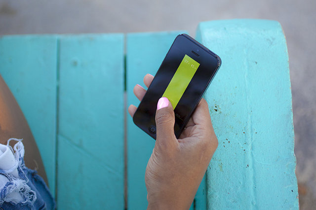
RobinHood is about to let anyone buy and sell stocks for free instead of having to pay E*Trade or Scottrade $7 per transaction. Today RobinHood begins inviting the 160,000 people who’ve signed up to download its glossy new app where you can efficiently track and trade stocks. “It’s by far the most beautiful brokerage app, though that’s not saying much” co-founder Vlad Tenev jokes. But while RobinHood makes Wall Street look stylish in your pocket, what’s special is what it does, and does for free. That’s letting you trade stocks with zero commission. You might assume it would cost RobinHood money to execute trades, but in fact it can make money by moving yours around. We’ve just been conditioned to assume its something you have to pay for after decades of investors handing Scottrade, E*Trade and other brokerages $7 to $10 for each buy or sell.

screenshot-2013-12-18-at-6-36-44-am

Those who want their trading for free can sign up for RobinHood and expect an invitation email over the next few weeks to months. Since you’re trusting it with your savings, RobinHood wants to onboard people with extreme care rather than as fast as possible. But soon it expects to be holding hundreds of millions of dollars for its users so they can make instant trades from their phones.

RobinHood gave TechCrunch the first look at its new app, and its investor Google Ventures‘ attention to design is readily apparent. The whole app is themed white or black depending on if the stock market is open or closed. Meanwhile, the app’s chrome goes green or red depending on if the currently viewed stock is up or down that day. This trick tells you at a glance whether you can officially trade or not and how well you’re are doing.

Robinhood_nightAndDay

Most finance apps only let you monitor stocks like Yahoo Finance or the first version of RobinHood, or charge you to trade them like those from the big retail brokerages. RobinHood co-founder Baiju Bhatt stresses that if you want to do deep financial research, you probably want to sit down at a desktop. But if you want to check your stocks whenever you have free moment and make some trades when the courage strikes you or whenever something shocks the market, RobinHood lets you do it in a few swipes. [Disclosure: I was friends with Vlad and Baiju in college.]

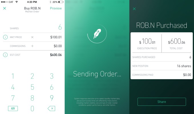
You can set alerts in case your stocks move a certain percentage, or place limit orders that are executed if the price hits a certain point. When you’re ready to make a live trade, just select how many shares of a stock you want to buy or sell. RobinHood previews how much that will cost or earn you, and you swipe to confirm the trade (which triggers some delightful animations and buzzes). And because security may be the biggest threat to RobinHood, it even lets you set up a special pin code that’s required to open the app.
Robinhood_ThreeScreens

RobinHood says it will never charge for trading. Right now, it’s supported by over $3 million in funding from Google Ventures, Index Ventures, Andreessen Horowitz, Rothenberg Ventures and some angels. But it plans to quickly become self-sustained by charging other developers for API access, letting users trade on margin (money they’re owed but don’t own yet) for a fee, and through payment for order flow where stock exchanges pay the startup to bring its trading volume to their marketplaces.

For now, though, RobinHood could democratize stock trading. If you were a fat cat trading in the hundreds of thousands or millions, those little $10 fees didn’t mean much. But if you’re not rich and still want to invest, those commissions could add up to eat away at what you earn through smart trading. By replacing brick-and-mortar store fronts and legions of salespeople with an app and a lean engineering team, RobinHood can pass the savings on to its users.


Source:  http://techcrunch.com/2014/02/27/trade-stocks-free-robinhood

'Details Matter, It's Worth Waiting to Get It Right' by Gavin Lau

SteveJobsFront2.jpg

Today marks what would have been Steve Jobs' 59th birthday, and Apple fans around the world are once again remembering the Apple co-founder and CEO more than two years after his death. Apple CEO Tim Cook is unsurprisingly one of those remembering Jobs today, and Cook has acknowledged the day in a pair of Tweets honoring Jobs and vowing to continue "the work he loved so much".

While remembering Jobs' legacy, Cook may also be indirectly addressing Apple's lack of significant announcements so far in 2014, reminding his followers of Jobs' philosophy on making sure all details are taken care of.

Cook has promised that Apple is working on "some really great stuff" in new product categories, with a smart watch and new television-related products topping the list of rumors. With Apple rarely being a company to rush to market, Cook may be quietly asking for patience as the company continues work on its upcoming products and services.

Coincidentally, today also marks the 14th birthday of MacRumors. Founded in February 2000 before the introduction of the iPad, iPhone, and even the iPod and OS X, the site has grown enormously and fostered the creation of our sister sites TouchArcade andAppShopper. As always, we are grateful to our readers, contributors, sponsors, and all those for whom MacRumors is an online home or a regular stop.


Source: http://www.macrumors.com/2014/02/24/cook-honors-jobs-59th-birthday/

Mobile payments are finally everywhere you want to be... by Gavin Lau

Screen-Shot-2014-02-20-at-1.03.24-AM.png

NFC was supposed to be the future.

My next phone was going to include the technology, which would let me pay at any cash register by waving my phone instead of swiping my credit card. NFC would also let me touch phones with a friend to share a picture, tap my phone to a speaker to play music, and even unlock my phone with a ring or clip. NFC would someday even replace bar codes,according to Osama Bedier, the one-time head of Google Wallet and unofficial torchbearer of the NFC movement. Google’s contactless payments system was bound to take over the world. Until Google gave up on it.

Carriers blocked the company from deploying Wallet on phones, and retailers outside Mountain View didn’t feel much urgency to upgrade their cash registers with NFC capability. Eventually, Google transformed Wallet into a straightforward PayPal competitor. The best hopes for NFC payment adoption in the US lie with several programs created by carriers (Isis) and credit card companies (MasterCard MasterPass), which only work with a few banks and at select retailers. An NFC payments solution — in the US, at least — is effectively stuck in a stalemate. But a new startup called Loop thinks it has the answer: a wireless payments technology that does what NFC promised to do, all without forcing carriers or retailers to change anything.

Loop comes in two flavors, for now: a $39 key fob and a $99 Mophie-esque ChargeCase. Both devices hold virtual versions of your credit and debit cards, and work at over 90 percent of the country’s credit card machines without retailers having to change anything, according to Loop. The Fob and ChargeCase work only with the iPhone, for now, but they will be compatible with Android in April. In 2015, Loop expects its technology to be built into a variety of phones from its OEM partners.

It’s the NFC dream all over again, except this time it might actually come true.

Magnetic attraction

Loop co-founder George Wallner founded Hypercom in the late ‘70s. You probably haven’t heard of it, but Hypercom built the technology behind many of the credit card readers still used in grocery stores, coffee shops, and other retailers today. After making his millions and eventually selling to Verifone, the biggest player in the space, Wallner retired to his yacht. "I was not paying much attention to the payments industry," he says, at least until about a year and a half ago. A friend mentioned that NFC was being pushed as a new medium to transmit credit card information.

Loopscreenshots2_300

"I was surprised that NFC, which is a good technology, was being used in such a simple way," Wallner says. "The best way to do it is to work with the equipment [retailers] have today — not just something in between." Wallner, an engineer by trade, prototyped a new technology that would transmit magnetic-stripe credit card data, but do it wirelessly. It would effectively have the same impact and feature set as NFC payments, but would work at over 90 percent of credit card machines in the US. Wallner was about to come out of retirement.

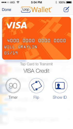
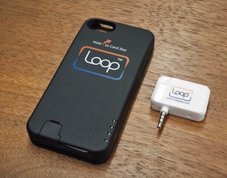
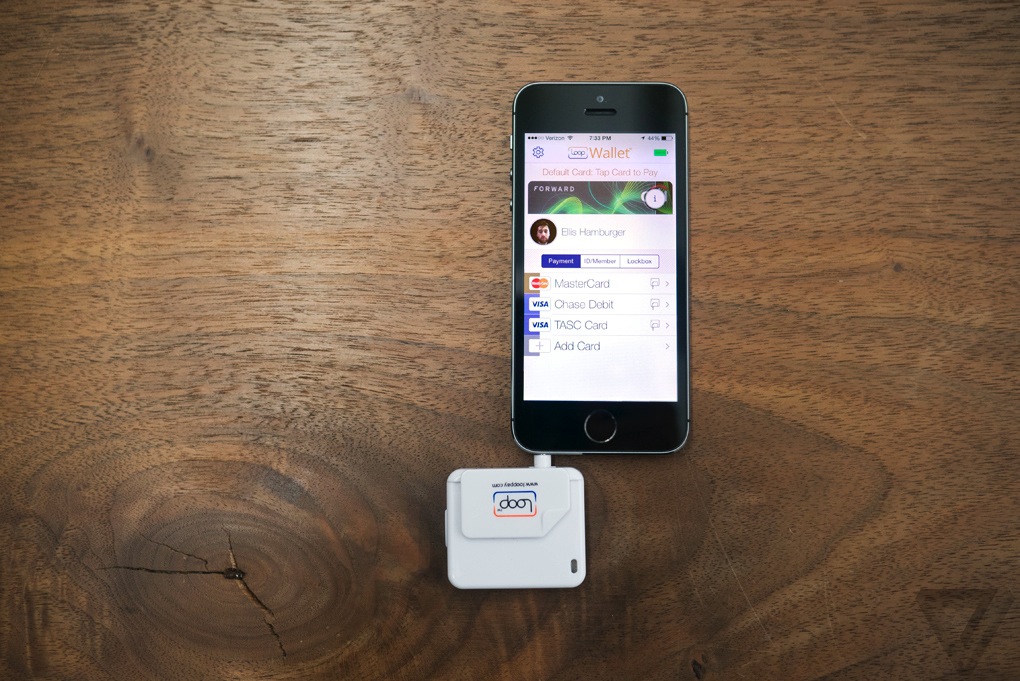
He founded Loop with Will Graylin, an entrepreneur whosold a mobile payments company of his own to Verifone, and Damien Balsan, the former head of NFC business development at Nokia. Loop’s first products are the Loop Fob and the Loop ChargeCase. The Fob is essentially a Square-esque credit card reader, and the ChargeCase is a battery pack / case combination with small credit card reader dongle. The Fob connects to your phone via headphone jack, while the ChargeCase connects via Bluetooth. Both devices interface with the PIN-protectedLoopWallet app, which lets you scan in your cards; Loop stores your card data in an encrypted form on your phone, and inside a secure element on the Fob and ChargeCase.

You’ll need to be within a few inches of the actual reader head inside a credit card terminal for it to work, but Loop’s range is good enough that you don’t need to hit it on the nose. From there, pressing a button on the side transmits the magnetic signal for your most recently used card just as if you’d swiped it. If you’re using the ChargeCase, you can tap a card’s icon inside the LoopWallet app to transmit its signal. I tried both the Fob and ChargeCase at coffee shops, taxis, restaurants, and grocery stores, and every time, cashiers were skeptical and wanted to call their manager. Only when I was persistent ("Look, just press the button, trust me") would they do so. And to their surprise, Loop almost always worked on the first try.

Loop_fob_and_keys

The point of sale

I’m happy with Loop’s reliability, but less so with its initial product designs. The Loop Fob is a bit chunky, and only holds one card at a time. (Coin solved this problem with an onboard screen and card-switching button, but it remains to be seen how well it actually works in practice.) I ended up carrying around both the Fob and my wallet just in case, which defeats the purpose of the Fob. Perhaps if it were much smaller, like a Mobil Speedpass, I’d bring it with me everywhere.

TAPPING ON MY PHONE TO PAY FOR SOMETHING FEELS TRULY FUTURISTICLoop_chargecase_and_reader

The Loop ChargeCase is a more logical form factor that provides both backup power and payment capabilities. The ChargeCase is essentially a cheaper-feeling Mophie: it can be activated either with a quick button press on its side, or using the Loop Wallet app. Inside the app, you can flip through all the cards you’ve scanned in, then tap one to transmit its magnetic signal to a credit card reader. Tapping on my phone to pay for something feels truly futuristic, like the Google Wallet promotional videos of yore. This was the promise of Google Wallet, but it’s Loop that delivers. And Loop says it’s already working on a new version of the ChargeCase with a removable Loop card you can hand to waiters and bartenders.

Loop worked at most credit card machines I tried aside from subway-ticketing machines, gas pumps, and ATMs that require you to fully stick in a card for a scan to take place. Loop has hacked its own way to working at these kinds of terminals — it involves sticking another card into the reader slot, and then pressing a Loop device against it — but it’s not worth the trouble. Loop also didn’t work at Duane Reade, a popular chain of drugstores in New York, but Loop says this is only because Duane Reade hasn’t upgraded the software in its credit card readers. At Walgreen’s and Staples, the credit card readers accepted debit card transmissions via Loop, but not credit card transmissions. They require a software upgrade too, it seems. But despite the hiccups, Loop worked in far more places than any mobile payments app or hardware I’ve ever tried. The company solved a big piece of the payments puzzle — but in doing so, revealed another enormous obstacle blocking the path of any mobile payments startup.

Loop_fob_and_phone

In your pocket

Loop’s biggest problem is that it’s a waste of time. It feels magical to use, but isn’t worth the additional 10 or 15 seconds it takes to explain to each and every cashier. At a bar or restaurant, handing over my phone or Fob while yelling instructions over the chatter of other patrons was both awkward and impractical. And even if a friendly cashier doesn’t ask any questions before trying out Loop, they almost always ask questions afterwards. I felt like I was not only wasting my time, but the time of the people in line behind me, like the main character in that one VISA commercial.

Hardware ubiquity, as it turns out, is only half of NFC’s problem. The other half is that it requires cashiers to trust you aren’t trying to hack them by touching your gadget to their credit card reader. Even if Loop works at every register, it doesn’t compute for every cashier. Acceptance may come in time as more cashiers learn about Loop, but I have a feeling that true ubiquity would only come from corporate executives formally deploying new systems asStarbucks and Whole Foods have done with Square readers. Or perhaps even from Isis.

EVEN IF LOOP WORKS AT EVERY REGISTER, IT DOESN’T COMPUTE FOR EVERY CASHIER

Loop and others say they add value by offering retailers digital rewards and custom payment app experiences, but these perks are separate pieces of the payments puzzle that should come once mobile wallets are ubiquitous. Loop also offers the ability to take pictures of your ID and loyalty cards for storage inside the Loop Wallet app, but until I start sprouting gray hairs, no bouncer is going to accept a photo of a photo ID. So I’m stuck with two or three cards in my wallet, which is really no less convenient than carrying five or six cards.

Wallner does say that Loop’s hardware is more secure than a credit card since it can’t be skimmed, providing one more reason to use it. I haven’t been able to personally verify the truthfulness of this statement, but in a world where credit card companies are liable for all fraudulent purchases, Loop’s security isn’t a killer feature.


Source: http://vrge.co/1nNBPOr

Ex-Ideo Designers Rethink The Calendar For Mobile Devices by Gavin Lau

3025671-slide-peek-photo3.jpg

Have you ever opened up a calendar app on your iPhone and wondered why almost the entire screen is taken up by a grid of tiny boxes, most of which represent the past, and all too small to contain any useful information? Amid Moradganjeh has, too. He and his team of ex-Ideo designers have created Peek, an app that throws out most of the assumptions we've attached to digital calendars and rethinks the experience from a minimal, mobile-first perspective. At first glimpse, Peek seems to have a lot in common with Clear, the influential gestural to-do list app. Like Clear, Peek has a flat, "chromeless" interface built around chromatic tiles and clean typography, with accordion-like animations that "unfold" information when you tap on the tiles. "Apps like Clear proved that simple tools that don’t try to do too much can sometimes be more useful," Moradganjeh tells Co.Design. "This is mainly the case for the group of people that are not necessarily that busy, and therefore, don't need an app that thinks for them."

According to Moradganjeh, Peek is aimed at this class of casual calendar users: people who aren't overscheduled CEOs or GTD geeks, but just folks who have stuff to take care of. "For this group, if using a calendar app is not easier than remembering things or writing them on a piece of paper, then they would not use it," he says.

That's why Peek looks more like a strip of brightly colored Post-It notes than a gridded database of appointments. The first things you see when you launch Peek aren't even dates; instead, the app displays large tiles simply labeled "TODAY" and "TOMORROW." Scrolling down further reveals more tiles labeled with forthcoming days of the week. "We learned that people don't perceive time in the form of grids and pages," Moradganjeh says. "So we explored the river model, in which a calendar is a unified timeline with the focus being on the near future." (Scrolling further down or up in this "river" does eventually display a more traditional grid of dates, which makes it easier to reach events further into the future.)

 Moradganjeh says that he based Peek's design on mobile interaction principles he investigated in Rimino, a student concept project he created two years ago (which we covered here). Rimino imagined a post-smartphone device built on lightweight, glanceable notifications rather than visual, highly focused interactions. Instead of displaying a dense thicket of appointment information, Peek surfaces simple, bold reminders that function less as an "outboard brain" for your schedule and more like a red string tied around your finger that helps visually trigger what you already know.

"We learned that most of the time, [casual calendar users] only need the information that can help them 'remember' their schedule," Moradganjeh explains. "This means that an event like 'Lunch with Adam at 12:00' is enough useful information for a user who knows already where she needs to meet Adam."

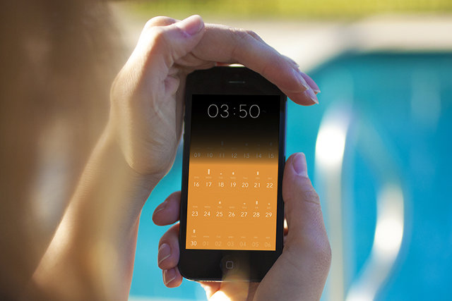
Peek contains some extra interactions that run the gamut from genuinely clever (covering the iPhone's ambient light sensor with your hand or thumb displays a large clock) to extraneously gimmicky (shaking the phone makes Peek cough up aspirational suggestions like "Take the time to relax!"). And the jury's still out on whether focusing an app's UI on gestural interactions isactually convenient or just a passing fad. But Peek's core concept--that most "normal people" don't need deep features and artificial intelligence to help them manage their time when simple, mnemonic microinteractions will do just fine--is a refreshing take on mobile design.


Source: http://www.fastcodesign.com/3025671/ex-ideo-designers-rethink-the-calendar-for-mobile-devices

'Hello Ruby' Teaches 4- to 7-Year-Olds How to Code by Gavin Lau

rubyheader1.jpg

The Kickstarter-funded book, which aims to teach programming principles to children, reached its $10,000 funding goal within hours of its launch, and 24 hours later had amassed $100,000 in donations. The project hit the $200,000 benchmark Jan. 28, with 24 days to go in the campaign. "This is a book to get kids excited about technology and affect the way they perceive technology as they grow up," she says.

The world of programming, Liukas tells Mashable, is perceived as cold, logical and machine-based. But Liukas feels quite differently. She sees in the coding world a universe of creativity and playfulness beyond ones and zeroes.


http://mashable.com/2014/01/28/hello-ruby-coding-book/#:eyJzIjoidCIsImkiOiJfY28xbmQybjNnN2QzMXluNXZncDNwMl8ifQ

Apple to Build Mobile-Payments by Gavin Lau

iphone-payment.jpg

Eddy Cue, the company's senior vice-president of Internet software and services, has met with "industry executives" to discuss Apple's role in handling payments for physical goods and services, The Wall Street Journal reported. The mobile-payments space is hot, with companies such as Square, PayPal and Stripe all working to make it easier for users to pay for physical goods with their phones.

Apple sells billions of dollars worth of movies, music, books and apps through iTunes. Still, aside from allowing customers at Apple retail stores to scan and pay for physical items inside the store via an iPhone, Apple hasn't extended its payments ecosystem outside of the digital realm.

That doesn't mean the company could't instantly become a major player in the mobile-payments space overnight, thanks to its absolutely huge iTunes customer base.


http://mashable.com/2014/01/25/apple-mobile-payments-2/#:eyJzIjoidCIsImkiOiJfY28xbmQybjNnN2QzMXluNXZncDNwMl8ifQ

HTML5 Vs. Native debate obscures the real challenges of mobility by Gavin Lau

04-HTML5-vs-Native.008.png

The vitriol spews on a daily basis. HTML5 or native apps? Each side is well armed with arguments and data to prove their points. This fight, destined to go on for a long while, masks some of the real problems that enterprises are facing when it comes to mobile applications. Do you have the right backend architecture for a mobile world? The right business analytics? Enterprises, brands and developers need to put their houses well in order before even beginning to answer what type of code an app will be built in.  

http://readwr.it/q0zV

Smart Tennis Sensor by Gavin Lau

Screen-Shot-2014-01-21-at-12.32.11-am.png

Sony showed off a prototype tennis racket sensor at CES 2014 that promised to track useful data about your technique and transmit it to your smartphone. That prototype has turned into reality faster than we thought it might — the final product now has a name, a price, and a release date for Japan...  

http://vrge.co/1iefefI

Blackphone: A Pro-Privacy Android-Based Smartphone by Gavin Lau

Screen-Shot-2014-01-15-at-11.40.36-pm.png

As the reality of the extent and invasiveness of the security services’ dragnet surveillance programs hits home, the pro-privacy movement has been cranking up its own ideas to counter spy-tech with pro-privacy tech. The Lavabit founder’s recent Kickstarter for a secure end-to-end open source encrypted email project called Dark Mail is one example. Today, here’s another: meet Blackphone, a smartphone that’s been designed to enable secure, encrypted communications, private browsing and secure file-sharing.

The project is a joint venture between Silent Circle — which shuttered its own encrypted email service last summer in order to preemptively avoid having to comply with government requests to provide data — and Spanish smartphone startup Geeksphone, which has previously made more standard Android handsets, and more recently has been building phone hardware for Mozilla’s open web standards HTML5-based Firefox OS.

https://www.blackphone.ch

http://techcrunch.com/2014/01/15/blackphone

Introducing a brand new way to play music by Gavin Lau

bang-olufsen-ces-2014-1.jpg

Bang & Olufsen is aiming to take the music you listen to on a smartphone and put it on the wall. The BeoSound Essence is a hockey puck-shaped music controller that reduces the number of actions you need to perform to one: just tap, and the music will start playing. What music, you ask? That depends on what you were playing last. The dial on the wall is just the first part of the product. The second part is a hideaway box that is wired to your speakers and communicates wirelessly with music sources. Those sources can be smartphones, tablets or PCs — anything with Wi-Fi connection. The Essence is compatible with Apple AirPlay, Spotify Connect and standard DLNA connections.

Apple Gets Serious About The iPad’s Creative Power In New Ad by Gavin Lau

Screen-Shot-2014-01-13-at-11.41.03-pm.png

Apple aired a new iPad advertisement during the NFL playoff game between the San Francisco 49ers and the Carolina Panthers today, and it’s all about creativity. It’s no secret that Apple wants to push the creative aspect of its mobile devices, which are still seen largely as consumption gadgets, and this new ad embraces a grand vision of iOS as fertile ground for inspiration and creation. “What will your verse be?” is the tagline for the ad, and the idea is that each person gets to contribute one verse to the overall poem of human experience (which is a terrible poem by the way). The iPad in the commercial is used in a number of different creative capacities, including as a filming accessory, as a prototyping tool, as a means for writing, and as a way to 3D prototype and work in the depths of the ocean...


http://techcrunch.com/2014/01/12/apple-your-verse-ipad-ad/

iPad-mounted Structure Sensor 3D scanner by Gavin Lau

Screen-Shot-2014-01-11-at-12.49.03-am.png

Augmented reality has never been nearly as cool as its name suggests. Even when it isn't gimmicky, it's virtually useless, in large part because your mobile camera's version of "reality" is short one dimension. Scanning and computer vision company Occipital, however, wants to add real depth to your tablet's vision with the Structure Sensor, a Kickstarter- backed product that shipped to backers late last year. The $349 Structure Sensor is a Kinect-like camera that fits on the back of an iPad or, with some hacking, any other device. With the bracket on, your tablet doesn't just see objects, it can figure out how far away they are, doing anything from turning an object into a 3D model to measuring the distance of a room. http://vrge.co/1lGoBVh

ZTE Eco-Mobius modular smartphone by Gavin Lau

6670-e0c6123c_680_400.jpg

To compete with Motorola's Project ARA, Chinese company ZTE has announced their very own modular Smartphone concept. Eco-Mobius is on display at ZTE's booth in Las Vegas, and the concept phone looks very similar to what Motorola had shown us months ago. Modules such as CPU core, RAM, camera, battery, etc. are all fixed to one another using magnets, allowing for easy replacement. Upgrading components of a phone rather than changing the entire phone can turn out to be both cheaper and more environmentally friendly...  

http://www.nextpowerup.com/news/6670/zte-shows-off-eco-mobius-modular-smartphone-concept.html


iOS: A visual history by Gavin Lau

Screen-Shot-2014-01-05-at-4.57.28-pm.png

Apple's Steve Jobs introduced the iPhone to the world on January 9th, 2007. In the five-plus years since then, the iPhone, iPad, and iPod Touch have literally redefined the entire world of mobile computing. That world is moving so quickly that iOS is already amongst the older mobile operating systems in active development today. That certainly doesn't mean it's underpowered or underfeatured — quite the contrary. Through what can only be described as relentless and consistent improvement over the years, Apple has made iOS one of the most feature-rich and well-supported platforms on the market. http://vrge.co/vd6Fhb

4 Reasons Why Apple’s iBeacon Is About to Disrupt Interaction Design by Gavin Lau

ibeacon660.jpg

You step inside Walmart and your shopping list is transformed into a personalized map, showing you the deals that’ll appeal to you most. You pause in front of a concert poster on the street, pull out your phone, and you’re greeted with an option to buy tickets with a single tap. You go to your local watering hole, have a round of drinks, and just leave, having paid—and tipped!—with Uber-like ease. Welcome to the world of iBeacon.  

http://www.wired.com/design/2013/12/4-use-cases-for-ibeacon-the-most-exciting-tech-you

Square launches thinner credit card reader with better swiping accuracy by Gavin Lau

Screen-Shot-2013-12-10-at-10.55.05-pm.png

Square is today shrinking down its iconic credit card reader with a new design that's thinner and more accurate than the original. After teasing a pending announcement yesterday, Square has made the latest revision of its hugely popular card reader official. The new design is 45 percent thinner than the original, essentially matching the thickness of an iPhone 5S. Square says that it's also enhanced swiping accuracy on the new model — which required replacing a number of existing components with custom-designed parts... http://vrge.co/J735L0

The War For Your Wrist by Gavin Lau

smartwatches.jpg

The past decade has seen the consumer electronics war grow more furious and more personal: your living room is a battlefield, as are your desks and your pockets. Now, more than a year-and-a-half since the Pebble (née Allerta) team saw its e-Paper smartwatch concept shatter a $100,000 Kickstarter funding goal, gadget purveyors of all stripes are vying for a spot on your wrist. http://techcrunch.com/2013/12/08/the-war-for-your-wrist/?

The Psychology Behind Information Dashboards by Gavin Lau

psychology-information-dashboards-small.jpg

With data-driven decisions gradually becoming the norm in every industry, the information dashboard has an important role. With its interactive and intuitive interface and its ability to visualize data in a single screen, it’s becoming a critical tool in the hands of the business user. Moreover, the information dashboard is also making its way into apps used by laypeople for managing day-to-day activities like budget tracking and fitness management...


http://uxmag.com/articles/the-psychology-behind-information-dashboards

How much does it cost to build the world’s hottest startups? by Gavin Lau

developing-apps-786x305.jpg

Could $100,000 and the right developer skills make you an overnight billionaire? How much does it really take to build a product like Twitter or Instagram? With mobile development agencies and product incubators on the rise and more corporate “labs” spinning out each day, there’s no shortage of talent to help you build the next great Web or mobile app.  

 http://thenextweb.com/dd/2013/12/02/much-cost-build-worlds-hottest-startups